• I want to thank all the members that have upgraded your accounts. I truly appreciate your support of the site monetarily. Supporting the site keeps this site up and running as a lot of work daily goes on behind the scenes. Click to Support Signs101 ...

Layout critique request.. :)

Circleville Signs

New Member
Notice, I refrained from inviting bashing...LOL.

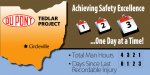
In any event, this is a 4'x8' with the top of the shape of Ohio CNC cut. Job site safety signage. There will be letter track for 4" letters to the right of the "total man hours" and "Days without reportable incident".

6mil Polymetal, digital print. Went with the orange because Circleville is synonymous with pumpkins.


Gary
 

Attachments

  • Thumbnail.png
    Thumbnail.png
    55.6 KB · Views: 146

Circleville Signs

New Member
Thanks all! So, the text spacing looks fine? I was a little worried that since I added the elipsis before the "One Day at a Time" line, and moved it to the left that it would look wierd. I had it set up centered first, but with the ellipsis it just looked "off".


Gary
 

Idea Design

New Member
I like the layout but would prefer to see the bottom stat on one line such as:

Days without LTA:

LTA being lost time accident.
 

rjpjr

New Member
Hello...

I have a few MINOR tweaks that you may want to consider.


1. Extend the brown panel completely across the board so that no white is visible above Ohio. That will help define the shape and add depth to the layout.

2. Vary the font weights according to the hierarchy of the messages.

3. Left justify the "Total Man Hours" block of text with the "Achieving..." text above.

4. Reduce the second and third calendar (approx. 10%). This will allow a little breathing room for the Brown Block text which will be it to read better.

5. Add Bullets to the man hours and recordable injury text. It looks like three items when there are really only two.

6. Add an accent stripe separating the brown and the blue panels. This will make it look a little more polished or complete.


I think this is all I have for yea...
 

Attachments

  • Ohio-Dupont.jpg
    Ohio-Dupont.jpg
    57.4 KB · Views: 126

Rising

New Member
Nice design, but I totally agree with rjpjr, just needed those little tweaks. Even from those tweaks I would reduce the bullet point info text height a little more.

Steve
 

Circleville Signs

New Member
Thanks for all the comments folks!

I like what rjpjr did, however as Astro8 pointed out, the top left portion of the sign (the top of Ohio) is CNC cut out of the substrate, so it won't just be 'white'.

i dont' care waht anyone says, I LOVE MYRIAD!!! Kerns well, easily legible, and if I happen to forget to convert to curves, EVERYONE has it.

I definitely am going to reduce the 2nd and 3rd calendars as suggested, because it just looks better :)

Thanks again!


Gary
 

Gino

Premium Subscriber
I know you want to cut the top shape out, but I think the continuation of the brown as rjp pointed out makes more sense. Although the cutout would be nice, if this thing is up for a while, it will weather much better without all the cutouts along the top.
 

signmeup

New Member
The purpose of the sign is to report the days without an accident. Why would you want to make that the smallest part of the sign?

I just mentioned the map because a lot of members didn't seem to realize that the top of the map was meant to be cutout. (it was a separate thought) It should have been on a separate line.
 

Rising

New Member
I am not saying it should, it is a very important part of the info. My thoughts are based on, collectively the type bullet points are looking sqaushed, to close to the border areas of the sign, and the line spacing of the second bullet point is way to close.

Just my thoughts buddy!

As I said nice design needs a little tweak.
 
Top