-
I want to thank all the members that have upgraded your accounts. I truly appreciate your support of the site monetarily. Supporting the site keeps this site up and running as a lot of work daily goes on behind the scenes. Click to Support Signs101 ...
You are using an out of date browser. It may not display this or other websites correctly.
You should upgrade or use an alternative browser.
You should upgrade or use an alternative browser.
Layout critique request.. :)
- Thread starter Circleville Signs
- Start date

signmeup
New Member
I get it. I'd make some other part of the sign smaller to uncroud the text.I am not saying it should, it is a very important part of the info. My thoughts are based on, collectively the type bullet points are looking sqaushed, to close to the border areas of the sign, and the line spacing of the second bullet point is way to close.
Just my thoughts buddy!
As I said nice design needs a little tweak.
Signmeup.... Yeah I agree on that, maybe the map could have a small trim down.
I looked at your website too, some great work there. I lived in LA back in 1994, was there for nigh on two years, I used to really enjoy sign foam signage, making it, installing it, and marveling at the finished product. I didnt do the talented part you do daily, but cut lettering from templates I did. No-one in the UK uses it at all, its hardly even available, some have tried but hasnt took off.
Good work
Steve
signmeup
New Member
Thanks for the compliments. Here is a link to a UK sign shop that does HDU stuff.
http://www.cloversigns.co.uk/ They appear to be a dealer or division of Danthonia Signs from Australia.
http://www.cloversigns.co.uk/ They appear to be a dealer or division of Danthonia Signs from Australia.
rjpjr
New Member
...the top left portion of the sign (the top of Ohio) is CNC cut out of the substrate, so it won't just be 'white'.
Sorry about that, I misread the post. I read it as though the whole state was going to be cut to shape and then applied to a secondary 4'x8' surface. Oops
With that in mind...
Attachments

GypsyGraphics
New Member
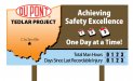
I might to see the pages torn off the calendar rather than three calendars and on rjpjr's layout.

vinylbarry
New Member
The red one does look much better seems the red goes with the brown better then the light blue.