-
I want to thank all the members that have upgraded your accounts. I truly appreciate your support of the site monetarily. Supporting the site keeps this site up and running as a lot of work daily goes on behind the scenes. Click to Support Signs101 ...
You are using an out of date browser. It may not display this or other websites correctly.
You should upgrade or use an alternative browser.
You should upgrade or use an alternative browser.
Logo design critique
- Thread starter TheSellOut
- Start date

thinksigns
SnowFlake
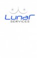
I think the first two, without the text, look almost NSFW-ish. Because the name doesn't fully describe them, I would like to see something in the logo that helps convey what they do. Lunar Services seems generic for such a cool idea.
Jet Fast Printing
New Member
Well I don't see a hairy eyeball, and I can't say what I do see it's nsfw. But really like the last one.
signcrafters london
New Member
So you can't say boob on here?
thinksigns
SnowFlake
My initial thought was Janet Jackson at the Super Bowl.
Jet Fast Printing
New Member
Didn't spot the sphincter right away. Good eyeJet Fast!
LOL I was talking about the boob.
Mike Paul
Super Active Member
They are not your typical lighting units, they are like giant balloons that light up and are anti-glare.
Got a pic?
tintguy31794
New Member
lol at the boob
Pat Whatley
New Member
Got a pic?
The things are pretty sweet. They've been doing night construction on the highway I take to work for the last six months. Driving by there are night the place is lit up like it's daylight with these lights but people driving aren't blinded by them.
Attachments

TheSellOut
New Member
The pic Pat posted is very similar.Got a pic?
Ditto on Mrs Jackson and Good call on the hairy nip.Didn't see Ms. Jackson until it was pointed out. The full color one is great. Take off the "nipple" for the BK and spot ones.
Not jerky in any sense...and thanks, that might be the most constructive observation this post has received.Not to be a jerk and maybe it's just my observation, but if they are a no glare light doesn't the star burst in the design sorted indicate a glare?
I think you are talking about the swoosh...and I had the same fear...but I felt in this case there was an actual purpose for it.I really like the logo. Only thing that bothers me is that when i see the swirl.. it just brings back memories of terrible people using a swirl in every design.
They are nice and I think you will start to see them more and more because of the anti-glare.The things are pretty sweet. They've been doing night construction on the highway I take to work for the last six months. Driving by there are night the place is lit up like it's daylight with these lights but people driving aren't blinded by them.
Here are a couple revisions!
Attachments

SignManiac
New Member
The revision really looks good now. I just knew that two would work better!
TheSellOut
New Member

W
wetgravy
Guest
I like the left side the best, the seperation between the two crescents is really nice. Not really digging grey on white background for the middle design of either though. good work.
DrCAS
New Member
The crescent shapes with the italicized letters seems to conflict with opposite motions to me. I would also lose gradients in the design. remember KISS.
I think you are on a good track... I actually like the first design better. I did agree about the burst because the long spikes did remind me of a glare. A sun shape might work better.
Ignore all the juvenile responses. They just can't help themselves.
I think you are on a good track... I actually like the first design better. I did agree about the burst because the long spikes did remind me of a glare. A sun shape might work better.
Ignore all the juvenile responses. They just can't help themselves.
signcrafters london
New Member
I like the latest full-color version, but I prefer the earlier (non boob) post #15 versions for the others.