Nascar racer Robby Gorden started a new energy drink company and the product will be called Speed Energy Drink and the logo is this "S"
http://www.robbygordon.com/news/201...-fueled-by-speed-energy-at-the-baja-1000.html
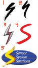
A bicycle company called Specialized Bicycle Components sued him for logo infringement, here is their logo.
http://www.specialized.com/us/en/bc/home.jsp
The judge ruled in favor of the bicycle company.........do you agree?
He already has 2.4 million cans filled and printed.
http://www.robbygordon.com/news/201...-fueled-by-speed-energy-at-the-baja-1000.html
A bicycle company called Specialized Bicycle Components sued him for logo infringement, here is their logo.
http://www.specialized.com/us/en/bc/home.jsp
The judge ruled in favor of the bicycle company.........do you agree?
He already has 2.4 million cans filled and printed.