signgal
New Member
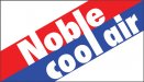
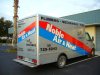
Need some input.  This is my stepdad's logo he's had since he got his trucks hand lettered in the 80's. They decided to make an actual division for the HVAC side of their business and asked me to come up with basically a duplicate logo with the word "air" replacing "plumbing". My stepdad can give a 5 day talk on anything under the sun but he lacks in the imagination department.
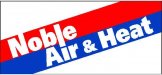
If I can come up with something not too different from the original but give it some pop that would be great! Air is so short and that logo was obviously created to accommodate the "p,l & g" in plumbing. Air doesn't have any distinguishing features FYI The white letters are reflective vinyl and his trucks are painted metallic silver, no digital graphics. I included what I've been messing around with, including where I tried to convince him to add heat. He argued we're in Florida and the customer doesn't care... see what I'm dealing with?!
This is my stepdad's logo he's had since he got his trucks hand lettered in the 80's. They decided to make an actual division for the HVAC side of their business and asked me to come up with basically a duplicate logo with the word "air" replacing "plumbing". My stepdad can give a 5 day talk on anything under the sun but he lacks in the imagination department.If I can come up with something not too different from the original but give it some pop that would be great! Air is so short and that logo was obviously created to accommodate the "p,l & g" in plumbing. Air doesn't have any distinguishing features
FYI The white letters are reflective vinyl and his trucks are painted metallic silver, no digital graphics. I included what I've been messing around with, including where I tried to convince him to add heat. He argued we're in Florida and the customer doesn't care... see what I'm dealing with?!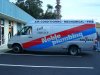

")