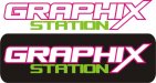
Well...
I think the letters in station need some breathing room. The space between "Graphix' and 'station' needs some more room.
I also don't believe this logo successfully passed the squint test, especially on a white background. For a
sign shop, it needs to be very readable. Unless you were always going to use a black box of some sort as a background...
I like the colors. I think the extended tail in X has been overused (myself included) but it works. I also think that font has been overused and abused (again, guilty!)
They layout could work though with some tweaks. It's a little boring though. Maybe add some sort of element to jazz it up a bit.
Just some thoughts. Not a bad start at all.