Jillbeans
New Member
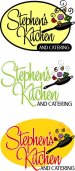
A few months back I started this topic about a catering logo for a guy with an odd last name.
He finally agreed to go a different route and use his first name rather than his last. I like the name now.
I also convinced him that he needs an icon of some sort, He wanted the old crossed knife and fork, but that has been done to death. So I doodled up a little skillet. He really likes it. I'm sure there is something similar out there but I did draw this by hand.
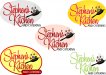
This new logo is pretty much a go, other than needing a bit of clean-up. Now I am stuck on colors. I have these five ideas (the one he's seen is top left) and I don't want to overwhelm him with color choices now that we are so close.
Which do you prefer, or should I try a different color combo? I think the layout needs the oval to ground it. I've messed with the angle of the pan in a few of these as well. I think I like the bottom left the best, but am not sure if the color choice is the best.
Sorry for having two threads about almost the same thing.
Love....Jill
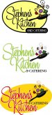
He finally agreed to go a different route and use his first name rather than his last. I like the name now.
I also convinced him that he needs an icon of some sort, He wanted the old crossed knife and fork, but that has been done to death. So I doodled up a little skillet. He really likes it. I'm sure there is something similar out there but I did draw this by hand.
This new logo is pretty much a go, other than needing a bit of clean-up. Now I am stuck on colors. I have these five ideas (the one he's seen is top left) and I don't want to overwhelm him with color choices now that we are so close.
Which do you prefer, or should I try a different color combo? I think the layout needs the oval to ground it. I've messed with the angle of the pan in a few of these as well. I think I like the bottom left the best, but am not sure if the color choice is the best.
Sorry for having two threads about almost the same thing.
Love....Jill

")