-
I want to thank all the members that have upgraded your accounts. I truly appreciate your support of the site monetarily. Supporting the site keeps this site up and running as a lot of work daily goes on behind the scenes. Click to Support Signs101 ...
You are using an out of date browser. It may not display this or other websites correctly.
You should upgrade or use an alternative browser.
You should upgrade or use an alternative browser.
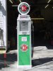
Name Of Font .........iam Tired Of Lookin At All I Have,,,,
- Thread starter OldPaint
- Start date

Bradster941
New Member
Guess you didn't know we have a dedicated section for your inquiry.
http://signs101.com/forums/forumdisplay.php?f=185

http://signs101.com/forums/forumdisplay.php?f=185
PMG
New Member
like you tell everyone.....get out the SHARPIE bada boom bada bing less than 5 min.got a name i can start with.............
5000 fonts is to many to visible search

SignosaurusRex
Active Member
I'm afraid you are going to have to do some work OP. The closest thing I have ever found.....which will require some stretching and editing skills is HAPPY CAMPERS originally from Nick Curtis (which is now a different font entirely). Here is a link to the original version. Its what I started with as a base font to edit some years back for a bunch of Petroliana Museum restoration and replication work. It may not be the closest....but It's what I chose at the time to work with.
http://www.1001freefonts.com/happycampers.php
http://www.1001freefonts.com/happycampers.php
Signguyno1
New Member
got a name i can start with.............
5000 fonts is to many to visible search
Should not be a problem. Break out the lettering quills, one shot and talent, paint and scan!
Font was hand lettered and screened back in the 20's I beleive.
Signguyno1
New Member

DOGraphics
New Member
For cryin out loud OP, ya got fruit flies in your speedos or something? Crack out a quill and get lettering, like the good old days. Should be lotsa fun!
To Funny.:ROFLMAO:
You've been called out OP. 
Service Sign Co
New Member
Draw it with the bezier tool,probably an hour tops
OldPaint
New Member
got it handled, no problem, my question was.......NAME OF THE FONT............
other then that....its done.
i got the VECTOR.......of this logo...SOMEPLACE!!!!!! with all the CD's i got, FONTS, & GRAPHICS, somethings get
lost in the pile.
i have an "old" bunch a corporate logos............on a CD, SOMEWHERE..... i remember seein this one, and damned if i can put my hand on it.
3 DAYS AFTER IAM DONE WITH THIS...............i will find it))))))))))))))
Service Sign Co
New Member
I made a quick vector drawing if you want it


Service Sign Co
New Member
That looks good, I guess you painted it?
Dave Drane
New Member
Allways bugs me when the drop shadow is at the top of the letters. Not a right or wrong, just the way I learned to letter. Benguiat and Bookman bold are similar.
Me too, it just doesn't look right for some reason.

Signguyno1
New Member
You are right Dave, It is not correct!Me too, it just doesn't look right for some reason.
The whole problem could have been taken care of by purchasing the correct decals (screen printed) or reproduction porcelain signs.
Complete list of suppliers are found at www.oldgas.com problem solved, if you are looking for perfection in the restoration of these artifacts!
But if you are looking for the cheap way out and not authenticity, go for cheap!
 :Oops: