• I want to thank all the members that have upgraded your accounts. I truly appreciate your support of the site monetarily. Supporting the site keeps this site up and running as a lot of work daily goes on behind the scenes. Click to Support Signs101 ...

Need some help on design for these windows...

Stacey K

I like making signs
They have the left side of this building with these odd windows. We were thinking of perf vinyl on the tops of both sides of the windows. I'm a little stuck on what should be on the other side? This is a 2 minute layout just for an idea. A house for sale or another sold house? Maybe a development map? Keeping this balanced is most important.
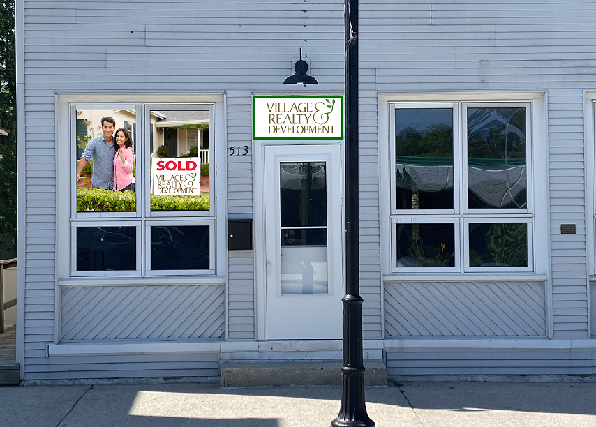
1658322701339.png
 

Boudica

Back to "educational purposes"
I like the idea of a development map. Why can't you fill the bottom windows?
 

Stacey K

I like making signs
I like the idea of a development map. Why can't you fill the bottom windows?
I can...here is what I have so far...it's just rough so no laughing!!! LOL I tried white on the bottom but it sticks out so much...or do you think the photos should fill all 4 windows? Be back in a bit, I have a trailer to do some work on...
1658325776550.png
1658325801775.png
1658325849550.png
 

Boudica

Back to "educational purposes"
I would fill the whole window bank with the photo, and fit the messaging in a clean area, like grass... Not busy. Working with the window frames.
 

Boudica

Back to "educational purposes"
One of my freelance customers are realtors and developers. They have several LLC's and corporations. I've done a lot of creative for them over the years and I've started steering away from using people in the photographs.
 

petepaz

New Member
definitely a fan of the happy horseshit Gino.

i think all of the options have some merit. perhaps give the customer 2 or 3 options. they may like one window in one option and a different window from another option. they can mix and match if they want but nice to give them a couple options
 

Notarealsignguy

Arial - it's almost helvetica
At least it's not arial... I blame architects for it's continued prominence. We had a flooring center open up in town, an established business here in AR, and the architect did what they always do and slapped arial on the drawing. I'll be damned if they didn't build it just so, even though these folks already have a logo... and yes, we all live in barns and run around barefoot in overalls.
View attachment 160533

And I concur with boudica on avoiding people on signage. I once printed a picture of some dude running for office that looked straight up like Lurch. The longer it was up (unlaminated coro), the more he faded, the more the darks stood out, the more he kept looking like Lurch.
Aerial is a very nice recognizable font. You want channel letters? 20% off for aerial font. We keep it in stock.
 

Stacey K

I like making signs
Thanks everyone! I'm back at the computer today and I'm going to get back at it. I'll let you know what she decides! Great ideas Boudica and Gino...I'm stealing them!
 

Scotchbrite

No comment
I'm curious if you have to permit this? In our local municipality window graphics have to be permitted if they cover more than 25% of the window area.
 

Stacey K

I like making signs
I'm curious if you have to permit this? In our local municipality window graphics have to be permitted if they cover more than 25% of the window area.
Nope, not for window vinyl :) It's also exactly 25%. They ended up going with just the left 2 windows which leaves 6 open ones. There's a title company going in on the other side and they are going to letter the right 2 windows so it's balanced. Hopefully soon so it doesn't look stupid lol

And Boudica won the art contest, they went with the hedge bottom windows LOL
 
Top