-
I want to thank all the members that have upgraded your accounts. I truly appreciate your support of the site monetarily. Supporting the site keeps this site up and running as a lot of work daily goes on behind the scenes. Click to Support Signs101 ...
You are using an out of date browser. It may not display this or other websites correctly.
You should upgrade or use an alternative browser.
You should upgrade or use an alternative browser.
new concession trailer
- Thread starter ucmj22
- Start date

ucmj22
New Member
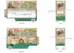
Thanks, They are the same trailer, one image is it open and ready and the other is what it would look like rolling down the road with the awnings down. Here is the picture of the rear at larger scale maybe it looks better. I had a hard time with the back of the trailer trying to make things look muted enough to be vintage, but still have enough contrast. I hope it works out, but I probably should have made the value separations a little more apparent.
as far as the Sutter's text, thats actually a ® logo, otherwise I would have.
as far as the Sutter's text, thats actually a ® logo, otherwise I would have.
Attachments

HulkSmash
New Member
you're probably right, I was trying to make things faded and Faux antiqued without looking crummy, but I probably lost the edge at about 3am and wasn't paying so much attention. This was the trailer i was considering the IJ480 for by the way. Thanks again for the input on that.
yeah 480 is overkill for that. Be sure to show us the final install photos.
ucmj22
New Member
Are you going to have it ready for the Illinois State Fair? If so, I will have to check it out when it is up here in Springfield.
I dont think this particular trailer will be at IL St Fair, as I believe its first spot is the Indiana state fair which runs Aug 02 - 18 and the ILSF runs in conjunction from the 8th-18th. but one of the other trailers I did will be there. If you see a clear cup with a black crown, I made that too
")
ucmj22
New Member
I got to see it being built, and they sent me some pictures while they were applying, but I never got to see it in person before I left. they have a couple pictures of it here http://instagram.com/statefairtaffy