• I want to thank all the members that have upgraded your accounts. I truly appreciate your support of the site monetarily. Supporting the site keeps this site up and running as a lot of work daily goes on behind the scenes. Click to Support Signs101 ...

Opinions on logo...

Moze

Active Member
I'm posting this a bit reluctantly due to the history leading up to the development of the current logo and not wanting to hear that the final product is "meh" (or worse). But avoiding critique by those of you who are true designers doesn't change the verdict or impression the logo gives others, so here goes...

Brief background (I'll keep this to one paragraph - if you don't want to read it, skip to the next paragraph):

I have zero background in sign or logo design. My experience in the sign industry is code research, surveys, some installation, permitting, and estimating. That being said, I recently started my own business and attempted to make my own logo. I got 'stuck' on an idea that I came up with and the resulting logo is probably reflective of my lack of design background. My business name is Precision Sign Services. The idea was to incorporate the word 'SIGN' into 'PRECISION', making the 'SION' also serve double-duty as the word 'SIGN'. That example is below.

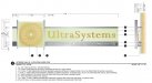
My new design was done through an online logo design company. You basically give them an idea as a starting point, a few designers upload their designs, you pick the one(s) you like, tell them the revisions you want, and so on, until they come up with something you're happy with. I was rushed due to wasting time on my own design, and the second attachments are the final design I accepted (one for a black background, one for a white). Also included the new business card design which I worked up in Photoshop using the new logo. Give me your thoughts. I'd say 'be gentle' but that would defeat the purpose of me asking for your thoughts...so fire away.
 

Attachments

  • Business Card - Front.jpg
    Business Card - Front.jpg
    32 KB · Views: 113
  • 2) MED BLK.jpg
    2) MED BLK.jpg
    28.7 KB · Views: 108
  • 2) MED WHT.jpg
    2) MED WHT.jpg
    29 KB · Views: 119
  • Business Card Final.jpg
    Business Card Final.jpg
    54 KB · Views: 119

Perks

New Member
Looks like the first one is more on line with what you were hoping to accomplish. The font is good but could be bolder for sure. It kinda reads weird...it may sound to some like prissy signs.
 

Moze

Active Member
at first glance it looks like your selling guns! for some odd reason.

The crosshairs are supposed to represent the element of accuracy and precision.

Didn't another guy just make his company and called it precision sign?

Quite possible. Throughout the U.S. there are quite a few sign companies using variants of "Precision...".

Looks like the first one is more on line with what you were hoping to accomplish. The font is good but could be bolder for sure. It kinda reads weird...it may sound to some like prissy signs.

Agreed...and with the "SIGN" in red, it kind of disappears at night. I had it on the back window of my truck and at dusk it looked like 'PRECI SERVICES"
 

Rick

Certified Enneadecagon Designer
I did a quick search on google for "precision logo"

Lots of crosshair logos.

the first idea is unreadable, I see you are already using the other idea. I would explore more options.. maybe do away with any graphic elements and try logotype only.

I see you hand draw your design details, do you do that with all your drawings?... I miss hand drafting and I don't. Occasionally I will scrawl out a hand detail for fun. You should see my grocery list, all written in my obsessive drafting style.
 

Circleville Signs

New Member
Well, here's my thinking...

#1 - that font is stretch and smooshed to hell and back.

#2/3 - if your target customer is age 14-22 and REALLY likes paintball, you've got a winner
 

Moze

Active Member
I did a quick search on google for "precision logo"

Lots of crosshair logos.

the first idea is unreadable, I see you are already using the other idea. I would explore more options.. maybe do away with any graphic elements and try logotype only.

I see you hand draw your design details, do you do that with all your drawings?... I miss hand drafting and I don't. Occasionally I will scrawl out a hand detail for fun. You should see my grocery list, all written in my obsessive drafting style.

Yes, I scrapped the first idea after wasting way too much time on it.

Not positive what you mean by this? I don't really 'draw' beyond what you see. I've had Photoshop forever but rarely use it. This was the first time in years...I guess it shows.

Well, here's my thinking...

#1 - that font is stretch and smooshed to hell and back.

#2/3 - if your target customer is age 14-22 and REALLY likes paintball, you've got a winner

Agreed on the font being stretched - one more reason I scrapped that first idea. That's actually a font that can be downloaded - I didn't adjust it at all.

Definitely not my target range. I think I read that the use of gradients isn't advisable with logos so that was probably a mistake. I just got to the point that I needed something so I could start sending out business cards and had to finalize something.

Thank you for your thoughts, Gary.
 

Circleville Signs

New Member
OK - just threw this together as an idea. The font conveys angularity and "precision". The icon portion is easily usable for many things. Something to get your juices flowing maybe?
 

Attachments

  • precisionSignSample.png
    precisionSignSample.png
    6.1 KB · Views: 88

Rick

Certified Enneadecagon Designer
Not positive what you mean by this?


.

Most people I know use a computer for attachment details, it's refreshing to see a hand scrawled detail... I am a sign designer, but all that means is 10% fun, and 90% getting it done. as you see on the image below. it took more work making the details to bid off of than designing a simple lobby sign.
 

Attachments

  • ULTRADRAFT.jpg
    ULTRADRAFT.jpg
    63.4 KB · Views: 92

Moze

Active Member
OK - just threw this together as an idea. The font conveys angularity and "precision". The icon portion is easily usable for many things. Something to get your juices flowing maybe?

I do like that. It would have to have "Services" worked in there somewhere, but yeah...it gets the wheels turning.

I'm kicking myself for the wasted time spent self-"designing". Now I have to decide if I want to change it again. Very frustrating.

Regardless, I appreciate the comments and ideas.
 

Moze

Active Member
Most people I know use a computer for attachment details, it's refreshing to see a hand scrawled detail... I am a sign designer, but all that means is 10% fun, and 90% getting it done. as you see on the image below. it took more work making the details to bid off of than designing a simple lobby sign.

I'm going on very little sleep, so I'm probably missing something super obvious, but what attachment details are you referring to that are hand drawn?

EDIT: You must be looking at the surveys on my website. If so, yes, I primarily hand-sketch everything.

The attachment you included is very nicely done. When I'm surveying, it's always a challenge to neatly show dimensions and make it look orderly when there's a lot of detail. Well done - I downloaded your image to 'study'. :)
 

Rick

Certified Enneadecagon Designer
I'm going on very little sleep, so I'm probably missing something super obvious, but what attachment details are you referring to that are hand drawn?

The ones on your website portfolio section....


I downloaded your image to 'study'. :)

That's how I learned, I collected and studied every detail drawing that came across my desk... then practiced drawing it in Illustrator.
 

Moze

Active Member
I wish I could see the dimension more clearly on the section view. Any chance I could get you to upload or send me a high-res copy of that portion?

Elevation views are typically fairly easy. Section views get tricky when there's a lot of detail.

EDIT: I was able to zoom in, scratch the upload request.
 

Moze

Active Member
Also nice, thank you.

I'm literally receiving my business cards and flyers with the crosshairs design today. I'm at the point now where I no longer have the time to develop a new logo. Perhaps in a year or so I'll launch a re-design and funnel my money to someone here that is actually in the sign industry rather than a catch-all logo design website.

I think Gary's design appeals to me because it resembles the HP logo. I didn't see it at first, but I was thinking that for some reason that logo appealed to me right away. It seemed familiar and 'strong' but I couldn't put my finger on why. But then it hit me - it looks HP-ish, which is a good thing.
 

Attachments

  • precisionSignSample.png
    precisionSignSample.png
    6.1 KB · Views: 90
  • hp-logo.jpg
    hp-logo.jpg
    2.1 KB · Views: 94

bob

It's better to have two hands than one glove.
The crosshairs are supposed to represent the element of accuracy and precision...

If you have to explain it then it's not working.

Gun sights, metaphorical or actual, mean guns, shooting, target acquisition, etc. Only via tortured abstraction do them mean 'precision'.
 

Moze

Active Member
If you have to explain it then it's not working.

Gun sights, metaphorical or actual, mean guns, shooting, target acquisition, etc. Only via tortured abstraction do them mean 'precision'.

All valid points, thank you.

Now I'm at the crossroads of whether or not to scrap this design as well and once again, start over.

I wish I had found this site sooner.

I appreciate everyone's input - thank you.
 
I personally like the crosshairs.... but sadly I do fall into the "14 - 22" age bracket... -.- I think its a good starting point. Hope you do well with the business!
 
Top