• I want to thank all the members that have upgraded your accounts. I truly appreciate your support of the site monetarily. Supporting the site keeps this site up and running as a lot of work daily goes on behind the scenes. Click to Support Signs101 ...

Our Shop Truck

CS-SignSupply

New Member
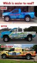
I don't think the picture really does the work justice, in regards to the readability... physically standing 20-40 feet from the actual truck is completely different thank looking at a 3" picture on a laptop screen.

I really like the blue and wish we could see more of the detail you mention.

The truck looks simple, clean and concise in my opinion.... A huge step, or two, from one of the local SAR's in my area.

Which reflective was this printed on? Maybe you should have messed up a few times to use more ink from me :)

Looks great!
 

sar bossier

New Member
Which reflective was this printed on? Maybe you should have messed up a few times to use more ink from me :)

Looks great!

:ROFLMAO::ROFLMAO::ROFLMAO::ROFLMAO: I WASTED a lot of vinyl - it's 3m 5100. I am walking outside RIGHT NOW, to take a better picture, in the sun - but NOW the truck is dirty!!:doh:
 

sar bossier

New Member
Here you go - sorry it's dirty!!
 

Attachments

  • Dodge closeup 1.jpg
    Dodge closeup 1.jpg
    81.5 KB · Views: 58
  • Dodge Closeup 2.jpg
    Dodge Closeup 2.jpg
    82 KB · Views: 66

wildside

New Member
Here you go - sorry it's dirty!!

from 5-10 feet away i am sure it looks good, but from 50-100 feet away that phone number is impossible to read

it looks good :thumb:, but i would have left the phone plain white and done something else with the logo colors, or the background colors for contrast and legibility
 
Last edited:

sar bossier

New Member
from 5-10 feet away i am sure it looks good, but from 50-100 feet away that phone number is impossible to read

it looks good :thumb:, but i would have left the phone plain white and done something else with the logo colors, or the background colors for contrast and legibility

Thank you, Wildside! My intention was to have the number visible from closer, and at night (which it REALLY is), so the number wouldn't take so much away from the design (the red logo does that). My husband wanted to make everything smaller, for that very reason (not covering up too much of the graphic elements). I really appreciate all of the comments, and constructive criticisms - THANK Y'ALL!!
 
Last edited:

phototec

New Member
I believe honesty is the best policy, and although I like the blue(s) and the overall design, the are some major issues, like those already mentioned.

• The text is very hard to read, red on blue along bed says what?
• Needed more contrast for the phone number.
• I have a pet peeve about layout and position of text, "Advertising", is to close to tail light.
• Text position on tail gate, again to close to tail lights, text should be more balanced.

Oh, and yes it looks great in your newly added close up photos, however that is NOT real world, mobile advertising is just that, a vehicle driving down the road and you only get a quick glance at a distance, not like a stationary sign.

So overall I would give the project a lessor grade because I think you missed a great opportunity to make your important information more VISIBLE as in mobile advertising!

:smile:
 

Attachments

  • Which is easier to read.jpg
    Which is easier to read.jpg
    71.5 KB · Views: 53

sar bossier

New Member
I believe honesty is the best policy, and although I like the blue(s) and the overall design, the are some major issues, like those already mentioned.

• The text is very hard to read, red on blue along bed says what?
• Needed more contrast for the phone number.
• I have a pet peeve about layout and position of text, "Advertising", is to close to tail light.
• Text position on tail gate, again to close to tail lights, text should be more balanced.

Oh, and yes it looks great in your newly added close up photos, however that is NOT real world, mobile advertising is just that, a vehicle driving down the road and you only get a quick glance at a distance, not like a stationary sign.

So overall I would give the project a lessor grade because I think you missed a great opportunity to make your important information more VISIBLE as in mobile advertising!

:smile:

Thank you, Phototec! I appreciate your insight!! :thumb:
 
Top