JR-Folientechnik
New Member
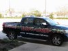
Super wrap, how long did it take? One or two wrappers? I would like to start offering my customers, USA style wraps.... they have to be trained to think outside the box! I would like to see more of your wraps.
Super wrap, how long did it take? One or two wrappers? I would like to start offering my customers, USA style wraps.... they have to be trained to think outside the box! I would like to see more of your wraps.
")
Thanks for the info, my wife and I almost work together as a wrap team...it's great! Many greetings from the Germany Connection...
Nice job. Clean and classy.
Is that a Juice Drop background or your own?

Not too shabby! But yeah, it's unfortunate you're locked into the SAR logo and the red is fighting that really nice blue...

I was gonna deck it out in fleur de lis, but that is SO passe here
I actually used fleur de lis on our first truck - partial wrap - HATED it.

There's not a cajun (sp?) in Louisiana who would want you to leave out those tiger stripes and fleur de lis
Sorry, I guess just the smallish size of the text graphics with a lack of contrast for the most part. Legibility is KEY, regardless of "shade" conditions.Whatcha policing? Comment?
Sorry, I guess just the smallish size of the text graphics with a lack of contrast for the most part. Legibility is KEY, regardless of "shade" conditions.
I know your hands are tied to a degree with the logo, but everything being in straight lines is kinda boring. It's not a "bad" design, just not "good".
I guess I'll be the one jerk that doesn't care for it. You know when you put it on here...that could happen. Nothing personal.
Looks good ... the blue phone number and red text along the truck bed aren't very legible from the pics ... but as you said that could just be a product of the shady pic.