White Haus
Not a Newbie
Doooo iiiiiiitWell not yet, they're waiting on their sign to post 'now open.' Easiest investigation is to call the number...
Doooo iiiiiiitWell not yet, they're waiting on their sign to post 'now open.' Easiest investigation is to call the number...
Oh yeah same here. I can freehand just about anything with an olfa or x-acto, or even a sharpie for that matter, but I bet I couldn't hand-letter a clean shape if my life depended on it.I don't need to try, every time I try to write large to label something, it runs off one side and my letters are either crowded or off center.
No give me a knife and I'll make 10 straight cuts in a row, but with a pen or pencil and I'm on par with my 7 year old.

 www.facebook.com
Vertical integration.. smartJust Googling the phone number comes up with this post.
Witch Well Farmers Market & Swap Meet | A person is in need, anyone know of a water delivery. | Facebook
A person is in need, anyone know of a water delivery.
In the Comments: "I’m in Witch Wells and pay $150 for 1,000 gallons. If you don’t have enough totes he’s gotta dump the water. I drowned my garden until I have enough totes.
Jeff at Big Splash Water Delivery +1 (520) 208-7420
Great guy!!!"
Looks like Big Jeff is on both sides of the water business.
Thank you for the positive point, I am appreciative of the input and I have looked at it from a different point of view. I redid the areas suggested by Gino and it's some better but yes, needs to be redone, but for now it hangs. and yes surprisingly he paid me for it. Maybe a pity payment, but there's hope for a do over. Again thank you for feed back.Beauty is in the eye of the beholder, if the customer likes it, sell it as is. If it's something you find disappointing, it's on you to redo until you'd be satisfied passing it every day.
Props on taking one on the chin from Gino and not bellyaching, I believe he cut his teeth on hand lettering, he is a great resource. Not sure about the best way to go about learning hand lettering any more, but there are more than a few old salts on here that may point you in the right direction.
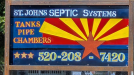
Well, I guess I've been everyone's laugh for the day, a first sad attempt and yes, it is a real request, and yes, I got paid, more than it was worth and yes it reeks of armature bad first attempt and a redo will be in the works as soon as possible. It hangs though and number does work. I know full of errors and I will do homework, approach differently. I have alot to learn, but glad for the experience. I did suggest the client just go online and order one direct from professionals. Thanks for your input I did spend some time fixing as best I could your highlighted suggestions. I'd post but lynching might be next so I will slide away quietly. Thanks though for the input.Ya know, just for sh!ts and giggles, I looked into this one. There is no St John Septic with that area code. Also, there are other things which don't quite jive, either.
Unless this person comes forth, I believe I've been suckered.
I know and I created digitally in 15 mins, but how would I get from computer to metal sign I was presented with? Rough metal sign needing pretreat to even take paint, and weights too much, and can't just get anyone to run the design. I suggested he just get one printed and scrap the sheet of metal he had. !!??Why not just do it digitally in under an hour? Will look 1000x better too
I did try to fix those points, and side two was better and I may try again smaller and different substrate. I appreciate your time. Yes letters would look better all the same font and size. Need better tools. Way harder than I expected.. lolTotally, if the guy like it and will pay ya, by all means, take it and move forward.
I was only trying to be helpful.
All flat letters will be the height setter, but the 'rounds' will be slightly above the height lines and below the bottom letter. It's an optical illusion. Most of your letters have completely different weights within the same word, let alone in the same line of copy. Some to most of your letters seem to be pointing slightly up, down, straight ahead and somewhat different heights. Look at the #2 in the phone. They're all different sizes and the bottom dash is different in 2 of them. The 0's are different weights and the 8 looks like it has scurvy. Tanks, chambers & pipes runs uphill and almost off the paint band. Your tabs within the lettering is missing at a buncha places and the period in St. is outta proportion. Ya probably should have something between the 3 words to define them better.
Pure..... there's more, but try to digest this and we'll move forward later, if ya wanna.
Everybody needs a laugh some times. Don't take the criticism too hard, and keep at it.Well, I guess I've been everyone's laugh for the day, a first sad attempt and yes, it is a real request, and yes, I got paid, more than it was worth and yes it reeks of armature bad first attempt and a redo will be in the works as soon as possible. It hangs though and number does work. I know full of errors and I will do homework, approach differently. I have alot to learn, but glad for the experience. I did suggest the client just go online and order one direct from professionals. Thanks for your input I did spend some time fixing as best I could your highlighted suggestions. I'd post but lynching might be next so I will slide away quietly. Thanks though for the input.
The owner is just setting up google and sign was first required step , so not connected yet.Just Googling the phone number comes up with this post.
Witch Well Farmers Market & Swap Meet | A person is in need, anyone know of a water delivery. | Facebook
A person is in need, anyone know of a water delivery.
In the Comments: "I’m in Witch Wells and pay $150 for 1,000 gallons. If you don’t have enough totes he’s gotta dump the water. I drowned my garden until I have enough totes.
Jeff at Big Splash Water Delivery +1 (520) 208-7420
Great guy!!!"
Looks like Big Jeff is on both sides of the water business.