• I want to thank all the members that have upgraded your accounts. I truly appreciate your support of the site monetarily. Supporting the site keeps this site up and running as a lot of work daily goes on behind the scenes. Click to Support Signs101 ...

Printing RED ?

ImpactSignCo

New Member
Don't forget to take your test prints outside, away from fluorescent lighting, to get a better understanding of how it will look in a real-world capacity. We have had problems in the past with reds, tans, greens, greys, etc. turning colors after the customer takes them outside. I would say to print your Roland Color Library chart, take it away from artificial lighting, and make your selection under some good ol' sunshine. That should give you the accurate depiction you are looking for.
 

splizaat

New Member
0-100-100-0 does occasionally show slightly orangish, but it's definitely red.

Most of the time we'll run one of these: 5-100-100-0 or 5-100-100-5

and for a really deep nice red we run 21-100-100-14


Are you running US Prepress or Max Impact? We run these in Max Impact.
 

heyskull

New Member
Good Luck on this problem (your gonna need it!).

Anyone who is running a CMYK printer will fall into this hole eventually.
If it isn't Reds, it's Greens, Blues and Greys and when you adjust/profile for one, the adjustment to make this colour will change other colours.
You will end up going round in circles!
Even with correct profiling you will always be compromised between other colours you print.
Believe me I have spent years adjusting profiles to come to realise that this matching colours on a 4 colour printer is always going to be an ish.

If the customer is so fussy I suggest you tell him due to the variables in CMYK printers, for you to recreate his colour you will need artwork and profiles that have been specifically made to run on your Machine, RIP, Material and Ink Set. Yes I know this is asking a lot but some customers want the moon on a stick so just throw the stick back!
After this they will just have to accept what comes out of the printer or pay the extra to have it screen printed to his exact spot colours.

Customers need to be educated that it is impossible to ever match colours exactly with such a small palette of Four Colours and probably the only colours we can print without too much trouble (and sometimes it is) is Cyan, Yellow and Magenta! Yes I left out Black as that has its own issues!

SC
 

kanini

New Member
If you're playing around with the Roland library make sure the "convert spot colors" are checked under "file format"tab in Versaworks. Otherwise you don't do anything with the Roland colors... Good luck!
 

phototec

New Member

Yep, this works for me, just print out the Roland color chart for the reds on the exact material you will be using, laminate, and have the customer select whatever red he likes, I would have him view the chart in the daylight, not in your shop (lighting).

Then you should be able to match the red selected by the customer perfectly.

See page 4 from the link above.

I have these Roland color charts printed on each different material I use, and it helps me to get closer to colors than matching PMS numbers.

:thumb:
 

Attachments

  • color_library.jpg
    color_library.jpg
    145.5 KB · Views: 103

autoexebat

New Member
0-100-100-0 does occasionally show slightly orangish, but it's definitely red.

Most of the time we'll run one of these: 5-100-100-0 or 5-100-100-5

and for a really deep nice red we run 21-100-100-14


Are you running US Prepress or Max Impact? We run these in Max Impact.

Thanks , I will try the 5-100-100-5
 

Salmoneye

New Member
I have had good luck with 42k and 43k on the Roland swatches but have just recently started using some swatch pallets from Oracal 751 and like them.
 

Salmoneye

New Member
Oracal has pallets that you can download with swatches for their different lines like 951series, 751 series... lots of great colors for designing signs and they seen to print well on my xc-540 as well. I use rgb illustrator files, save as .eps, enable spot colors, max impact or sign and display setting. Try it, it's free.
 

autoexebat

New Member
Sadly I am back here looking for help once more. I keep failing at making a true RED ... I tried what you guys have stated here 0-100-100-0 but it's just not red. I sold a few more graphics kits to people and have refunded all of them because they say it's orange.. I really don't know what else I can try , should I use a different formula and export from corel into CYMK ? or what am I doing wrong.

I called my dealer 2 times and was supposed to get a call back , guess what ? You guessed it .. never got a call.

It really sucks because red is practically the most common color there is !

I must ask ... Is there a way for this printer to actually print a real true red ? or am I hoping for something that wont happen.

Note from my last customer
-
I'm going to be honest I'm happy with your customer service but I'm disappointed in the graphic kit because it looks orange the picture on ebay made it look pretty red but it's not and it doesn't match anything on my quad because the kit is orange and my quad it red.

I wish you would have told me when I asked for red that you don't have a red cartridge so the red really isn't red. but I do appreciate you responding so fast

-
 

deegrafix

New Member
I have one customer that I have this problem with and I have ended up doing his particular decals in photoshop, using Pantone 185, maxing the saturation then lightening it 10% and printing 2 pass. The red is fabulous but you will have to really play with any other colors, making them very light so they will come out the right color. Everything will look very strange on the monitor but you can do swatches for the other colors so you know what you will get. I have several "color families" with the Pantone numbers printed on them on vinyl pinned to the wall so I know which color to choose to get the one I really want. Very unscientific, lol. I have a 6 color old Roland printer. Takes some trial and error setting up the job and longer to print but the red is very nice. Without 2 pass I can't seem to get a good red either. My Roland printer will always do a brighter red using an rgb jpeg file rather than cmyk or any other file type, so even if I design in vector I'll drop it into photoshop and make a jpeg to print.

I'm sure this method would be a pain if you had heavy work flow, but I do what I have to to accomplish what I need to.

I'm so sorry to hear that your new printer wasn't more "plug and play". I would have expected red after laying out the cash!
 

autoexebat

New Member
Yeah the photoshop deal wont work with me as I'm going it all in vector in Coral X6 . I just fired up my printer and will run a test with RVW-PR43K

Will let you know how this turns out.
 

GAC05

Quit buggin' me
Print out a color chart from Corel on the media you use the most.
Note the output/render settings on the chart.
Print the same chart with different (recommended) settings.
Find the red that looks best to you and save that color chip to the pallet you use when you set up your graphics to print.
If you save it in the default pallet it will be available every time you start a new file.

wayne k
guam usa
 

bob

It's better to have two hands than one glove.
Apparently you didn't comprehend it the first time it was stated so here it is again: What comes out of the printer is the truth. Read it, know it, be it.

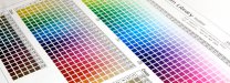
If you want to hit some particular color or another, regardless of profiles, profiling equipment, and praying to your gods, all a monumental waste of time, print a good color chart. The most useful would be a Pantone Gloss Coated chart. Failing that, use the object blend technique also previously described. Print this chart with all of your rendering intents, except for "Bitmaps", set to "No Color Correction". Set Bitmaps to "Perceptual". Leave them there. Forever. Find a color on this output that you like and live with it.

The point is that you should stop trying to bend your printer to your will and start understanding and dealing with what comes out of it.Begin a competent digital pressman is far more art than science. Time spend questing after some magic bean of a profile or color formula would be far better spent in coming to know and understand your printing tackle. Develop a comprehension of input resolution to output resolution and dither algorithms and why they matter.

This is certain to give all of the profilistas the vapors, an event not without a certain charm, but it's the best advice you're likely to get.
 
Top