• I want to thank all the members that have upgraded your accounts. I truly appreciate your support of the site monetarily. Supporting the site keeps this site up and running as a lot of work daily goes on behind the scenes. Click to Support Signs101 ...

Rasterlinkers

Neil

New Member
Any other Rasterlink users out there?

I actually don't use it myself- primarily.
Having looked at it thoroughly when CJV30 machine first arrived, I, like many others, was unimpressed with the print quality.

Being that I've made my own printmodes and profiles in Signlab, I happily use that for all printing and print/cut workflow.
The output I get from Signlab is just about perfect.

But recently I had a problem with Signlab's in rip contour cutting, which has forced me to take another look at Rasterlink (and Finecut) for print/cut.

So I printed test files of CMYK and RGB vectors and RGB bitmap images, with all of the profiles supplied in Rasterlink.
After deciding on the best one (there's not much in it from best to worst - they all look similar), I then altered the rendering intents, resolution, passes etc. trying to get the best one to look somewhat better.

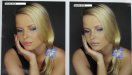
The CMYK vectors (Pantone swatch) were pretty good, but the bitmap images were dull. RGB swatches were dull.
Oranges were burnt orange, yellows greenish, dark colours almost black.
Thick, dense, oversaturated ink, undersaturated chroma, too much CMY and not enough K, prints take forever to dry...

I really don't understand how they can expect you to use their canned profiles as they are.

But I had to face the fact that I might have to actually print with Rasterlink. Albeit only for print & cut - which however is about 10 steps more involved than simply print & cut in Signlab.


But I digress.

--------------------------------

Chapter 2 - going under the hood

Sorry but I realised I'm writing a novel here.

I recently watched some very good tutorial videos about using Rasterlink.
These are from the Mimaki Australia site:
http://dgsmimaki.com.au/pages/tutorials/tutorials.html

If you have Rasterlink you should go and watch the first 6 or so - there's stuff in there I didn't realize you could do. Especially the condition management video which shows how to alter and save different settings.

It's not covered in their Operation Manuals. Why is that? And there's no help menu in the rip.

Seriously, how many any Rasterlinkers out there know how to alter global ink densities?

How about that you can alter each CMYK channel density individually for either vector or bitmaps - for shadows, mids or hilights?
On top of that, you also have control over ink limits, linearization, K to CMY mixing ratios...
AND you can change the input profiles!

I had no idea you do so much.


So this got me tweaking.

I replaced the input profiles with AdobeRGB1998 and USWebCoatedSWOP.
This is what I've always used in Signlab.
WOW, what a difference that has made - especially to the images and RGB colours. Suddenly pictures have pop and don't look dull like they do with SRGB.

I reduced the overall density - now it lays down just the right amount of ink.

I changed the CMY to K mixing ratio - now it uses K more and CMY less in the dark areas and greys.

I tweaked the individual channels a tad.

I'm astonished to say it, but now the output from Rasterlink is almost identical to what I'm getting from Signlab.
The bitmaps are colourful and vibrant. Reds, oranges and yellows are bright and pure. RGB black ramp is neutral grey all through.
Pantone Color Bridge CMYK swatches are almost identical to the whole book!

It's almost as good as it gets.
(And I didn't have to fork out 4k for their profiling module)

It's just a pity they don't actually tell you any of this - or how to do it.


As a footnote: I was able to get Signlab's contour cutting up and running as normal, so I probably won't need to fire up Rasterlink again!
Sheesh, after all that...

But still, I must say I'm quite impressed with Rasterlink now.
If anyone wants to discuss it further please chime in...
 

artbot

New Member
thanks for the link! some of the options are so complex in rasterlink, i just say "what the hell is all this?"

maybe i won't be so afraid to start clicking around.
 

Signmart

New Member
Thanks for the Tips. I've gone in a watched the videos and I'm getting a lot better results with my prints especially on clear vinyl. before it was laying down way too much ink.
 

Neil

New Member
Yeah, all my profiles were laying down too much ink too.
The biggest benefit I got was by altering the density to -20.

Color Edit/Color Adjustment/ add new color adjustment file.
Then select that filename and choose Density/Whole/-20.

Then update the condition management with the new color edits.

It's amazing how much better the colours are when it's not throwing down so much ink in the dark colours/areas.
 

Neil

New Member
The proof, as they say, is in the pudding.

I have a file which I like to take along to demo days and get printed from the various printer vendors.
A stock picture of a beautiful model's face along with a grey background.

I now have samples of the same file printed with a Roland SP540, VP540, Mimaki JV3SL, Mutoh Valuejet, Seiko and HP 9000.
Along with my own Signlab profiles, made with i1 match and Signlab, for my previous printer - a converted Roland, and my current printer - Mimaki CJV30.

The benchmark has always been the print from the HP9000 (with Shiraz rip)
The guy who did the machine demo also made the profiles and is a real guru. The print output is flawless.

Second is the VP540v. Once again this vendor also made his own profiles.
And being a distributor for Gretag/Xrite at the time, he was pretty good too.

Next, comes the prints using my profiles printed through Signlab to the CJV.
Then prints from Signlab to my old Roland machine.

Then a long way back comes the Valuejet prints.
And lastly the worst quality prints were from the JV3SL (with Rasterlink) -
which I specifically had printed and mailed to me from Mimaki HQ in Sydney when I was evaluating the JV3SL.


So I've taken photo's of the same image now done on the CJV with Rasterlink using my new colour edits.
It's a bit hard to tell from a downsized picture here but you can get an idea of what I'm looking at.

The first one compares ARGB with SRGB - all the other settings are the same. (both using my new density adjustments etc.).

Using ARGB has improved the overall colour in the print so that it looks like the actual on screen bitmap tones.
The SRGB file alongside looks dull, colourless and lifeless.
Having ARGB as an input profile definately boosts the colours on the RGB side of things - for both vectors and images.


The second pic shows the ARGB Rasterlink print on the left vs the benchmark HP9000 Shiraz print.
Slightly darker grey background on the Rasterlink output but everything else is pretty close.
The skin tone gradations on her arms and face are smooth and accurate.
There's still colour detail in the dark vest too which was completely lost in the SRGB version.

Side by side there's nothing in it. The Rasterlink print is as good as the HP9000/Shiraz print.
Which is as good as it gets IMHO.
All you need to do is change some settings!

This is all my not very scientific opinion based on my own observations.
Feel free to object, suggest, ask or add any further comments.
 

Attachments

  • RL Argb v Srgb.jpg
    RL Argb v Srgb.jpg
    38.7 KB · Views: 240
  • RL v Shiraz.jpg
    RL v Shiraz.jpg
    38 KB · Views: 248

artbot

New Member
they do look great. the raster side is still laying down more black, you can see it in the background and in the roots of the hair, thus neutralizing some browns and cool grays. i've been buried and not had the chance to look at all the tutorials. don't be surprised if you get a pm from me asking some stupid questions.
 

Neil

New Member
Yes the medium grey is a tad darker. Could be due to the CMY to K mixing ratio which I hack-handedly adjusted without knowing just what I was doing.

I printed some photo's yesterday which had a lot of chrome and whites and the Rasterlink versions were very neutral - and superior to the same pics printed through Signlab which had a colour cast.

PM or ask here if you want to get started.
I need some answers too.
 

sjm

New Member
The proof, as they say, is in the pudding.

I have a file which I like to take along to demo days and get printed from the various printer vendors.
A stock picture of a beautiful model's face along with a grey background.

I now have samples of the same file printed with a Roland SP540, VP540, Mimaki JV3SL, Mutoh Valuejet, Seiko and HP 9000.
Along with my own Signlab profiles, made with i1 match and Signlab, for my previous printer - a converted Roland, and my current printer - Mimaki CJV30.

The benchmark has always been the print from the HP9000 (with Shiraz rip)
The guy who did the machine demo also made the profiles and is a real guru. The print output is flawless.

Second is the VP540v. Once again this vendor also made his own profiles.
And being a distributor for Gretag/Xrite at the time, he was pretty good too.

Next, comes the prints using my profiles printed through Signlab to the CJV.
Then prints from Signlab to my old Roland machine.

Then a long way back comes the Valuejet prints.
And lastly the worst quality prints were from the JV3SL (with Rasterlink) -
which I specifically had printed and mailed to me from Mimaki HQ in Sydney when I was evaluating the JV3SL.


So I've taken photo's of the same image now done on the CJV with Rasterlink using my new colour edits.
It's a bit hard to tell from a downsized picture here but you can get an idea of what I'm looking at.

The first one compares ARGB with SRGB - all the other settings are the same. (both using my new density adjustments etc.).

Using ARGB has improved the overall colour in the print so that it looks like the actual on screen bitmap tones.
The SRGB file alongside looks dull, colourless and lifeless.
Having ARGB as an input profile definately boosts the colours on the RGB side of things - for both vectors and images.


The second pic shows the ARGB Rasterlink print on the left vs the benchmark HP9000 Shiraz print.
Slightly darker grey background on the Rasterlink output but everything else is pretty close.
The skin tone gradations on her arms and face are smooth and accurate.
There's still colour detail in the dark vest too which was completely lost in the SRGB version.

Side by side there's nothing in it. The Rasterlink print is as good as the HP9000/Shiraz print.
Which is as good as it gets IMHO.
All you need to do is change some settings!

This is all my not very scientific opinion based on my own observations.
Feel free to object, suggest, ask or add any further comments.

So were your printing conditions identical to those in which the the profile was built in?

Stock profiles are just that.
 

Neil

New Member
Well I did use the same media that the profile was intended for - Orajet 3551.
Although (and the purists will disagree) I think it's a bit moot. Using different vinyl hardly alters the output from a specific profile/printmode. Likewise, slightly different heat settings or even changing the resolution or passes or speed doesn't alter the output that much.
 

sjm

New Member
Well I did use the same media that the profile was intended for - Orajet 3551.
Although (and the purists will disagree) I think it's a bit moot. Using different vinyl hardly alters the output from a specific profile/printmode. Likewise, slightly different heat settings or even changing the resolution or passes or speed doesn't alter the output that much.

So what your saying is that if I use the profile you adjusted on the same media and printer as you did, we would get identical results?

What occurs if my printer albeit the same as yours has seen 5 times the mileage?
 

luggnut

New Member
Neil if you are printing with sRGB then swapping to adobe RGB for your RGB input profile, you will get muted shifted colors in the sRGB. RGB spaces in digital 8 bit color are represented by numbers (0-255 for each color)

if you design in adobeRGB then your input profile needs to match... same with sRGB. because say you have adobeRGB green that is 245... that same green is 245 in sRGB too.. its just that the color space is a little smaller so that 245 represents different colors in each space.

so your digital color file is just numbers and your profile translate those numbers to the correct colors.

if you design in adobeRGB and then print it with sRGB it will always mute the colors.
 

luggnut

New Member
here is a comparison chart

see if you had a adobeRGB green 245 and then used the input profile on your rip sRGB it would move that green 245 inside the sRGB space to equal sRGBs translation of 245.

make sure to match those design program and RIP input profiles...

when in doubt and you don't want to think about it as much use sRGB since most programs and devices default to sRGB and the web is sRGB etc....
 

Neil

New Member
Neil if you are printing with sRGB then swapping to adobe RGB for your RGB input profile, you will get muted shifted colors in the sRGB. RGB spaces in digital 8 bit color are represented by numbers (0-255 for each color)

if you design in adobeRGB then your input profile needs to match... same with sRGB. because say you have adobeRGB green that is 245... that same green is 245 in sRGB too.. its just that the color space is a little smaller so that 245 represents different colors in each space.

so your digital color file is just numbers and your profile translate those numbers to the correct colors.

if you design in adobeRGB and then print it with sRGB it will always mute the colors.

Yes, good point. This particular file has ARGB embedded.

But I have long used ARGB in Signlab due to more extensive testing proving that the colour output is consistently more vibrant when compared to images AND rgb vectors printed with srgb.

I'd like to be proven wrong here - and hopefully will be.

A while ago I bought a digital SLR camera which enables either srgb or argb. Great I thought, I switched to argb to match my print workflow.
However, the colours were dull compared with srgb when viewed in most viewers due to them not supporting argb. Likewise pics posted online will only use srgb.

So the opposite happens - argb images look dull compared to srgb.
Being that I mostly view my pictures on screen, I switched back to srgb and then switched my colour management to srgb too.
But as a consequence I lost a lot of saturation and vibrancy in my prints.

Now I'm seeing the same thing in Rasterlink.
 

eye4clr

New Member
I think the core of Mr. Lugnut's point is the difference of converting vs assigning.

Let's say your image is truely ARGB and you run it through your RIP setup with sRGB as the input profile. You should get flat, desaturated results with good grays. This output would look very similar to an an screen version of the image if you simply assigned sRGB to the ARGB file in Photoshop.

Now if you take that ARGB file and convert it to sRGB prior to running through the sRGB input profile setup, you should get very close results to the ARGB with the ARGB a bit more saturated in the most vibrant colors only. If you see an overall shift, something is wrong with the test and the workflow.

Once upon a time when I first started working with people at the Graphic Intelligence Agency who knew this stuff much better than I, I was very dogmatic that ARGB was SOOOOOOO vastly superior and one of them liked to train students to use ColorMatch RGB. What sacrilege! When I questioned him he challenged me to prove the differences. I was astonished and bit disappointed in my trusty friend ARGB. The differences were so tiny between sRGB, ColorMatch RGB, and Adobe RGB. I found the same thing about rendering intents. There is usually a very small difference in results between perceptual and relative colorimetric. Especially when you're working with a print system that has some decent gamut.

So much of success in profiling is in having a healthy printer, a decent media, and a solid process for building the media profile. Much of this other stuff that gets so much discussion is relatively minor.
 

Neil

New Member
Now if you take that ARGB file and convert it to sRGB prior to running through the sRGB input profile setup, you should get very close results to the ARGB with the ARGB a bit more saturated in the most vibrant colors only. If you see an overall shift, something is wrong with the test and the workflow.

I find that having argb as the input profile means I don't have to convert anything. I get the most colours possible regardless of any or no embedded/assigned profile in the image.
Likewise RGB vectors, which I use too, print better in the reds oranges and greens than the same swatches printed using srgb.

I don't know any more than what I see from comparing test prints and having a preference for the more "colourful" print.

Yesterday I had to print a series of photographs. These were all taken with SRGB in camera profile.
I printed one batch in Rasterlink using SRGB input profile, then reprinted them using ARGB.
Even though the files were native srgb, the argb prints were still more saturated in the warmer tones and green grass.

More pleasing to look at. (IMHO).
I can't see any reason not to use ARGB.
But I can see reasons to not use SRGB.
 

luggnut

New Member
If you see an overall shift, something is wrong with the test and the workflow.

i disagree with this... if i design a website in photoshop and forget and use aRGB instead of sRGB when i publish it the color change is immediately noticeable.

i agree a little about rendering intents... unless you have 2 prints side by side to compare the difference doesn't jump out at me. if they do you probably have some more problems.
 

eye4clr

New Member
Yesterday I had to print a series of photographs. These were all taken with SRGB in camera profile.
I printed one batch in Rasterlink using SRGB input profile, then reprinted them using ARGB.
Even though the files were native srgb, the argb prints were still more saturated in the warmer tones and green grass.
This illustrates my point in reverse. What you're seeing is the artificial inflation of the sRGB color when it is assumed to be aRGB by your RIP. It will definitely be an obvious change. You may like it, and that is great, nothing wrong with liking it or your customers liking it. But it isn't accurate or true to the file.

Sorry, the geek in me feels compelled to make a point about how this works. If you like it, carry on and ignore me.

If you see an overall shift, something is wrong with the test and the workflow.
i disagree with this... if i design a website in photoshop and forget and use aRGB instead of sRGB when i publish it the color change is immediately noticeable.

I should not have used the word "wrong". I should have said it simply wasn't a properly color managed workflow. Just as above, you're running a workflow that does not respect the incoming working space. There is a mismatch between the file and what your RIP is setup to think it is. This can give you inflated (sRGB run through an aRGB input profile) or deflated (aRGB run through sRGB input profile) color. Neither is a proper workflow. But you may like the results of the sRGB going through a RIP setup with aRGB as the input profile because it inflates the color (artificially). Just watch out that your flesh tones don't look wildly sunburned and grass go kinda neon. Stuff like that can be a problem at times.
 
Top