spooledUP7
New Member
Super frustrating when the gray prints pink, am I right? I have no idea why Roland ships straight out of the box with this obvious undesirable issue, but they do. I have gone through a massive amount of setting and color values in an effort to print a clean gray color and a massive amount of vinyl. Anyway, here is a solution you may want to try, and if you have any solutions you have used then please add to this thread.
It's all in the settings.
Try these versaworks settings:
Vinyl: [8c] Generic Vinyl 1
Preset: Custom
Simulation Target Profiles
• RGB: AdobeRGB1998
• CMYK: USWebCoatedSWOP
Matching Method
• Raster: Absolute
• Vector: Absolute
Preserve Primary Colors: Checked
Use Embedded ICC Profile: Unchecked
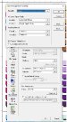
It's all in the settings.
Try these versaworks settings:
Vinyl: [8c] Generic Vinyl 1
Preset: Custom
Simulation Target Profiles
• RGB: AdobeRGB1998
• CMYK: USWebCoatedSWOP
Matching Method
• Raster: Absolute
• Vector: Absolute
Preserve Primary Colors: Checked
Use Embedded ICC Profile: Unchecked
")