• I want to thank all the members that have upgraded your accounts. I truly appreciate your support of the site monetarily. Supporting the site keeps this site up and running as a lot of work daily goes on behind the scenes. Click to Support Signs101 ...

Talking Bout the CarWash.... HAHA It's Stuck In My Head

HeavyHitter

New Member
I have been working on a project for a soon to open car wash in my local town. I can not get that freaking car wash song out of my head. Work and Work, Get Your Car Wash Today. HAHA

The car wash is a new company starting in a tough economic enviroment where people are eating out less, mowing their own grass, and more importantly washing their own cars. The owner of the car wash is aware of the challenges he faces opening this business and is trying to do things correctly but at the same time not break the bank.

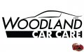
The start to this project is a simple logo design. The client described what he wanted the logo to look like. He mentioned wanting a sports car into the logo. I choose to give him a sports car but with a little twist. I traced the roof line of a Bugatti Veyron to be part of the logo to get the car shape. The logo was created in black and white, but the car roof line will be changed to blue for some applications.

Here is link to the WOODLAND CAR CARE LOGO DESIGN project.
 

Attachments

  • woodland_blkW.jpg
    woodland_blkW.jpg
    69.1 KB · Views: 186

Flame

New Member
Sorry, fonts are a bit boring. The car is clean looking, but look at your demographics, are they upscale or cowpokes? I see that logo drawing in one class of people, but not even being noticed by another class. So... just double check your demographics is all I am saying.

But definitely, shine up them fonts!
 

HeavyHitter

New Member
Sorry, fonts are a bit boring. The car is clean looking, but look at your demographics, are they upscale or cowpokes? I see that logo drawing in one class of people, but not even being noticed by another class. So... just double check your demographics is all I am saying.

But definitely, shine up them fonts!

Thanks for taking a look. I will take another look at it.

Dan
 

rjpjr

New Member
I kind of agree with Flame about the Fonts.

I spent some time designing an alternative of my own. These design posts are great practice since I don't get to do design as often as I would like. Some logos fall right into place, this one didn't. I struggled with this one and I am still not sure it works.
 

Attachments

  • Woodland-Car-Care-lambo-reventon-5c.jpg
    Woodland-Car-Care-lambo-reventon-5c.jpg
    40.7 KB · Views: 168

Jillbeans

New Member
I agree about the fonts.
The main font chosen is really wimpy looking as opposed to the beefy looking CAR CARE (which probably should have more emphasis than the Woodland part unless there are 10 car care places in his neighborhood)
The bottom panel creates a weird sharp angle against the italic of Woodland. The car is also fighting this angle. Perhaps you could flip the car to face the other direction and lose the panel on the bottom.
Love....Jill
 

astro8

New Member
I was messing around with some new fonts.

A couple of ideas....one loose and one a bit more stiff in b&w.

I like working in b&w, shows all the flaws.
 

Attachments

  • woodland.jpg
    woodland.jpg
    64.4 KB · Views: 163

HeavyHitter

New Member
I agree about the fonts.
The main font chosen is really wimpy looking as opposed to the beefy looking CAR CARE (which probably should have more emphasis than the Woodland part unless there are 10 car care places in his neighborhood)
The bottom panel creates a weird sharp angle against the italic of Woodland. The car is also fighting this angle. Perhaps you could flip the car to face the other direction and lose the panel on the bottom.
Love....Jill


Jill,

Thanks for taking the time to take a look at the project. Some very good insight. I will post up a few changes soon. I have been slammed with a couple more pressing projects.

Dan
 

HeavyHitter

New Member
I was messing around with some new fonts.

A couple of ideas....one loose and one a bit more stiff in b&w.

I like working in b&w, shows all the flaws.

I like the E on the bottom one. Reminds me of a friend's logo in Vegas. He has a company called Homeless Entertainment. Haha. I still have no clue why he named his company with that name.

Thanks for posting. I have a question for you on a non related subject. I will PM you in a few minutes

Dan
 

HeavyHitter

New Member
I kind of agree with Flame about the Fonts.

I spent some time designing an alternative of my own. These design posts are great practice since I don't get to do design as often as I would like. Some logos fall right into place, this one didn't. I struggled with this one and I am still not sure it works.


Thanks for taking the time to look it over and do a mock up. Looks awesome. I like what you came up with.

Dan
 

HeavyHitter

New Member
I should point out the owner of the logo wanted a deign that he could cut on his vinyl plotter. He wants to cut these stickers about 3 inches wide to place on some of his clients windows. I think this would need to be considered in the design process. I should have mentioned this in the first post.

Dan
 

jfiscus

Rap Master
the first logo is almost identical to someone else's logo I have seen before but the name escapes me... an auto lube chain maybe??? Might be the logo below, but not sure... was thinking there was something even closer.
 

Attachments

  • BCCA_Color.jpg
    BCCA_Color.jpg
    28.2 KB · Views: 158
Top