• I want to thank all the members that have upgraded your accounts. I truly appreciate your support of the site monetarily. Supporting the site keeps this site up and running as a lot of work daily goes on behind the scenes. Click to Support Signs101 ...

Tennis Team Logo

stephenj148

New Member
Just a side note:

Everyone on here so far is being brutally honest which is something that you don't get in design classes. This is the first project of mine that I have posted on here and I'm defiantly going to continue to in hopes of becoming a better designer.
 

Rick

Certified Enneadecagon Designer
I made them in illustrator... the top one is "brushes", the bottom one is "Stroke" with dashes.
 

stephenj148

New Member
I made them in illustrator... the top one is "brushes", the bottom one is "Stroke" with dashes.

Thank you. I really like those designs. Very creative, very fast too...

Would it be okay to base my design off of what you showed? Obviously I will not use your designs, but I like the idea of the determined ball with the motion behind it.
 

Circleville Signs

New Member
You definitely don't want the ball to be more "realistic". I'd go MUCH more cartoon-ish. Rick has pointed you in a great direction...


Gary
 

Rick

Certified Enneadecagon Designer
It's called "Fabulous" from the Las Vegas Font Collection (House Industries)
 

signmeup

New Member
Just a side note:

Everyone on here so far is being brutally honest which is something that you don't get in design classes. This is the first project of mine that I have posted on here and I'm defiantly going to continue to in hopes of becoming a better designer.
Dude....from what I've seen, they won't even teach you kerning in design school.
 

stephenj148

New Member
Dude....from what I've seen, they won't even teach you kerning in design school.

I'm more technically in an art program at Keene State College in Keene NH. Suposed to be a decent program. Hoping to learn more as I get into the higher graphic design classes.
 

ndemond

New Member
Rick, what is the name of that script. The bottom of the Y. looks cool.

Thanks
JR

Leave it to sign guys that think the bottom of a letter looks cool. Was thinking the same myself, and what I could do with that letter.

Rick your designs are inspiring to all as usual.


Nancy
 

stephenj148

New Member
Okay how's this one looking?

Rick, thanks for all of your help.
 

Attachments

  • newlogo3.jpg
    newlogo3.jpg
    623.6 KB · Views: 85

Marlene

New Member
Just a side note:

Everyone on here so far is being brutally honest which is something that you don't get in design classes. This is the first project of mine that I have posted on here and I'm defiantly going to continue to in hopes of becoming a better designer.

yep, we do tend to be honest which will help you push past Ok to great work! nice re-do of the logo. I'm getting a red x so you might want to check that your file is RGB. when ever some one like Rick (I don't want to have your babies but would love to curl up in your sock drawer) post a suggestion and the person gets to see what a super pro would do, the degree of learning is equal to about six years of classroom training. hang in there and continue to post layouts. if you check past threads concerning layouts & designs, you'll find a lot of great threads and can see the progress of other designs which is helpful.
 

rjpjr

New Member
Okay how's this one looking?

Rick, thanks for all of your help.

I am not Rick but I thought I would share my thoughts for whatever they are worth.

In my humble opinion the typeface is not working for this particular application. The placement of "Team" is unbalanced. The natural slant of the the typeface indicates motion to the right while ball is traveling to the left at an opposing angle.

As others have suggested, I would veer away from a literal or realistic appearing ball and would instead do something more cartoonish or playful.

Try designing in black and white first and once you have a solid concept then you can start working with color and subtle effects.

While working on your design, get up and look at your concept from across the room from your monitor or print it out an tape it to the wall. If you can not read it legibly at a distance, then you know you have some more work to do. The thumbnail sized images as presented in this thread are perfect for viewing whether a design is legible or not.

here is a different interpretation for whatever it is worth...
 

Attachments

  • Smiles-tennis-2.jpg
    Smiles-tennis-2.jpg
    31.5 KB · Views: 84

stephenj148

New Member
I am not Rick but I thought I would share my thoughts for whatever they are worth.

In my humble opinion the typeface is not working for this particular application. The placement of "Team" is unbalanced. The natural slant of the the typeface indicates motion to the right while ball is traveling to the left at an opposing angle.

As others have suggested, I would veer away from a literal or realistic appearing ball and would instead do something more cartoonish or playful.

Try designing in black and white first and once you have a solid concept then you can start working with color and subtle effects.

While working on your design, get up and look at your concept from across the room from your monitor or print it out an tape it to the wall. If you can not read it legibly at a distance, then you know you have some more work to do. The thumbnail sized images as presented in this thread are perfect for viewing whether a design is legible or not.

here is a different interpretation for whatever it is worth...

I'm trying to gain everything that I can from this site and the people on it.

I never took into consideration the slant of the typeface in combination with the direction the ball appears to be moving. I'll keep an eye out for that type of thing in the future. And I will try working with just black and white to begin with as well.

Thanks
-Steve
 

stephenj148

New Member
What is the easiest way to put a cut line around this design. Draw It, or.......?

I'm planning on putting a cut line around the whole design and leaving a space of white in between.
 

Service Sign Co

New Member
I wouldn't print it just yet,spend a little more time with the design before you worry about the contour cut. I made a quick one too.
 
Last edited:

rjpjr

New Member
What is the easiest way to put a cut line around this design. Draw It, or.......?

I'm planning on putting a cut line around the whole design and leaving a space of white in between.

Regardless of what design direction you take, creating a cut line is fairly easy.

Not sure how much or what you know about Illustrator, but I can't stress enough to learn to use layers. It really makes managing your illustration much easier. Also learn as many "hot key" commands as you can as it will really speed up the process.

1. Assuming graphics are all on one layer, go to the "Layers" fly out and click the third icon (create new layer) over from the left on the bottom.
2. In the same "layers" fly out Select the entire graphics by clicking on the meatball to the right of the menu box on the original layer. A small colored square will appear next to the meatball indicating that the entire contents are now selected.
3. Holding down the alt/option key, left click on the colored square and drag it to the new layer. This will create a duplicate of the contents of the original layer in the second layer without copying and pasting.
4. If the graphic in the new layer contains text, chose the Text menu at the top and click on "Create Outlines"
5. Left click the meatball on the second layer selecting the entire graphic.
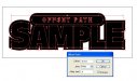
6. Click the Object menu and choose Path/"Offset Path".
7. Turn Preview on.
8. Enter a value into the "Offset" field and preview. Re-enter different values until you get the desired distance.
9. Click OK
10. Select only the newly created "Offset" and drain it of color and add a stroke.
11. De-select the outline sections you want to keep.
12. Delete the remaining undesirable outlines (if any).
13. Select the original graphics and delete them.
14. Outline finished.
15. Label the layers...
original layer = Graphic,
second layer = Outline or Cutline. This is not necessary, but it is very helpful and a good practice in managing complicated files.

Good Luck...
 

Attachments

  • offset sample 1.jpg
    offset sample 1.jpg
    130.6 KB · Views: 90
  • offset sample 2.jpg
    offset sample 2.jpg
    57.8 KB · Views: 103
  • offset sample 3.jpg
    offset sample 3.jpg
    52 KB · Views: 105
Top