-
I want to thank all the members that have upgraded your accounts. I truly appreciate your support of the site monetarily. Supporting the site keeps this site up and running as a lot of work daily goes on behind the scenes. Click to Support Signs101 ...
You are using an out of date browser. It may not display this or other websites correctly.
You should upgrade or use an alternative browser.
You should upgrade or use an alternative browser.
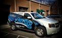
The Shop Truck
- Thread starter tonywhittier
- Start date

Pat Whatley
New Member
I actually like it. Sure, the logo could have used a little tweaking and the back is a little busy but all in all I like it....and I hate almost every wrap I see.
The only thing that jumps out at me is the "stand out in a crowd" tagline. SignsNow uses "Stand out in a crowded world". You're a little close in my opinion but nobody outside the industry would notice that.
The only thing that jumps out at me is the "stand out in a crowd" tagline. SignsNow uses "Stand out in a crowded world". You're a little close in my opinion but nobody outside the industry would notice that.
xxaxx
New Member
wow, that sure is something.
Jealous much? hehe jkjk
HulkSmash
New Member
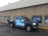
Here's one of ours.
Matte Black with Like a Gloss Metallic Blue overlay print on top of the matte.
A Real head turner, and trust me it is getting a ton of attention.
It's all about what's going to bring the business in. I see people taking pictures of the wrap as they're driving by daily.
Matte Black with Like a Gloss Metallic Blue overlay print on top of the matte.
A Real head turner, and trust me it is getting a ton of attention.
It's all about what's going to bring the business in. I see people taking pictures of the wrap as they're driving by daily.
Attachments
Craig Sjoquist
New Member
...I like to say something positive that ya put much effort in.
I like the side graphic looks edgy & same with the Sharpy design look of the back.
Also KNOW you can do alot better..... Also expect to see it within 6 months.
PLEASE read ...Mike Stevens Mastering Layout 1st
I like the side graphic looks edgy & same with the Sharpy design look of the back.
Also KNOW you can do alot better..... Also expect to see it within 6 months.
PLEASE read ...Mike Stevens Mastering Layout 1st
Craig Sjoquist
New Member
Colorado....Very nice can see why they take pictures & gets you responses.
Note your eye goes to the main message...Note light color area on black then copy is light enough to be readable on color.
Only thing I see odd is that panel over back wheel ya lost the flow, if panel was mirrored front ya have better flow.
You sure have improved alot.
Note your eye goes to the main message...Note light color area on black then copy is light enough to be readable on color.
Only thing I see odd is that panel over back wheel ya lost the flow, if panel was mirrored front ya have better flow.
You sure have improved alot.
Marlene
New Member
Jealous much? hehe jkjk
ya, jealous, that's it. no, I was blessed with the gift of sight
tonywhittier
New Member
wow, that sure is something.
I'm gla you like it..that's what I was hoping for.........................................
Marlene
New Member
^ huh?
it was an answer to a crack at me. in the orginal thread, the design for this was posted and many suggestions were made as there are a ton of issues with the design, none were taken by the OP who went ahead and put this on his truck and still, has no clue as to what is wrong with it. he is happy and that is that, not much to do past that now. I posted "wow, that sure is something" as I rally thought that when I saw the finished wrap it would have the issues corrected and it would look nice, that didn't happen. it was my way of trying to be kind and not tell the OP that it is hidious, poorly composed, hard to read with black outlines on dark blue letters and messy looking. some like it so be it, jealous? not a chance
GAC05
Quit buggin' me
Here's one of ours.
I see people taking pictures of the wrap as they're driving by daily.
The picture taking guys - was it this guy?.....
wayne k
guam usa
Attachments

tonywhittier
New Member
it was an answer to a crack at me. in the orginal thread, the design for this was posted and many suggestions were made as there are a ton of issues with the design, none were taken by the OP who went ahead and put this on his truck and still, has no clue as to what is wrong with it. he is happy and that is that, not much to do past that now. I posted "wow, that sure is something" as I rally thought that when I saw the finished wrap it would have the issues corrected and it would look nice, that didn't happen. it was my way of trying to be kind and not tell the OP that it is hidious, poorly composed, hard to read with black outlines on dark blue letters and messy looking. some like it so be it, jealous? not a chance
I took what people said into consideration and majority of if was about the logo which I said I wasn't changing...I'm sorry YOU don't like it and really could care less if MARLENE from signs101 likes it. Majority of the people like it minus some small stuff which can be fixed...I believe it's bed time in the nursing home so see ya
")
HulkSmash
New Member
I took what people said into consideration and majority of if was about the logo which I said I wasn't changing...I'm sorry YOU don't like it and really could care less if MARLENE from signs101 likes it. Majority of the people like it minus some small stuff which can be fixed...I believe it's bed time in the nursing home so see ya
LOOOOOOOOOOOOOOOOOOOOOOOOOOOOOOOOOOOOOOOOOOOOOOOOOOOOOOOOOOOOOOOOOOOOOOOOOOOOOOOOOOOOOOOOOOOOOOOOOOOOOOOOOOOOOOOOOOOOOOOOOOOOOOOOOOOOOOOOOOOOOOOOOOOOOOOOOOOOOOOOOOOOOOOOOOOOOOOOOOOOOOOOOOOOOOOOOOOOOOOOOOOOOOOOOOOOL
ok i'm done.
Flame
New Member
If you never take criticism, you will never improve. You have a half a** layout, I'm sorry. What you DO have, is a good flow, good colors, and it does pop pretty good! But you're only halfway there, because your logo BUTCHERS the text very horribly. That style is cool and catchy, it just needs better execution.
Same goes for the back website. Making it blue, thumbs up. Making it THAT dark of a blue, thumbs down.
Overall bro, I think you need to take some criticism, and if you do, you could be cranking out some very sick stuff. Take your style and flair, work on the technicality of it, and I'd say you're golden.
That's my $0.02, and not given to you to make myself look good, but to hopefully help a bro out. Best of luck man.
xxaxx
New Member
I took what people said into consideration and majority of if was about the logo which I said I wasn't changing...I'm sorry YOU don't like it and really could care less if MARLENE from signs101 likes it. Majority of the people like it minus some small stuff which can be fixed...I believe it's bed time in the nursing home so see ya
Haha thats the right attitude ... Just wait til the phone calls start rolling in and see who was right.