• I want to thank all the members that have upgraded your accounts. I truly appreciate your support of the site monetarily. Supporting the site keeps this site up and running as a lot of work daily goes on behind the scenes. Click to Support Signs101 ...

Thoughts on this one...

Ursta Graphics

New Member
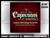
I think I may be over thinking this one.

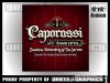
The client came in wanting a more "old fashioned" design for their accounting service but the old english style fonts had to stay...

This is what I have so far.

This will be a printed background, die cut with engine turned gold overlays.

Looking for thoughts on any tweaks it may need?

Thanks,

-Ursta
 

Attachments

  • caporossi 3.jpg
    caporossi 3.jpg
    69.5 KB · Views: 89

HardbargerSigns

New Member
Nice!

I would alternate some bright yellow into the tagline and sub tagline to break up the text and improve readability just a tad. Another less ornate panel for the taglines might help draw more attention to the headline text too.

Obviously, we don't have to tell you that it looks FABULOUS! ;) I love your stuff!

Cheers! Bryan
 

threeputt

New Member
I love it! Especially the radial gradient, center to edge.

The only "negative" thing that popped out to me was the use of the "scales of justice". Maybe it's different in your area, but around here they imply the practice of law, not taxes or bookkeeping.

But it may be appropriate if they are viewed differently in the east.

Overall, Bravo!
 

Jillbeans

New Member
Too many clashing decorative fonts.
Keep the Old English style one they insist on, unless you can change it to LHF Stratford.
Then make all the other copy different weights of LHF Stevens Percepta.
That will keep it classy and dignified.
...and don't squish "associates".
Love....Jill
 

HardbargerSigns

New Member
Closing up the graphics top and below the headline might give it more cohesion. Like this attachment. Rather than the scales just floating free, they now form a part of the logo as a whole. :)

Love your style my friend! B. :cool:
 

Attachments

  • caporossi-3_Bryan.jpg
    caporossi-3_Bryan.jpg
    218 KB · Views: 73

WildWestDesigns

Active Member
The only "negative" thing that popped out to me was the use of the "scales of justice". Maybe it's different in your area, but around here they imply the practice of law, not taxes or bookkeeping.


I was thinking the same thing and at first thought it was a law practice, but I still like the overall design myself.
 

Blackie

New Member
good idea- looks rich

The fonts are perfect. I would drop the red vertical background lines. They are distracting and off center to the top circle logo.
Keep the top circle logo but drop the scales of justice. Insert a pen with vertical bar graph background. The top circle logo is definitely the center of interest and the eye travels well to the title and subtitles. Maybe a scalloped corner border around the edge of the sign to contrast the dark background. I am interested in seeing your approved and finished product. It looks awesome so far.
 

Ursta Graphics

New Member
It's been quite a while but I finally got pictures of this job finished up. Thanks for the suggestions. The client was happy with the end results.
 

Attachments

  • cap1.jpg
    cap1.jpg
    97.1 KB · Views: 71
  • cap3.jpg
    cap3.jpg
    95.8 KB · Views: 68
Top