• I want to thank all the members that have upgraded your accounts. I truly appreciate your support of the site monetarily. Supporting the site keeps this site up and running as a lot of work daily goes on behind the scenes. Click to Support Signs101 ...

Top 5 Signage Mistakes

gnubler

Active Member
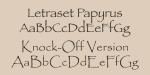
Came across this article from Woodland Mfg and it reminded me of the time a customer ordered flush mount acrylic letters, complete with instructions on how to install, and then sent me a picture of them drilled right through faces. Looked like crap. The article also mentions Papyrus font, which I presume everyone else here agrees should be banned from existence. Any other design disasters to share? Post 'em up.


Gino

Premium Subscriber
Personally, papyrus is a very nice type face if used correctly. in the right situations. It refers to the writing and such done back n the days when papyrus papers were used and that was the effect you got from it. What grinds me more is the stupidly misuse of the word font.... whether by YOU or your magazine article. Typeface or type style is more the term used for identifying various styles. Fonts was the term for making a type style bold, italicized or just changed from it's original flavor. Wanna make fun of something, make sure ya know what you're talking about.
 
Last edited:

victor bogdanov

Active Member
The article also mentions Papyrus font, which I presume everyone else here agrees should be banned from existence. Any other design disasters to share? Post 'em up.
I frequently go to the Kalahari Resort in Round Rock TX opened a few years ago and most of their signage is done in Papyrus font. Looks pretty good imo and goes well with their theme
 

Boudica

Back to "educational purposes"
I used to think it was a very pretty type face, back in the 1990's. Now it's just over used.

However...

defense-of-papyrus-book.jpg
 

gnubler

Active Member
It's the overuse that killed it, people see it installed on their computer and have no idea how ubiquitous it is. There's an upscale HOA community in my area with their logo/signage all done in Papyrus. It's hideous. A lot of the natural health/yoga places use it, which is appropriate, but there's hundreds and hundreds of similar fonts to choose from now.
 

Bobby H

Arial Sucks.
The original version of Papyrus, designed by Chris Costello for Letraset in 1982, was a pretty decent display typeface. I remember buying a Letraset "Fontek" version of it on a 1.44MB floppy disc in the early 1990's.

A couple or so knock-off versions of Papyrus were made later, which includes the version Microsoft often bundles into installations of Windows and MS Office products. IMHO, the version Microsoft ships in its products is pretty hideous. The lowercase letters were re-drawn much smaller. The font file's built-in spacing is atrocious. Check out the word "Version" in the attached sample. Unfortunately Microsoft's widely distributed version of Papyrus is what's most often used in all the crazy examples we love to hate.

If I ever have to use Papyrus in a design I always use the original Letraset version. And I make sure Ryan Gosling isn't in the building, ready to punch me in the head:
 

Attachments

  • Papyrus-Versions.png
    Papyrus-Versions.png
    91.9 KB · Views: 65

Stacey K

I like making signs
I used to love Papyrus back in the 1990's. I don't use not unless I have to reset something.

Bad kerning is something that drives me nuts.
 

gnubler

Active Member
Guess what else was cool in the 90s? Quark XPress! :rock-n-roll:

The kerning and no template for the letters on the original link is horrible. I'm guessing drinking was involved on that install.
 

AndersHerp

Something, something Dark Side
My graphic design professor in college hated Papyrus, so I would always try and sneak it into designs or use it as an option when we had to bring in multiple versions of things. It may have definitely become an overused font, but it like every other font has a time and place.
 

Stacey K

I like making signs
Guess what else was cool in the 90s? Quark XPress! :rock-n-roll:

The kerning and no template for the letters on the original link is horrible. I'm guessing drinking was involved on that install.
I forgot all about that program! That's what I leaned on back in the 1990s!
 

gnubler

Active Member
Good Grief......... where did I go wrong in my life to have you syphoning the air outta everything ??
Probably somewhere around post #30,000. Maybe stifle yourself and give others some space before you start dumping all over them?
 

Shred_signs

Lost Member
Skipped to the bottom:

Personally, papyrus is a very nice type face if used correctly. in the right situations. It refers to the writing and such done back n the days when papyrus papers were used and that was the effect you got from it. What grinds me more is the stupidly misuse of the word font.... whether by YOU or your magazine article. Typeface or type style is more the term used for identifying various styles. Fonts was the term for making a type style bold, italicized or just changed from it's original flavor. Wanna make fun of something, make sure ya know what you're talking about.
I think the new Avatar movie title is in Papyrus. I saw an interview with James Cameron and how it happened.
 

Gino

Premium Subscriber
Probably somewhere around post #30,000. Maybe stifle yourself and give others some space before you start dumping all over them?


Ya know, you come late to every conversation and repeat what was already said and substitute words and think you're contributing. You don't know where to get anything or how to do anything and you wanna tell me to stifler it ?? You're more like edith, and she was always stifled by archie. Is that what you need ??

You need a new tune, cause that broken record of yours is really old..... even older than me.

Have a great day gnoobles. :sleepin:
 

gnubler

Active Member
You love me, there's no denying it. And you get points for the Archie Bunker reference.

I've been raging about Papyrus for years. When Avatar came out a friend of mine at the time blurted out "Look, there's the Avatar font!" every time we saw it on a sign or printed somewhere. Horrific.
 

bob

It's better to have two hands than one glove.
My graphic design professor in college hated Papyrus, so I would always try and sneak it into designs or use it as an option when we had to bring in multiple versions of things. It may have definitely become an overused font, but it like every other font has a time and place.
As Gino said, it's 'typeface' not 'font'. A font is a specific instance of a typeface. Including but not limited to size, weight, compression/expansion, and slant. Half of all understanding involves knowing, as well as using, the correct nomenclature.
 

gnubler

Active Member
Oy vey. Nerd alert! In everyday speech most people just say font, even within the industry. In the end it doesn't matter...Papyrus is horrible no matter what you call it. My version of Papyrus only has one instance, so does that make it both a typeface and a font?

Gino and Boudica wrote "type face", you wrote "typeface". So which is the correct nomenclature? :sleepin:
 
Top