-
I want to thank all the members that have upgraded your accounts. I truly appreciate your support of the site monetarily. Supporting the site keeps this site up and running as a lot of work daily goes on behind the scenes. Click to Support Signs101 ...
You are using an out of date browser. It may not display this or other websites correctly.
You should upgrade or use an alternative browser.
You should upgrade or use an alternative browser.
Trailer wrap design opinions
- Thread starter Wraps ink
- Start date
phototec
New Member
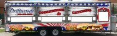
This is a concession trailer we are working on. The client likes it so far, opinions please. They wanted a fun carnival feel without it being tacky.
Give it the squint test - can't read the phone number and the red text with black outline is hard to read.
Also, the Driftwood's blends into the background to much, I think it show standout more.

TammieH
New Member
My opinion...The top and bottom graphics are fighting each other.
I sort of like the weathered look of the red, white and blue, (even though I don't care for red, white and blue, that's just a personal thing)
Maybe give the copy a more weathered look as well...and as gmr55 said, nix the black outline...
...and then there is the food graphics at the bottom, it just seems out of place.
Pixels Are Bad Mmmkay?
New Member
I like the layout in general. The only things I would change is removing the black outline from the red lettering and also I would have tried "& CATERING" on the third panel. I just think the ampersand looks out of place on the second panel. Also, my eyes stay drawn to the red lettering. Maybe try "Driftwoods" in red also.
Craig Sjoquist
New Member
Besides the upside down stars, & black outline, also agrees with Driftwood red & no ampersand, area code to me use lighter weight font & sans serif.
The 1st thing I saw was the color .. Gray .. has nothing to do with food ...suggest Ivory ...food means ... yellow, orange, red, blue & green can be used also.
Great start, likes the idea & what ya have done.
The 1st thing I saw was the color .. Gray .. has nothing to do with food ...suggest Ivory ...food means ... yellow, orange, red, blue & green can be used also.
Great start, likes the idea & what ya have done.
OldPaint
New Member
DOES NOT GIVE A CARNIVAL FEEL!!!! more patriotic thn carnival/fair type food.
did you try GOOGLE.........CARNIVAL CONCESSION TRAILERS? of couse not or you would see where you missed the mark.
https://www.google.com/search?hl=en....0....0...1ac.1.25.img..1.27.1276.iYtDoI208u4
did you try GOOGLE.........CARNIVAL CONCESSION TRAILERS? of couse not or you would see where you missed the mark.
https://www.google.com/search?hl=en....0....0...1ac.1.25.img..1.27.1276.iYtDoI208u4
Gino
Premium Subscriber
I'm not crazy about the stars on their side, but the rest of it looks like a good start.
I would keep the black outline, just a smidgin' thinner and open up your kerning quite a bit. Your copy basically passes the 'squint test', but it's far too tight for this application.
I would keep the black outline, just a smidgin' thinner and open up your kerning quite a bit. Your copy basically passes the 'squint test', but it's far too tight for this application.
Christian @ Visual Graphx
Active Member
Fairs/Carnivals are tricky things, they seem to want to break alot of rules but that's what sells for them. We work with 3 of the largest fair companies in the United States and they are all the same, bright/colorful/gaudy is what sells for them. Don't consider normal design rules as no one cares at the fairs, they just want big and bright.
I can show you some very successful designs if you'd like?
I can show you some very successful designs if you'd like?
JD3
New Member
Here's a question: This is a concessions trailer. Are they the only concession trailer at the venue? If not, what is going to set THEIR concession trailer apart from the one directly next to it? Is there a specialty item that they're known for? Are they just cheaper? Is their food better?
I think I'd find that out and focus on that.
I think I'd find that out and focus on that.