• I want to thank all the members that have upgraded your accounts. I truly appreciate your support of the site monetarily. Supporting the site keeps this site up and running as a lot of work daily goes on behind the scenes. Click to Support Signs101 ...

Trifold brochure

This trifold brochure isn't just for any customer. It's for our own business. It's my first stab at it, so I could really use some feedback on the good, the bad, and the ugly before we send these out to print and then wind up hating them later. If there is anything at all that you would change, please let me know, including text. I'm debating about putting a photo of myself and my business partner under the logo on the front cover, but I'm still not sure.

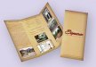
Another concern is, do you feel the inside layout has too much going on? I wanted to give people a good idea of some of the many products that we offer. Initially, I had considered just listing products down the right hand infold section, but I thought I needed more graphic content so the image would be a good substitute. Maybe it's too much?

Thanks for the help.
 

Attachments

  • Brochure_Front Side 3 copy SMALL.jpg
    Brochure_Front Side 3 copy SMALL.jpg
    677.4 KB · Views: 87
  • Brochure_Back Side 3 copy SMALL.jpg
    Brochure_Back Side 3 copy SMALL.jpg
    986.4 KB · Views: 71

legacyborn

New Member
Personally, if I walked into a store and grabbed this brochure, I would put it back after a quick glance. There isn't a frame of reference for the information so it tends to blend together. I would suggest breaking up the information into different sections. That way when someone looks at it they can quickly find the information relevant to them.

I'm not a fan of making people turn the brochure sideways (or have to turn their head) it makes immediate recognition of the brochure difficult and then further makes it difficult to read. I want all my marketing items to be as easy on the client as possible.

On the back there are a lot of phone numbers but no explanation for why I would want to call any of them except the main number. I would either remove them or add titles or job descriptions so it is easier for people to understand who they should call.

Overall I think it's a good start but it seems busy and, on the computer, is a little difficult to read maybe because of the background color.
 

James Burke

Being a grandpa is more fun than working
Signs that "last a lifetime"...you might need to re-word this one. Either that or be prepared to do a lot of warranty work.

Other than that, you might want to reduce the amount of words. Overall, people are visual and will make the connection with the photos without all the explanation.

JB
 

James Burke

Being a grandpa is more fun than working
Here's one of our old "pocket folder" brochures. I run them on a hand operated hot-stamp press. We're in the process of updating them since our re-branding last year.

They consist of an inexpensive piece of card stock, a photo and a business card. All three elements will get a fresh makeover this spring.

They're nothing too flashy, but most people are tactile and like the feel of the debossed logo...and thus, they tend to hang on to them longer. They easily slip into a #10 envelope and can also hold a hand written note as well.


JB
 

Attachments

  • Jarsa Logo Brochure Folder.JPG
    Jarsa Logo Brochure Folder.JPG
    62.5 KB · Views: 67
  • Jarsa Pocket Folder 1.jpg
    Jarsa Pocket Folder 1.jpg
    56.5 KB · Views: 68

SAR.Summerlin

New Member
Too much text. Scrap and start over. Sideways text bad idea and try bullet points instead of paragraphs. Also too many images your eye can't settle so you give up. It looks messy and unbalanced I would put it back. Also the turquoise background is hard on the eye.

Just my .02
 

2B

Active Member
the main points have already been covered.

try different types of fonts to create focal points.

pictures need to be separated and by each picture a quick bullet point list for highlights of that product
 

Jillbeans

New Member
Wayyyyy too much text and I really dislike the background color.
Keep the copy short and to the point.
In this "instant" society we live in, nobody will take the time to read that.
Perhaps lighten up the background color by using a white gradient.
That color makes me think of a 1960s mental institution wall color.
Love....Jill
 
Thanks for all the insight. I'm totally new to designing brochures so I think I will start grabbing more of them at hotels and gas stations and studying them to get some idea what works and what doesn't. I definitely can see how too much information can easily be ignored so the inside layout will be completely revamped, focusing on our products and services broken down into a bullet format like James posted. I really like what he posted and the less is more approach makes sense.

Jill, what kind of background color would you suggest? I thought the blue/green would be calming and soothing.

I'm posting another brochure I designed for a small business last summer. The guy pretty much had in mind how he wanted everything laid out, I just had to put it together. Is this more the direction we should go? I'm thinking so, as the whole thing can be taken in and absorbed in a matter of a few seconds.

I will keep posting until I can nail something good. I am really not happy with it as is, hence the reason for posting it, so please keep the suggestions coming. Thank you.
 

Marie

New Member
Brochures can be used a self-mailers. If you redesign the back to accept an address label and postage, you could have a counter brochure and a mailing piece.

I also agree that there is too much text in the inside. Try breaking some of it into bullet lists. Try a soft ivory or white for the background.
 

qmr55

New Member
Here is a brochure we did for one of our customers. I like to keep things simple on a brochure and limit how much text you include on it. I understand that sometimes you have a lot to say and you want to make sure you get your point across to the customer, but look at it from their side. Do they really wanna read on that? You know the answer to that.

We usually have one page that has the majority of the text then the rest are a lot more simple.
 

Attachments

  • flip_brochure.jpg
    flip_brochure.jpg
    204.4 KB · Views: 62
Thank you, qmr, for posting that. I must say it inspired a little different direction than what I was going previously. I hope you don't mind that my cover is a near perfect rip off, but I honestly really like what you have posted there.

Sooo....

Here is my latest attempt. Sorry, Jill. I changed the background to black. White just wasn't cutting it for me. I figure if I go glossy it may be darn near blinding and white just isn't my color in a colorful fancy world of signs. So I figure black is neutral enough and will create more impact. Matter of fact, I think I might go with a matte black finish and do some spot UV clear on it. If I go the UV clear route I will post that layout too.

I still don't have a clue what to do down the infold side, hence the reason it is presently blank. Any ideas would be greatly appreciated.
 

Attachments

  • Brochure_Front Side 5 small.jpg
    Brochure_Front Side 5 small.jpg
    163 KB · Views: 58
  • Brochure_Back Side 5 small.jpg
    Brochure_Back Side 5 small.jpg
    644.6 KB · Views: 78

James Burke

Being a grandpa is more fun than working
I still don't have a clue what to do down the infold side, hence the reason it is presently blank. Any ideas would be greatly appreciated.

Re-position the blank "infold" so it becomes the center "back" of the brochure. Place a white address box and your return address in the apropriate places and you're good to go with the self-mailer. Honestly...there's nothing wrong with a little negative space...trust me.

Also, omit the "...and much, much more" from the bottom of your product and service listing.


JB
 

Jillbeans

New Member
I like it better black (it never occurred to me to suggest it!)
Definitely lose the much much more.
Do AM and PM rather than a.m. and p.m.
Don't abbreviate Mon-Fri.
Other than that it's worlds better.
I would also capitalize the secondary words in your laundry list rather than having just the first word caps and l/c.
 

2B

Active Member
I still don't have a clue what to do down the infold side, hence the reason it is presently blank. Any ideas would be greatly appreciated.

this is much better, the blank side would be ideal to place directions on where you are located (A map)

depending on the status of your website would increase the size of your URL

instead of much much more, CONTACT FOR FULL LINE OF PRODUCTS, or something to that effect.
 

GB2

Old Member
One thing you did not do, is pay any attention to where the folds will fall with your new layout. As long as you are aware and you are OK with it before you print, then it's up to you as to whether or not it's OK. Typically however, you try not to have images or important elements cross over folds, even if it is a full size layout like you've shown.
 
One thing you did not do, is pay any attention to where the folds will fall with your new layout. As long as you are aware and you are OK with it before you print, then it's up to you as to whether or not it's OK. Typically however, you try not to have images or important elements cross over folds, even if it is a full size layout like you've shown.

So keep the photos uniformly placed between the folds rather than a photo collage type thing spread over both folds like I posted here? I hope I'm understanding you correctly.
 

GB2

Old Member
No, it doesn't have to always be a uniform layout. I was just trying to make you aware of the fact that some of the images will be right in the middle of the folds and therefore may not look so nice and clean when it's actually printed and folded. Just try one first before you print them all to see what you think when it's folded.
 
Top