-
I want to thank all the members that have upgraded your accounts. I truly appreciate your support of the site monetarily. Supporting the site keeps this site up and running as a lot of work daily goes on behind the scenes. Click to Support Signs101 ...
You are using an out of date browser. It may not display this or other websites correctly.
You should upgrade or use an alternative browser.
You should upgrade or use an alternative browser.
Discussion True letter height vs. software
- Thread starter myront
- Start date

Ronny Axelsson
New Member
I believe we have been asking for an option to show and use "true size" for at least twenty years.
It should be easy to add but...
It should be easy to add but...

myront
Dammit, make it faster!!
Yes, Flexi is about the only one that does it correctly. Corel, Illustrator, MS Word, MS Powerpoint all have it the wrong way. I'm sure there's a reason they have it that way but it would be nice to be able to change it in the default settings or a custom workspace.what software are you using to get those kind of results?>
Ronny Axelsson
New Member
The "normal" way to define font sizes is based on the body height of old fashioned metal types, and doesn't really say much about the true size of a font.
Surely we should have had time to adapt to a more modern and meaningful way to define font size by now.
When I started cutting vinyl for signs in the early nineties, Sign Studio/SignLab was already doing it right, and the font size was defined by the height of the letter "H".
Surely we should have had time to adapt to a more modern and meaningful way to define font size by now.
When I started cutting vinyl for signs in the early nineties, Sign Studio/SignLab was already doing it right, and the font size was defined by the height of the letter "H".
bob
It's better to have two hands than one glove.
I see that you people haven't set much type. When you set the font height to 72pt or 1", your providing sufficient vertical space to contain every character in that font if they were set side by side. In the "Apples" example you have to measure from the top of the tallest character, in this case either 'A' or 'l', to the bottom of the lowest character, the 'p'. Even then it adds up to 0.9nn" because there's many special characters that are taller and/or lower than the characters actually being used. Thus endeth the lesson.
All of which is the now arcane way of setting type in a wooden frame from metal slugs. It's unfortunate that we are mostly using software that is still set up for printing handset type. When making signs we more often have to meet compliance or preference rules like a license number has to be 3" letters or a street number has to be 6" letters. Then you need to be able to define that height without regard to descenders on letters or special characters. That's why sign software lets you select the letter size based on a square capital letter's height. You can still see the overall height of the text line somewhere else. When I use Corel Draw to do the same task I first type a square letter, make the height what it needs to be, and then retype the line to say what it needs to say.I see that you people haven't set much type. When you set the font height to 72pt or 1", your providing sufficient vertical space to contain every character in that font if they were set side by side. In the "Apples" example you have to measure from the top of the tallest character, in this case either 'A' or 'l', to the bottom of the lowest character, the 'p'. Even then it adds up to 0.9nn" because there's many special characters that are taller and/or lower than the characters actually being used. Thus endeth the lesson.
myront
Dammit, make it faster!!
That's the scientific answer. Which I get but when a work request calls for a specific font and specific font height they're referring to the capital letter or lowercase if that's all that's in the text. When you type that into the software you won't get what you're expecting. H in Arial set at 1" by the software = .716I see that you people haven't set much type...
In order to get the true 1" one has to scale it, check, scale it, check etc.
Until I right a macro to do it.
myront
Dammit, make it faster!!
You need my macro. Select Artistic Text or Paragraph Text, run the macro, input your desired size in inches and bam! Text is sized accordingly.All of which is the now arcane way of setting type in a wooden frame from metal slugs. It's unfortunate that we are mostly using software that is still set up for printing handset type. When making signs we more often have to meet compliance or preference rules like a license number has to be 3" letters or a street number has to be 6" letters. Then you need to be able to define that height without regard to descenders on letters or special characters. That's why sign software lets you select the letter size based on a square capital letter's height. You can still see the overall height of the text line somewhere else. When I use Corel Draw to do the same task I first type a square letter, make the height what it needs to be, and then retype the line to say what it needs to say.
Marie
New Member
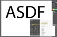
Here is what I do that works most of the time when using Illustrator. First, under Preferences / Unit - set type to inches (instead of points). Then in the Character menu, click on the 3 bars to fly out options and make sure that "Show Font Height Options" is checked. Then in the box that appears on the Character menu, pick Cap Height (see attachment). Usually when I convert to outlines, it is very close to the correct height in inches on the capital letters.
Attachments
Gino
Premium Subscriber
I found a quick & easy way to do this task many years ago.
For me, I don't give a rat's a$$ of higher 'l's or 'h's or anything else. I use a square letter and if the customer want a 4" letter, I make a 4" square. Give it a 50% transparency and take the square letter I chose and size it til it fits the 50% square. Once that's established, I can proceed with anything. As long as every line isn't a difference size, this works very nicely.
For me, I don't give a rat's a$$ of higher 'l's or 'h's or anything else. I use a square letter and if the customer want a 4" letter, I make a 4" square. Give it a 50% transparency and take the square letter I chose and size it til it fits the 50% square. Once that's established, I can proceed with anything. As long as every line isn't a difference size, this works very nicely.
myront
Dammit, make it faster!!
Gino, is this method with Coreldraw?I found a quick & easy way to do this task many years ago.
For me, I don't give a rat's a$$ of higher 'l's or 'h's or anything else. I use a square letter and if the customer want a 4" letter, I make a 4" square. Give it a 50% transparency and take the square letter I chose and size it til it fits the 50% square. Once that's established, I can proceed with anything. As long as every line isn't a difference size, this works very nicely.
Bengt Backhaus
New Member
I use the same method as Gino in both CorelDraw and Illustrator.Gino, is this method with Coreldraw?
I only use actual size when doing regulatory signs that require a certain letter height.Very seldomly do I see a benefit to a true font height vs making something that looks appealing in a visible opening or limited area.
ADA signs would be the only real example I can think of where you're bound by type size more so than overall dimensions or available area.
myront
Dammit, make it faster!!
Would you be interested in testing a macro to do this? Works great for me in Corel.I use the same method as Gino in both CorelDraw and Illustrator.
Select your text, run the macro, input your desired letter height in inches and hit enter. Text will be scaled to size. You can select more than 1 text or 1 artistic & 1 paragraph etc.
Gino
Premium Subscriber
Gino, is this method with Coreldraw?
It's been a long time since I've used Corel, but I wouldn't see why not. I'm in Illy.
Last edited:
Stacey K
I like making signs
Without looking - how many points in a pica? Easy question for someone who knows his way around the pica pole. I still use mine everyday.I see that you people haven't set much type. When you set the font height to 72pt or 1", your providing sufficient vertical space to contain every character in that font if they were set side by side. In the "Apples" example you have to measure from the top of the tallest character, in this case either 'A' or 'l', to the bottom of the lowest character, the 'p'. Even then it adds up to 0.9nn" because there's many special characters that are taller and/or lower than the characters actually being used. Thus endeth the lesson.
Bengt Backhaus
New Member
Thank you, but i use like 4% Corel and 96% Illustrator.Would you be interested in testing a macro to do this? Works great for me in Corel.
Select your text, run the macro, input your desired letter height in inches and hit enter. Text will be scaled to size. You can select more than 1 text or 1 artistic & 1 paragraph etc.
bob
It's better to have two hands than one glove.
12, without looking...Without looking - how many points in a pica? Easy question for someone who knows his way around the pica pole. I still use mine everyday.