• I want to thank all the members that have upgraded your accounts. I truly appreciate your support of the site monetarily. Supporting the site keeps this site up and running as a lot of work daily goes on behind the scenes. Click to Support Signs101 ...

Website revisions

qmr55

New Member
The two different grunges do not contrast very well at all. No, I don't mean they look the same...I mean they are WAY too different and too bold which brings your attention directly to the blue bar. You lose all your other content in that.

+the background grunge doesn't cover the entire background, big white space on the right.
 

jkdbjj

New Member
The two different grunges do not contrast very well at all. No, I don't mean they look the same...I mean they are WAY too different and too bold which brings your attention directly to the blue bar. You lose all your other content in that.

+the background grunge doesn't cover the entire background, big white space on the right.
Wow, how wide is your screen???

So are you suggestion tone down the blue grunge, get rid of it, or what?
 

jkdbjj

New Member
The two different grunges do not contrast very well at all. No, I don't mean they look the same...I mean they are WAY too different and too bold which brings your attention directly to the blue bar. You lose all your other content in that.

+the background grunge doesn't cover the entire background, big white space on the right.
I did a quick fix on the white area, I sampled it to be a shade of tan of the texture.

The texture background is currently 1400 wide, so you must have a very wide screen. Thanks for the feedback. I know changing the white to tan isn't the perfect solution, but it will do until I have time to reconsider how to make the background more universal for all monitors. Let me know if it at least looks better than the white blank area.
 

jkdbjj

New Member
The two different grunges do not contrast very well at all. No, I don't mean they look the same...I mean they are WAY too different and too bold which brings your attention directly to the blue bar. You lose all your other content in that.

+the background grunge doesn't cover the entire background, big white space on the right.
Sorry to comment again, but after inspecting it again. How are the blue and tan grunges so different. I mean I realize there is a bit more going on in the blue then the tan, but overall they are about the same graininess and subtleness of texture. Just looking for more detailed description from you.
 

qmr55

New Member
1: Honestly, the tan background looks way out of place and just doesn't seem like it fits into the "clean & crisp" design the rest of the site looks like.

2: The blue grunge is too strong of an element. You never want your background element to be stronger then the foreground more important elements. For example, when I open your webpage, the first thing I see is the blue block at the top...which has no information in it. And every time I try to look at something else, my eyes are just attracted to the top of the page. It is WAY too strong. Try something else.

As for the tan, gonna be honest, it isn't much better. Just looks like it's not suppose to be there, which is true. Try and figure out something else on the background then fix this problem.
 

jkdbjj

New Member
1: Honestly, the tan background looks way out of place and just doesn't seem like it fits into the "clean & crisp" design the rest of the site looks like.

2: The blue grunge is too strong of an element. You never want your background element to be stronger then the foreground more important elements. For example, when I open your webpage, the first thing I see is the blue block at the top...which has no information in it. And every time I try to look at something else, my eyes are just attracted to the top of the page. It is WAY too strong. Try something else.

As for the tan, gonna be honest, it isn't much better. Just looks like it's not suppose to be there, which is true. Try and figure out something else on the background then fix this problem.
Awesome thanks for the write up. BTW, you didn't say the width of your screen?
 

jkdbjj

New Member
Also, would you mind taking a screen capture and posting so I can see how it is acting on your screen?
 

qmr55

New Member
My laptop screen (which I am on now) is 1600 wide and my other is 1800.
 

Attachments

  • Untitled.jpg
    Untitled.jpg
    36.7 KB · Views: 139

jkdbjj

New Member
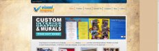
Well, I've been finishing the pages. The only thing left to do for a little while is the home page layout and I decided to go with a different logo (please don't open that box again people) I hired somebody else to design a logo, and I will implement in a creative way on the website.

I also have to integrate the testimonials in the site.

Thoughts, suggestions etc, are welcome.

Page ranking has been picking up. The keywords I have been targeting are:

Signs in Charlotte
sign company charlotte nc
vinyl banners charlotte nc
trade show displays charlotte nc
vinyl decals charlotte nc
retail graphics charlotte nc (#1 on that)
interior graphics charlotte (#1 on that)
retail signs charlotte nc
vehicle wraps charlotte nc
vehicle graphics charlotte nc
sign installation charlotte nc
outdoor signs charlotte nc
outdoor advertising charlotte nc
outdoor graphics charlotte nc

and a few others. It has taken about 3 weeks, but most of these key phrases are either 1st or 2nd page now, so it is starting to shape up.

any questions, let me know.
 

jkdbjj

New Member
FYI when I search retail graphics charlotte nc at http://duckduckgo.com which eliminates tracking clicks one has made I don't find you in top 85, I gave up counting after that, anyway your site looks pretty good, best of luck.

On google what you click effects the results you get. http://donttrack.us/
OK, so if you personally go to google and type retail graphics charlotte
I am not #1?

Also, who uses duckduckgo? I have never heard of it. I get that it is a way to cut down on certain things, but I am targeting Google. I am also not ranking well on Yahoo yet, so it is not a surprise that I am not on duckduckgo. I'm trying to understand why you would choose to search on that? I suppose I should have made it clear I am targeting Google at this point in search terms.

So if you don't mind checking just that on google and letting me know.
 

Justin

New Member
OK, so if you personally go to google and type retail graphics charlotte
I am not #1?

Also, who uses duckduckgo? I have never heard of it. I get that it is a way to cut down on certain things, but I am targeting Google. I am also not ranking well on Yahoo yet, so it is not a surprise that I am not on duckduckgo. I'm trying to understand why you would choose to search on that? I suppose I should have made it clear I am targeting Google at this point in search terms.

So if you don't mind checking just that on google and letting me know.

Your website does show for me with those keywords. I'm in NE KY, but you should know that it doesn't take me to your main landing page. It takes me to your interior graphics page. http://i.imgur.com/jrcUD.png
 

peavey123

New Member
Dude, Your site looks professional. Using a template is not a bad thing. You aren't selling websites here...
I would concentrate on making your site pop a bit more. Can't say exactly what it needs, but it needs something...a font upgrade may help a bit. You ever use google web fonts? If not check it out. There's gotta be something on there, nicer than your standard arial-like san-serif.

I wish I had better input for ya, but I just wanted to tell you not to get discouraged in trying to make it "less like a template" It's actually a good thing. I'd give your shop a visit over a shop with a cheesed out website anyday...but then again I'm pretty much a minimalist.
 

signswi

New Member
I'd have a million suggestions on site speed and seo if you were on WordPress, but you're not so...;P. Looks like you're off to a good start though with my quick glance through your source.

As a suggestion, take like one half-day a week to update and tweak it (schedule this time), websites are organic changing things.

Also make sure to get Google Analytics and Google Webmaster Tools hooked up. How can you tell what's working if you don't have Analytics? And Webmaster Tools are fantastic to make sure the site doesn't have crawler errors. Bing has a similar tool which is also worth using to make sure Bing (and Yahoo, by extension) can crawl correctly.
 

jkdbjj

New Member
Dude, Your site looks professional. Using a template is not a bad thing. You aren't selling websites here...
I would concentrate on making your site pop a bit more. Can't say exactly what it needs, but it needs something...a font upgrade may help a bit. You ever use google web fonts? If not check it out. There's gotta be something on there, nicer than your standard arial-like san-serif.

I wish I had better input for ya, but I just wanted to tell you not to get discouraged in trying to make it "less like a template" It's actually a good thing. I'd give your shop a visit over a shop with a cheesed out website anyday...but then again I'm pretty much a minimalist.
I agree very much. The site has little personality. Now that the content is on there, which is a task unto its own. I need to figure out the personality of the site. I will check the fonts out on Google thanks.

I think your logo needs redone/saved. It just doesn't look crisp imo.
I am dropping this logo for a different one, so for now I am just gonna leave it. Thanks for pointing that out though.

Your website does show for me with those keywords. I'm in NE KY, but you should know that it doesn't take me to your main landing page. It takes me to your interior graphics page. http://i.imgur.com/jrcUD.png
Thanks. As far as the landing page, retail and interior are one and the same on my site. I am trying to narrow down those loose set of words. So it took you to the correct place for now.

I'd have a million suggestions on site speed and seo if you were on WordPress, but you're not so...;P. Looks like you're off to a good start though with my quick glance through your source.

As a suggestion, take like one half-day a week to update and tweak it (schedule this time), websites are organic changing things.

Also make sure to get Google Analytics and Google Webmaster Tools hooked up. How can you tell what's working if you don't have Analytics? And Webmaster Tools are fantastic to make sure the site doesn't have crawler errors. Bing has a similar tool which is also worth using to make sure Bing (and Yahoo, by extension) can crawl correctly.
Great suggestions. I seem to do it in spurts when I can focus on it. If I am busy with kids or wife, it is difficult to sit for a few and hammer things out.
I think half the battle was getting the content on the site.
Right now I have or use three analytical programs. Primarily AwStats.
Though I am going to look into what you just suggested.

Have a great holiday weekend everyone.
 

jkdbjj

New Member
Hi everyone, so it has been about a month. I've been working hard to address the aesthetics of my website. Got some new content on it as well.

Looking for some critique and comments.

Thanks again.

www.vivisual.com
 

Justin

New Member
The logo is much much better! I really like the redesign of the site, but I honestly don't like the buttons on the top right.. It's not their position I don't like, it's the way they look out of place, imo..

Have you tried making the buttons orange or white, and the font blue?
 

wildside

New Member
i didn't read the whole thread, but i think the site looks pretty good, nothing over the top about it, but much better than alot of sign company sites i have seen

i did a search for you and you are averaging around 8-12 spots down on the first page, so kudos to you
 
Top