-
I want to thank all the members that have upgraded your accounts. I truly appreciate your support of the site monetarily. Supporting the site keeps this site up and running as a lot of work daily goes on behind the scenes. Click to Support Signs101 ...
You are using an out of date browser. It may not display this or other websites correctly.
You should upgrade or use an alternative browser.
You should upgrade or use an alternative browser.
What are "Presses"?
- Thread starter Scotchbrite
- Start date
James Burke
Being a grandpa is more fun than working
Basically, it's like like some dude looked at his George Knight t-shirt press and said..."Hey, I've got a good idea".
Watch to the end....it's more than just squeezing dough.
Watch to the end....it's more than just squeezing dough.
Last edited:
Morten CHristensen
New Member
Fresh off the press..
James Burke
Being a grandpa is more fun than working
The fact that they can be par-baked is a game changer for those who like a crisper crust throughout without having to put up with charcoal on the edges.Fresh off the press..
And with options to do tortillas, and paninis....what's not to love?
JB
James Burke
Being a grandpa is more fun than working
Start this one at 7:30...this dude is amazing.
Pauly
Printrade.com.au
It's the lazy american way of not stretching a pizza.
As james burk posted, it's a press for pizzas, would be same as rolling them with a rolling pin. You'd get the thin crunchy pizza crust.
Stretched pizza dough is more authentic, which would be your typical newyork pizza.
As james burk posted, it's a press for pizzas, would be same as rolling them with a rolling pin. You'd get the thin crunchy pizza crust.
Stretched pizza dough is more authentic, which would be your typical newyork pizza.
James Burke
Being a grandpa is more fun than working
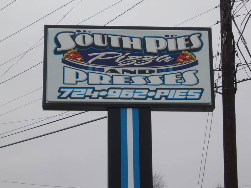
Definitely. The telephone number blends in terribly, and would have been better served on its own panel below the sign.Looks like they ran that layout through a press more than once to cram as much as they could into the vertical height available.
JB
Boudica
I'm here for Educational Purposes
Are you still talking about pizza?That and the god awful multi outlines.
Also, while not the worst, why go with blue and black for your pizza joint color scheme? If anything shows up on you're pizza that's black or blue, something is askew...
Ok, whatever, black olives, but that cyan blue?
Nevermind. I missed some of the conversation.

James Burke
Being a grandpa is more fun than working
"Traditional" pizza colors follow the Italian flag....red, green and white.... why go with blue and black for your pizza joint color scheme?
JB
weyandsign
New Member
balstestrat
Problem Solver
I don't even know if you are serious or not.IMO phone numbers on signs are 100% useless. Especially this one since it doesn't tell you the last 4 numbers lol.
Scotchbrite
No comment
So basically "presses" is a different way to make pizza. I suppose there are people that seek out this type of pizza.
Ah, the phone number debate. It used to be back in the day we'd tell people to leave the number off their sign because "you don't have your phone with you in the car, you've gotta look it up in the yellow pages when you get home anyway." All outdated thinking these days. I guess because we used to think that way, now I think since we do have phones with us all the time maybe the phone number is handy to have. But then that same phone can be used to look up the number via Google. Usually I leave it to the customer to decide. And sometimes the phone number is handy to use for a space filler if the logo doesn't fit the sign dimensions well.
Ah, the phone number debate. It used to be back in the day we'd tell people to leave the number off their sign because "you don't have your phone with you in the car, you've gotta look it up in the yellow pages when you get home anyway." All outdated thinking these days.
 I guess because we used to think that way, now I think since we do have phones with us all the time maybe the phone number is handy to have. But then that same phone can be used to look up the number via Google. Usually I leave it to the customer to decide. And sometimes the phone number is handy to use for a space filler if the logo doesn't fit the sign dimensions well.
Solventinkjet
DIY Printer Fixing Guide
This is what I did before entering the sign world. I've thrown thousands of pizzas in my lifetime. Can't imagine why a press would be any better honestly.Start this one at 7:30...this dude is amazing.

