• I want to thank all the members that have upgraded your accounts. I truly appreciate your support of the site monetarily. Supporting the site keeps this site up and running as a lot of work daily goes on behind the scenes. Click to Support Signs101 ...

Need Help WinPCSign Font Height

monument man

New Member
Hello, I've got a customer who's having an issue with TrueType fonts being brought into WinPCSign too small. Some fonts work properly, and others will have an incorrect height. So, if he types in 1.5" for the font height, with certain fonts he'll get a height of 1.311". Anyone else dealt with this before or have any recommendations on how to solve this?
 

Attachments

  • Roman and Vermarco.jpg
    Roman and Vermarco.jpg
    75.3 KB · Views: 178

Commando

New Member
Stroke, height etc varies from font to font. If it is too short, or too high, just manually change it. Well, if it doesnt throw it out of proportion too bad.
When i type out street signs, I use highway b font. Instead of a 4" or 6" size, i have to add a quarter inch
 

monument man

New Member
Stroke, height etc varies from font to font. If it is too short, or too high, just manually change it. Well, if it doesnt throw it out of proportion too bad.
When i type out street signs, I use highway b font. Instead of a 4" or 6" size, i have to add a quarter inch

Yes, I understand, but if you look at the attached image you can see the issue a little more clearly. The two larger fonts are actually different fonts of a similar style as the smaller ones. The smaller fonts are being rendered at 1.311", even though all 4 fonts have been given a height of 1.5" in the software.
 

Gino

Premium Subscriber
Looks like they're all using the same baseline. So, if it's too hard to figure out, tell him to try paying for the fonts. That could make a world of difference. Sometimes ya get what ya pay for. If he's already paying for them, he should be complaining to his source and make them deal with it.
 

monument man

New Member
Looks like they're all using the same baseline. So, if it's too hard to figure out, tell him to try paying for the fonts. That could make a world of difference. Sometimes ya get what ya pay for. If he's already paying for them, he should be complaining to his source and make them deal with it.

Hi Gino, he is a paying customer. I am the source of the fonts, but this isn't a font issue. The fonts work correclty in Adobe Illustrator, CorelDRAW, as well as when imported into Gerber using the TT Font Converter (which gives users direct control over the font height). This is a WinPCSign software issue. I've reached out to WinPCSign support and also encouraged him to do so as well, but thought I would try posted the question here as well–as other users often have solutions to common problems and can be quicker to deal with than support.
 

shoresigns

New Member
Fellow typeface designer here. How much do you know about vertical metrics? Operating systems and applications have many different ways of interpreting them, due to a lack of standardization that spiralled out of control over the years. So, the way to troubleshoot this is to get yourself a copy of the software in question, and test it until you can work out how it's interpreting the vertical metrics in your font. Or ask the developers of the software for advice on what they expect for vertical metrics.

Here's a really good article on different approaches to vertical metrics (useful even if Glyphs isn't your software of choice):
https://glyphsapp.com/tutorials/vertical-metrics

Bottom line: if your customers are only using major design apps like Adobe CC, you can just export your OTF/TTF with the default settings in your chosen font design software, and you won't likely have problems. But if you want your fonts to be compatible with as many apps as possible, you either have a long learning curve ahead of you, or you need to hire a font engineer.
 

monument man

New Member
Fellow typeface designer here. How much do you know about vertical metrics? Operating systems and applications have many different ways of interpreting them, due to a lack of standardization that spiralled out of control over the years. So, the way to troubleshoot this is to get yourself a copy of the software in question, and test it until you can work out how it's interpreting the vertical metrics in your font. Or ask the developers of the software for advice on what they expect for vertical metrics.

Here's a really good article on different approaches to vertical metrics (useful even if Glyphs isn't your software of choice):
https://glyphsapp.com/tutorials/vertical-metrics

Bottom line: if your customers are only using major design apps like Adobe CC, you can just export your OTF/TTF with the default settings in your chosen font design software, and you won't likely have problems. But if you want your fonts to be compatible with as many apps as possible, you either have a long learning curve ahead of you, or you need to hire a font engineer.

Yes, thanks for the link, I am also a Glyphs user. I'm definitely no expert when it comes to vertical metrics, but do understand the basics. I believe the software is ignoring any vertical metrics entirely. I've given the customer test fonts with two different Units per Em and the results were the same when imported. The response I got from WinPC Sign support was "Normally the height is taken from a square letter like H, T , etc"—which is not terribly helpful. There is no way for the user to specify the letter, so I'm not sure how the software chooses. Either way, this seems to be a bug, considering some of my fonts come in at the correct height and others don't–but they share virtually all metrics. None of the fonts in question are script fonts or have any strange swashes that would "confuse" the software when identifying the cap-height.
 

shoresigns

New Member
The response I got from WinPC Sign support was "Normally the height is taken from a square letter like H, T , etc"—which is not terribly helpful.

That is possible, and I have heard of applications that determine metrics by measuring certain glyphs, but in most cases it's a stupid way to get vertical metrics, since all fonts have vertical metrics defined in the font file. Perhaps the app developers found it easier to measure an "H" than to learn how to read the vertical metrics.

Anyway, if you want to solve the problem, WinPCSign offers a 1 month trial, so you can do the troubleshooting yourself instead of sending test fonts to the client.

One really helpful tool in understanding these sorts of problems is TTX, a command line tool commonly used by font engineers, that takes any OTF or TTF binary file and converts it into a human-readable XML file. The best part is you can make edits and then convert it back to OTF/TTF. Just Google the names of tables and attributes you see in the XML file, which will usually take you to the OpenType Spec at docs.microsoft.com, which does a decent job of explaining how each table works.

And another useful tool is FontBakery, a command line tool which performs a large number of QA checks on font files and generates a helpful report detailing any errors and how to fix them. It includes a few predefined sets of checks that large font distributors like Google Fonts and Adobe Fonts use.

And if you aren't already, you'll need to get comfortable with Python and command line tools, as they are a huge part of font development.
 

TammieH

New Member
Are you sure the fonts work correctly in Illustrator? Because you have to size fonts manually in Illustrator
ie. I typed Myriad Pro Bold at 2" but it only comes out to 1.3472" ...so adjust manually.
 

shoresigns

New Member
Are you sure the fonts work correctly in Illustrator? Because you have to size fonts manually in Illustrator
ie. I typed Myriad Pro Bold at 2" but it only comes out to 1.3472" ...so adjust manually.

In the dropdown menu in Illustrator's Character panel, enable Show Font Height Options, then change the Font Height Reference from Em Box to Cap Height. Then you can type "2in" into the font size box and your capital letters will be exactly 2 inches tall (plus overshoots on round letters like C and O).
 

Bobby H

Arial Sucks.
FYI, the Font Height Options feature in Adobe Illustrator was recently added just a few weeks ago with the ".3" update of Illustrator CC 2020. I wish the font height options thing was always visible, but it does seem to be "sticky" once it is made visible in a document pre-set.

There are "purists" who insist type should never be manipulated in terms of physical letter height. These (mostly) are people who are used to setting type for print publication where the only thing which matters is how many points of distance is between one baseline to the next -usually on a layout grid. The default behavior (hiding the options) is there to make those people happy, IMHO.

Anyone wanting to set lettering according to cap height (or x-height) in literal physical sizes, like inches of height, in Adobe Illustrator must also be sure to change the measuring units for type to the same units used for the page, such as inches.

The "old" behavior in Adobe Illustrator (the blue box surrounding the text objects) was annoying. Doing any literal sizes of lettering, which would be applied to that bounding box was completely pointless. And that "Em Box" had no consistent relation to the font's actual UPM box and other dimensions.

shoresigns said:
That is possible, and I have heard of applications that determine metrics by measuring certain glyphs, but in most cases it's a stupid way to get vertical metrics, since all fonts have vertical metrics defined in the font file. Perhaps the app developers found it easier to measure an "H" than to learn how to read the vertical metrics.

All fonts have dimensions that define the position of the baseline, cap height, x-height, ascender and descender as it relates to the overall UPM square. Very few fonts are identical in these dimensions. I think the sign making apps (and Adobe Illustrator) use some kind of happy medium between looking at the font's built in dimensions and measuring glyphs between the baseline and physical tops of letters. That's because some fonts have their cap height lines set substantially above the tops of letters. In some cases it's way above.

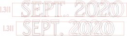
For example, open Bickham Script Pro in a font editor like FontLab Studio and then open a glyph like the capital A. You'll see the ascender, cap height and x-height lines all set way above the glyph (at 680, 750 and 638 respectively). The literal top of the A is only about 428 units above the zero/baseline. 428 to 750 is a huge gap between the top of the letter and its defined cap height line. But in Adobe Illustrator when I set lettering in Bickham Script Pro Bold at 2" tall the top of that same capital letter A slightly over-shoots a 2" tall box snapped to the letter's baseline.

At least Adobe Illustrator will keep the letter height consistent if you change the typeface. The cap height will still be the same or logically close to it depending on the kind of typeface chosen. The cap heights stay exactly the same when switching from one geometrical sans face to another. When type is set in points using the normal page layout methods of physical sizes of the letters are often different when set in the same point size.
 
Last edited:
Top