-
I want to thank all the members that have upgraded your accounts. I truly appreciate your support of the site monetarily. Supporting the site keeps this site up and running as a lot of work daily goes on behind the scenes. Click to Support Signs101 ...
Search results
-

Fire Away
i think the font is good but it looks like a "eat at joes" neon sign look .. get rid of the blue inside or see if you can add a texture and the color overlay to make it look more solid to give it that "Xtreme" look and what blue fish said behind the v and smaller made somting like this...- grafxxx
- Post #14
- Forum: Designs & Layouts
-
-
Fire Away
what people have been saying change the off road font. take those splats an spread it out for the background and lower the opacity on it to blend it in the back ground and make them brown for the blue girl move closer to the logo and have the off road tag shadow over her shoulder.- grafxxx
- Post #9
- Forum: Designs & Layouts
-

-
-
banner rack ideas?
that is how it was set up at a shop i worked in AZ.. but instead of having hole there where angled slots so you could just slide out the banner rolls. -
van wrap question
magnets are def a plus. learned that lesson real quick. I'm going horizontal there is not a lot to match up just a city scape of Boston. with the company name at the top and i think that the seam will fall in the water area of the design so it should be hidden pretty well. thanks for the advice..- grafxxx
- Post #15
- Forum: Vehicle Wraps
-
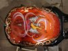
some recent airbrushing
LOL thanks weasel. i actually make my own trans by using 409 mixed believe it or not it also helps when reducing it and helps with tip drying. in but i will try that on the next piece and have you in the back of my head before i touch the black...lol or i will just keep it out of site i started...- grafxxx
- Post #10
- Forum: Portfolio Board
-
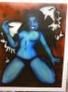
some recent airbrushing
@pat thanks. the first one was a about 1 - 2 hours the second about an hour. @ kage thanks using createx/auto air (less harmful chemicals to breath in).. lol all water base. @ weasel thanks yes i have a bad habit of going to dark the wife yells at me all the time about going to dark. one time...- grafxxx
- Post #8
- Forum: Portfolio Board
-
some recent airbrushing
thanks kwik and jill yeah these where/ are practice pieces. i still want to add some more on to the girl like a top which she was supposed to have but got lazy.. but now you have inspired me to make a green top on her. lol.. my avatar is my new biz card design (with out my mug on it)- grafxxx
- Post #6
- Forum: Portfolio Board
-
Grommets and Coro Question ?
try using less pressure you might have to play around till you get.- grafxxx
- Post #6
- Forum: General Signmaking Topics
-
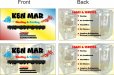
business card layout
maybe you you see if you could find some clipart like this and try to Incorporated in the design (not saying use these images using for reference ) one on the front and one on the back.- grafxxx
- Post #56
- Forum: Designs & Layouts
-
-
Is it safe to put vinyl over the rear defrost lines on car?
never had a problem here and live in MA. the only problem i have had is people scraping them off with there ice scrapers- grafxxx
- Post #9
- Forum: General Signmaking Topics
-
some recent airbrushing
just some practice pieces still working on the green flames one more- grafxxx
- Thread
- Replies: 11
- Forum: Portfolio Board
-
Start off today with a Ticket!!!
that really sucks butt. can you park your car or truck out front. and if so jsut letter up your car or truck to display your sales..- grafxxx
- Post #11
- Forum: General Chit-Chat
-
van wrap question
it will be me alone installing and the printer is 54" wide ok great sound good. thanks ~mike- grafxxx
- Post #4
- Forum: Vehicle Wraps
-

What R They Thinking.....
i just gave a quote for a 12 cube van at about 900 both sides and back with 3 colors cut vinyl oracal 751 and the guy wrote back saying he got it cheaper than i quote. just hope my design is not on that truck when i see it...- grafxxx
- Post #16
- Forum: General Chit-Chat
-
van wrap question
just a quick question on a van i have to wrap. best way to install vertical or horizontal. thanks in advance. ~mike- grafxxx
- Thread
- Replies: 27
- Forum: Vehicle Wraps
-
Console Stuff
are these just for you. or are you selling those designs.? they look great just a warning about the mega death art on there.. but again they came out clean i really like the screaming skull one the best.- grafxxx
- Post #61
- Forum: Portfolio Board
-
Grrrr... web site taken over....
well tell them to reset your password. if they had done so already.- grafxxx
- Post #5
- Forum: General Chit-Chat