-
I want to thank all the members that have upgraded your accounts. I truly appreciate your support of the site monetarily. Supporting the site keeps this site up and running as a lot of work daily goes on behind the scenes. Click to Support Signs101 ...
Search results
-
This is what I'm working on now, thoughts?
This is where I'm at now, I think I took care of the hoof problem by adding the leaf stems and the lobster issue by making the leaves green! I showed this design to over 10 people and not one said "hoofs" or "lobster" and all like the leaves orange. It was everyone's favorite of the 3 designs! I...- Signmaker1234
- Post #19
- Forum: Logo Design
-
-
This is what I'm working on now, thoughts?
More like leaves?- Signmaker1234
- Post #11
- Forum: Logo Design
-
This is what I'm working on now, thoughts?
Kinda liking this!- Signmaker1234
- Post #5
- Forum: Logo Design
-
This is what I'm working on now, thoughts?
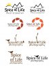
Nature was the subject I was given!- Signmaker1234
- Thread
- Replies: 42
- Forum: Logo Design
-

Please help! My kid needs votes to win a trip to Legoland!
Voted!- Signmaker1234
- Post #10
- Forum: General Chit-Chat
-
Ever happen to you...............??
Good luck, I hope you get paid!- Signmaker1234
- Post #14
- Forum: General Chit-Chat
-
Hello from Houston!!!
Welcome from Pennsylvania!- Signmaker1234
- Post #11
- Forum: New Member Introductions
-

-
Today's project
I tried some of the recommendations, and did change the flower from green to yellow! This is the finished design! She absolutely loves it!- Signmaker1234
- Post #11
- Forum: Logo Design
-
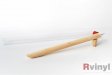
Whats your favorite weeding tool?
I use one of these!- Signmaker1234
- Post #3
- Forum: General Signmaking Topics
-
Logo for a multi purpose business
I like the old font better! Just my opinion!- Signmaker1234
- Post #21
- Forum: Logo Design
-

Business card
Doesn't look bad! You did exactly what the customer wanted! Good job!- Signmaker1234
- Post #5
- Forum: Designs & Layouts
-
-
Today's project
I made them different than the one at the top because if they were flowers they wouldn't all look the same, just my thought.- Signmaker1234
- Post #7
- Forum: Logo Design
-
Today's project
It is a logo, the flowers are camera shutters!- Signmaker1234
- Post #3
- Forum: Logo Design
-
-
Logo for a multi purpose business
I really like the idea of highlighting their pictogram for the different parts of the company! I think that was a creative idea!- Signmaker1234
- Post #14
- Forum: Logo Design
-
Hey everybody! New here from Red Deer, Alberta, Canada! :)
Welcome from Pennsylvania!- Signmaker1234
- Post #13
- Forum: New Member Introductions
-
Logo for a multi purpose business
Looks good to me! Not sure about the light green though!- Signmaker1234
- Post #8
- Forum: Logo Design
-
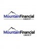
Old vs. new
I am going to go with a darker blue and change the font. As far as usage, I agree on a letterhead the old is better, but I made them a sign once, years ago, and it was hard to read because it was so small because of the length.- Signmaker1234
- Post #8
- Forum: Logo Design