-
I want to thank all the members that have upgraded your accounts. I truly appreciate your support of the site monetarily. Supporting the site keeps this site up and running as a lot of work daily goes on behind the scenes. Click to Support Signs101 ...
Search results
-
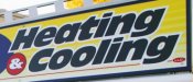
Good Morning - Need A Little Help With This Font ID
Happy Monday! Looking for this font. Thanks for the help!- RadicalDesignHutch
- Thread
- Replies: 4
- Forum: Fonts and Typography
-
-

I Should Know This One But It's 5PM!
Need a little help on this one. It's 5pm and my brain's fried lol....Thanks!!!!!- RadicalDesignHutch
- Thread
- Replies: 2
- Forum: Fonts and Typography
-
Customers who are their own designers... uggg
We do alot of work for the local Ford Dealer here in town. They like to design their own stuff too but they have gotten to the point where it's just a guide for me to show what all they would like on their signs & graphics. At first they wanted it exactly like they designed but one day I...- RadicalDesignHutch
- Post #2
- Forum: General Signmaking Topics
-

Anyone ID This One Please?
Can anyone ID this font? Don't seem to have this in my library. Thanks!- RadicalDesignHutch
- Thread
- Replies: 3
- Forum: Fonts and Typography
-
wrapping over a wrap
Well for starters. When the vinyl fails on the first layer it's going to take the second layer with it.- RadicalDesignHutch
- Post #2
- Forum: Vehicle Wraps
-
First Portfolio Post Here
Here is a scaled rendering of the storefront. They went away from the theme because they wanted both to provide their own impact. They're owned by the same person but wanted the signs to give the feel that they are separate businesses all together.- RadicalDesignHutch
- Post #26
- Forum: Portfolio Board
-
First Portfolio Post Here
Thanks for all of the positive feedback everyone. Signs will be installed either tomorrow or Saturday....will update when I get pics.- RadicalDesignHutch
- Post #19
- Forum: Portfolio Board
-
First Portfolio Post Here
Thanks Blue Fish!!! A little background on the customer. He's an older Mennonite gentleman and wanted the signs to keep the old fashioned look. I was able to talk him into somewhat modernizing the Gospel Book Store sign.- RadicalDesignHutch
- Post #14
- Forum: Portfolio Board
-
First Portfolio Post Here
Adtechia - Not a problem at all..... cha88 - Thank you- RadicalDesignHutch
- Post #12
- Forum: Portfolio Board
-
First Portfolio Post Here
I noticed my picture of the first one really didn't show much detail. Here's a portion of the design to show you the detail that the sign has on it.- RadicalDesignHutch
- Post #10
- Forum: Portfolio Board
-
First Portfolio Post Here
1/4" Alumacorr - 2 Pieces- RadicalDesignHutch
- Post #8
- Forum: Portfolio Board
-
First Portfolio Post Here
Adtechia.....I have 2 shades of darker red on that. The Lightest is C: 26.3% M: 100% Y: 100% K: 36.1% The Darker Red in the box with the Bibles verbiage and in the scrolls in the bg is C: 26.3% M: 100% Y: 100% K: 47.1% Hope that helps you dial in that vibrant darker red. I printed these on a...- RadicalDesignHutch
- Post #6
- Forum: Portfolio Board
-
First Portfolio Post Here
Pat the 1/2" white edge cap would work great on it. I would use silicone to anchor the edge cap on because the 1/2" doesn't fit quite as snug as the 1/4" does on 1/4" Alumacorr- RadicalDesignHutch
- Post #4
- Forum: Portfolio Board
-
First Portfolio Post Here
One step ahead of ya lol. We were contracted to replace both signs due to both businesses being at the one location. Here's a pic of the new Gospel Book Store sign. Just finished it up.- RadicalDesignHutch
- Post #3
- Forum: Portfolio Board
-
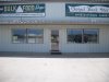
First Portfolio Post Here
Hey everyone! Haven't posted anything on the portfolio board yet. Things are gearing up for the Kansas State Fair right here in Hutchinson, KS and this customer wants to have his signs replaced before the fair starts. His 2 old signs are 4' x 16' Nu-Alum that have been up for about 10 years. The...- RadicalDesignHutch
- Thread
- Replies: 26
- Forum: Portfolio Board
-
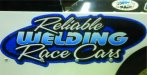
Does anyone know these fonts?
Reliable & Race Cars is AS Speedway Welding is AS Graphina- RadicalDesignHutch
- Post #2
- Forum: Fonts and Typography
-

-
Font ID Please
Am having trouble finding the font for "by Tawnie" it looks like a standard font but can't seem to locate it. Thanks !- RadicalDesignHutch
- Thread
- Replies: 2
- Forum: Fonts and Typography
-

Golf school logo
Here is what we just got finished up for a client over here. This is what the customer signed off on. I'm not too big on the two swoops on top and bottom of the "I", but the customer was happy and didn't want any other changes made to it. But the upside down arch is supposed to represent the...- RadicalDesignHutch
- Post #8
- Forum: Logo Design
-

Fairfield Font?
Hey fellow sign guru's! Hope you all are having a great morning! Got a font here that I can't figure out. Does anyone have a clue as to what the font in "Fairfield" is? Appreciate all the help!- RadicalDesignHutch
- Thread
- Replies: 0
- Forum: Fonts and Typography