-
I want to thank all the members that have upgraded your accounts. I truly appreciate your support of the site monetarily. Supporting the site keeps this site up and running as a lot of work daily goes on behind the scenes. Click to Support Signs101 ...
You are using an out of date browser. It may not display this or other websites correctly.
You should upgrade or use an alternative browser.
You should upgrade or use an alternative browser.
Golf school logo
- Thread starter thinksigns
- Start date

signcrafters london
New Member
This has nothing to do with your designs, but as an avid golfer, I would stay away from a golf school which employed a flaming ball in its signs/logo. Makes me wonder what kind of clientele they are going after.
thinksigns
SnowFlake
This has nothing to do with your designs, but as an avid golfer, I would stay away from a golf school which employed a flaming ball in its signs/logo. Makes me wonder what kind of clientele they are going after.
I'm trying to talk him into one without flames. He said his clientele is people already playing but are ready to get serious about it.
omgsideburns
New Member
Yeah, I'm not usually picky about color choice, but something in me wants to see green when I see golf.
RadicalDesignHutch
New Member
Here is what we just got finished up for a client over here. This is what the customer signed off on. I'm not too big on the two swoops on top and bottom of the "I", but the customer was happy and didn't want any other changes made to it. But the upside down arch is supposed to represent the swinging action by the golfer.
Attachments

iSign
New Member
We are designing a logo for two guys...
...These designs are basically finished...
one for each guy?

iSign
New Member
...the upside down arch is supposed to represent the swinging action by the golfer.
dear lord...
Craig Sjoquist
New Member
Sees nothing dynamic, or real profession here.
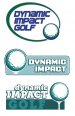
So lets start with the first one seems to be best start, besides green needed, this logo needs action lower case Dynamic, upper case impact both italicize, now the golf ball could use some movement, one of the ways to give it more of a dynamic image is to make the panel smaller then the words and ball.
So lets start with the first one seems to be best start, besides green needed, this logo needs action lower case Dynamic, upper case impact both italicize, now the golf ball could use some movement, one of the ways to give it more of a dynamic image is to make the panel smaller then the words and ball.
thinksigns
SnowFlake
James Burke
Being a grandpa is more fun than working
Here is what we just got finished up for a client over here. This is what the customer signed off on. I'm not too big on the two swoops on top and bottom of the "I", but the customer was happy and didn't want any other changes made to it. But the upside down arch is supposed to represent the swinging action by the golfer.
Kinda reminds me of the Quake logo...even the color.
JB
Attachments


Dan Antonelli
New Member
Here's a few we've done in this sector:
http://www.graphicd-signs.com/portfolio-logo-health#6
http://www.graphicd-signs.com/portfolio-logo-health#2
The last one, we did a pretty big branding campaign for with trade show booths, collateral, web and the package design for a neat flat sided golf ball (http://www.graphicd-signs.com/case-studies-csquare) . I just noted the URL is wrong on the sidebar - but the site we did for them is http://www.csquaregolf.com/ ).
As already said, just really think about the target audience. Very high end sport, and I think the branding should be very clean and upscale. The flame idea might be a little lowbrow for the given audience. The more you can do to make them look expensive, the more likely to attract that audience.
James Burke
Being a grandpa is more fun than working
As already said, just really think about the target audience. Very high end sport, and I think the branding should be very clean and upscale. The flame idea might be a little lowbrow for the given audience. The more you can do to make them look expensive, the more likely to attract that audience.
Ditto.
Have you ever really observed the commercials played during golf?
There are none of those wild beer commercials typically shown on football games, or any of those "in your face" deodorant ads. They're all high-end investment firms and fine sports cars spots. They obviously know their market.
Sure, you'll have the occasional redneck viewer who will strive for the finer things in life, but the general crowd leans toward toward the middle upper, to upper class.
thinksigns
SnowFlake
Dan - those look great. I would love to be able to design something that direction and have him accept it.
At our initial meeting, he emailed me six different examples of flaming golfballs (who knew that many existed). This customer come to us because I lettered his Hummer 4 years ago when he was doing the rubber tiles for your garage. Now he is a golf instructor. I will have to come up with something great to get him to change his mind.
I have attached a couple of more samples. I recently upgraded our Flexi and I'm having trouble getting the colors to come out right when I open the file in Photoshop to create the file for here.
