-
I want to thank all the members that have upgraded your accounts. I truly appreciate your support of the site monetarily. Supporting the site keeps this site up and running as a lot of work daily goes on behind the scenes. Click to Support Signs101 ...
Search results
-

NAME THAT FONT
https://www.whatfontis.com/NMY_Birthstone-Bounce-Medium.font?text=701- The Vector Doctor
- Post #4
- Forum: General Signmaking Topics
-
-

Raster and Vector Image Customer Rant
Here is an old post at Facebook that can help with gradient directions. I use this trick on nearly every file i receive that has gradients.- The Vector Doctor
- Post #48
- Forum: General Chit-Chat
-
Raster and Vector Image Customer Rant
gradients can be tough to match. There are lots of variables such as direction, starting and ending point colors and some have other color stops at various points along the gradient with different color values- The Vector Doctor
- Post #47
- Forum: General Chit-Chat
-
my apostrophes are wrong?
the straight line version does not come out by default when I use Illustrator CC. In order to add the character i don't drag. I double click on it within the glyph box. If this issue for you is a sudden change from what you are used to then maybe the app or computer needs restarted. I believe...- The Vector Doctor
- Post #11
- Forum: Fonts and Typography
-
my apostrophes are wrong?
while your cursor is in the type area choose the symbol from the glyphs window and double click the character you want to add. Some fonts have hundreds of extra symbols and ligatures- The Vector Doctor
- Post #7
- Forum: Fonts and Typography
-
my apostrophes are wrong?
Open up the glyphs window in Illustrator. It will show you all the special characters built into a font- The Vector Doctor
- Post #6
- Forum: Fonts and Typography
-
Raster and Vector Image Customer Rant
That is an excellent idea. I approve this message- The Vector Doctor
- Post #13
- Forum: General Chit-Chat
-
Font Help Need help identifying this font!
Player condensed would be far less work. Winner has too many differences- The Vector Doctor
- Post #7
- Forum: Fonts and Typography
-
Font Help Need help identifying this font!
player condensed is probably a close base font for this with those notches added and the center serif block edited out of the E's The asymetrical A, short center stem of the M and angled S match Player- The Vector Doctor
- Post #5
- Forum: Fonts and Typography
-
How long have you been on here?
I joined the site in 2005. Wow cannot believe it has been that long Anyone still on here that joined up within the first few months of the startup?- The Vector Doctor
- Thread
- Replies: 81
- Forum: General Chit-Chat
-
Should be so simple.....
Maybe Haettenschweiler or Helvetica Extra Compressed (aka swiss 911)- The Vector Doctor
- Post #3
- Forum: Fonts and Typography
-
-
It is better to contact me via email since i don't login here often. Is this the only version...
It is better to contact me via email since i don't login here often. Is this the only version they have? the reflection is making this a bit more work to produce. Also i don't know the fonts used so tracing every letter will definitely be much more expensive. art@vectordoctor.com- The Vector Doctor
- Profile post comment
-
Font id
Here is a closeup view of the serifs on Garamond Bold.. for those that were wondering why i made the disparaging comment about the font- The Vector Doctor
- Post #8
- Forum: Fonts and Typography
-
Font id
It is the garamond bold that comes with MS office, not garamond from Adobe or elsewhere. It is actually a pretty sh!tty font. Not very good on some details. The script is Vladimir- The Vector Doctor
- Post #7
- Forum: Fonts and Typography
-
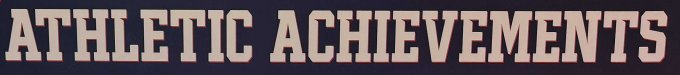
athletic font, trying to figure out the best match
that one is called Stahls Varsity- The Vector Doctor
- Post #3
- Forum: Fonts and Typography
-
Happy Halloween everyone
Do you have more or fewer trick or treaters? Seems like we get less and less every year. Plenty of kids in the neighborhood- The Vector Doctor
- Thread
- Replies: 18
- Forum: General Chit-Chat
-
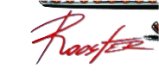
Looking for this script font
probably not a font. The R's and o's don't match- The Vector Doctor
- Post #2
- Forum: Fonts and Typography
-
Question about cutpaths in new (2020) illustrator
sounds like it is converting the stroke into 2 shapes. An inner and outer that are .25 apart. No stroke and just a fill might fix that issue. Also try saving your vectors down to a version 8 ai or eps instead of the default- The Vector Doctor
- Post #4
- Forum: Adobe
-
Question about cutpaths in new (2020) illustrator
usually having multiple paths for the same shape is caused by having a stroke applied to shape in addition to the fill. Make sure your shapes are fill only and have no stroke applied to it- The Vector Doctor
- Post #2
- Forum: Adobe