-
I want to thank all the members that have upgraded your accounts. I truly appreciate your support of the site monetarily. Supporting the site keeps this site up and running as a lot of work daily goes on behind the scenes. Click to Support Signs101 ...
Search results
-

customer needs a small pole pocket banner - reply is lol
Actually, I think on your proof the logo is too high, even if it is centered exactly. I think it would look better a little bit lower. Not as much as she asked for.- unclebun
- Post #4
- Forum: Designs & Layouts
-
-

Rant Solicitation from a design/consultant. Your thoughts.
I'm not making a complete connection between the title and the thread.- unclebun
- Post #5
- Forum: Logo Design
-

Wedding font
You could spend half a day browsing that category at dafont and still not find the exact font the Pinterest user had. But you'd find 9999 others that are really similar, as if they'd been done on a different day by the same person, or maybe someone trying to copy the original.- unclebun
- Post #4
- Forum: Fonts and Typography
-

picture of my work
It's Spanglish. Instalacion/Installation.- unclebun
- Post #4
- Forum: General Chit-Chat
-
I lost my "New From Template" under file
Hold the F8 key while starting Corel Draw. This will cause it to open with reset defaults to the original settings. You will lose customizations. -
Why does valuejet printer say ink is out when cart seems 1/3 full?
The low ink warning is to prompt you to buy a new cartridge so that you will not be caught without when it runs out. There is always a little ink left in the cartridge when it trips the empty signal. That's to keep the printer from running dry. -

-
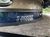
Font help please, for boat reg. numbers...
https://www.myfonts.com/fonts/typodermic/kenyan-coffee/regular/- unclebun
- Post #2
- Forum: Fonts and Typography
-
Where can I get a black PVC Post & Rail kit?
This argument is a long way of saying that most likely nobody makes black ones in PVC. Just white and khaki.- unclebun
- Post #10
- Forum: General Chit-Chat
-
Rant Has ANYONE ever heard of this mess................. ??
Never seen that, but after going to some auction at nearby shops that shut down after a long time in business, and seeing what they used to build signs, accurate cutting and bending does not appear to have always been paramount.- unclebun
- Post #2
- Forum: Electric Signs & Channel Letters
-
Clear Vinyl for Outdoor Lightbox
That's how we have flex faces done. But for commonplace 4x8 faces, it's easier and faster to just print them ourselves.- unclebun
- Post #12
- Forum: General Signmaking Topics
-
Question HI UM NEW HERE
https://printcopy.info/?l=ru&mod=erc&brand=Mimaki&model=JV33-160&code=07- unclebun
- Post #2
- Forum: New Member Introductions
-
Clear Vinyl for Outdoor Lightbox
I think the only possible explanation is you're not getting all the air out, and because of the air channels it all looks OK and smooth. But out in the sun, perhaps the edges are getting sealed before all the air comes out, so it eventually gets all collected in one spot. As a test, apply some...- unclebun
- Post #9
- Forum: General Signmaking Topics
-
Clear Vinyl for Outdoor Lightbox
That is something you fix in your media compensation so that prints always come out the size you intend. On our Epson, each media has its own settings so that we don't have to worry about discrepancy. However, even when we've had small differences in final size, the slight misregistration is...- unclebun
- Post #7
- Forum: General Signmaking Topics
-
Clear Vinyl for Outdoor Lightbox
You don't have to do registration when you do double vinyl layers. Make your prints to be 1/4" smaller than the plastic panel all the way around. Trim them with a straightedge exactly on the edge line. Then you install the clear one (we don't do it wet because air bubbles won't show), then tape...- unclebun
- Post #3
- Forum: General Signmaking Topics
-

Number font help
Anyone know a source for this font? It's a jersey number font Nike uses. Hoping there's an equivalent out there somewhere. They call it Morgantown Bold Italic.- unclebun
- Thread
- Replies: 0
- Forum: Fonts and Typography
-
Reading reg marks with chrome vinyl
We put a piece of application tape over the marks and redraw them with a fine point Sharpie -

Need Help What is my issue? Media Brand, ICC Profile, or?
Spot Color Replacement we have checked. It's where we set the named spot colors for our silver ink and white ink, as well as the CutContour color. Bit Depth should be Smart 16 Bit Processing.- unclebun
- Post #19
- Forum: Newbie Forum
-
Dimensional Letters Outside - Thickness/Material?
Why did you expect to get a "deal" from Gemini? They sell to everyone at the net price listed in their catalogs. Can you make cheaper letters? Yes, as you've found. But you aren't going to be able to get free replacement letters when the plastic fails over 20 years later, even though they were...- unclebun
- Post #18
- Forum: General Signmaking Topics
-
Need Help What is my issue? Media Brand, ICC Profile, or?
We do not use the "All ICC Profiles On" setting. We use a custom setting, where we've chosen US Web Coated (SWOP) v2.icc for CMYK image and vector, and sRGB_IEC1966_21.icm for RGB image and vector. Under Rendering Intents we have chosen Perceptual for both Image and Vector and Absolute...- unclebun
- Post #13
- Forum: Newbie Forum