-
I want to thank all the members that have upgraded your accounts. I truly appreciate your support of the site monetarily. Supporting the site keeps this site up and running as a lot of work daily goes on behind the scenes. Click to Support Signs101 ...
Search results
-

Best banner for wrapping truss structure
"Truss structure" can mean a lot of things... some of which can change recommendations. Got a pic? -
-
Any Idea How I'd reach this sign?
Remove a section of the fence to accommodate the outrigger. Those suckers have got to be removable.- JTBoh
- Post #20
- Forum: General Signmaking Topics
-
Stretched Canvas Material Brand Type "please show me the light at the end of the tunnel"
Yea. Where you guys out of? -

Need Help Anyone know this font?
Looking for this font - i had cleaned it up for the normal services. Marceta is close, but not quite. The tendrils off the Ess and V.- JTBoh
- Thread
- Replies: 0
- Forum: Designs & Layouts
-
How to design a sign with Japanese writing on it?
Kanji pictograms are notorious for bad translations. If possible, get an actual japanese person (a real live one!) to actually write it out, scan, and vectorize imo.- JTBoh
- Post #6
- Forum: Designs & Layouts
-
Product of the year
I'm going on an "undie run" for charity on the 17th. Might have to get this.- JTBoh
- Post #7
- Forum: General Chit-Chat
-
Stretched Canvas Material Brand Type "please show me the light at the end of the tunnel"
Welcome from Clermont. -
Font help pleez.
Vinyl thats been on 20 years... random slanted line... crooked a$$ text... gotta be an RV.- JTBoh
- Post #6
- Forum: Fonts and Typography
-
News Just Need to say WOW
Figured more people'd come here than on yet another what the font this is... Here ya go font finders! What the font took a massive dump on finding this one.- JTBoh
- Post #2
- Forum: Fonts and Typography
-
Free estimates...friend or foe?
From a sales perspective: I'm (usually) thrilled to go out and talk to customers, and do a site survey. It gets me a face-to-face with a decision maker, and allows me to "show off". I will straight up tell customers that "we're all the same, give or take 10% or so" and have told them "You...- JTBoh
- Post #15
- Forum: Business Management
-

shadow today
HE'll be here tomorrow.. and the day after... and the day after- JTBoh
- Post #3
- Forum: General Chit-Chat
-
Laminating window perf
"I swear to God I'll pistol whip the next guy who says "Optically Clear."- JTBoh
- Post #12
- Forum: Vehicle Graphics
-
Question Are you a bitter, cranky old sign guy?
The majority of sign guys I've met over the years are bitter, old and cranky. I'm bitter and cranky, still workin' on the old. I don't know what causes it but it sure is hilarious. How's bout it?- JTBoh
- Thread
- Replies: 29
- Forum: Entertainment, Humor and Spoofs
-
Suggestions Stud mounting adhesive
Silicone indoors only. Construction adhesive outdoors. 2-part epoxy for bronze plaques and exterior metal letters, with an hourglassed hole. (prevents hoodlums from yanking it and selling for scrap. -
What would you guys charge for a 3x6 color vinyl print with laminate?
You are losing profit on the board that they supply. Charge accordingly. Also - no warranty. I've seen some garbage boards in the past.- JTBoh
- Post #26
- Forum: Sales, Marketing, Pricing Etc.
-
Suggestions Material for 8 x60 ft banner
LMGTFY Best way to go. A plain banner will look like cr*p if not instantly then eventually. The frame also brings you return business - use it as a selling point. Dibond will be in the (minimum if you wanna make money) 4k-6k range.- JTBoh
- Post #16
- Forum: General Signmaking Topics
-
I'm just a lowly sales guy... but...
Customer loved the design. I did move the first "o" over a bit before sending it over. The white lines are a bullsh** graphical representation of a lake, or whatever I have to say to sell a sign. I think I used the phrase "visual communication" 6 times yesterday. I'd much rather say "it...- JTBoh
- Post #42
- Forum: Designs & Layouts
-
I'm just a lowly sales guy... but...
It'll be machine shaped with hand details. Presenting this logo to the customer today for approval, but its a done deal. Their guidance on the design was - "Make it look pretty". I took a 5 year break from this site, but remember some of your "critiques" Gino - I'll take the above gladly haha.- JTBoh
- Post #3
- Forum: Designs & Layouts
-
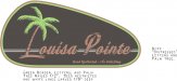
I'm just a lowly sales guy... but...
I think I did OK with this. Open to critique (and compliments!) Carved HDU sign, 1/2" raised letters and border, 108" wide... Customer wanted a palm tree and a "lake". Distressed font is doable with a 1/8" router bit.- JTBoh
- Thread
- Replies: 57
- Forum: Designs & Layouts
-
Need Help Brushed Alum 6mm Dibond
We have one, but they only carry BL/BL. I'll harass grimco some more lol.- JTBoh
- Post #4
- Forum: General Signmaking Topics