-
I want to thank all the members that have upgraded your accounts. I truly appreciate your support of the site monetarily. Supporting the site keeps this site up and running as a lot of work daily goes on behind the scenes. Click to Support Signs101 ...
Search results
-

feedback? any help?
That's not a flower!! You must be on drugs or something... :Big Laugh MARKET needs to be Bolder...- rjpjr
- Post #18
- Forum: Designs & Layouts
-
-
feedback? any help?
...and what is this Mr. Maniac??? :munchie:- rjpjr
- Post #15
- Forum: Designs & Layouts
-
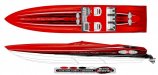
Boat Graphic Designs
What techniques do you use to create the splintered effect stripes? Do You use "Brushes" or is everything designed manually?- rjpjr
- Post #29
- Forum: Designs & Layouts
-

Fun with Signs 101 Logo
Hey... Signs 201!! That is a great idea!!! :ROFLMAO:- rjpjr
- Post #5
- Forum: Logo Design
-
-

New Logo
I like it. Really diggin the critter... I might make him a little darker- rjpjr
- Post #20
- Forum: Logo Design
-
Since I was called out.......................
this :ROFLMAO:- rjpjr
- Post #113
- Forum: Sales, Marketing, Pricing Etc.
-
Since I was called out.......................
don't make me pull over this car!!!- rjpjr
- Post #9
- Forum: Sales, Marketing, Pricing Etc.
-

The Golden Tamale - Suggestions?
What if the tamale stack is moved to the top and behind the text? The name becomes more dominant.- rjpjr
- Post #11
- Forum: Logo Design
-
Making Vehicle templates
AGREED!!! http://artstation-vehicletemplates.com/- rjpjr
- Post #26
- Forum: Tips & Tricks
-

Critique, please
A singular upside down red maple leaf not attached to a tree reminds me of Fall... or to be more specific, when everything dies and turns brown. Probably not the first impression a Landscaping company would prefer to have. A logo representing LIFE is probably a better way to go.- rjpjr
- Post #18
- Forum: Logo Design
-
What are your pet peeves
...Trying to tear toilet paper and it rips in the wrong place and rips down the entire length and just won't stop!!! :ROFLMAO: ...walking through the ENTRANCE of a large department store and running into to idiots using it as an EXIT! They are clearly marked, use them appropriately!- rjpjr
- Post #100
- Forum: General Chit-Chat
-

Vector gradients
Agree... If you are seeing MANY vector shapes to create the gradient, the blend has just been expanded. -
Signs101 WRAP CONTEST
caution!! This popped up when I clicked on the above link. ?- rjpjr
- Post #21
- Forum: Vehicle Wraps
-
-

New Logo
IMHO, there are negative space issues with the horizontal oval. What if the oval is rotated to better align with the KIWI?- rjpjr
- Post #55
- Forum: Logo Design
-
Best employee gripe so far...
you mean kinda like this one... http://www.youtube.com/watch?v=UF5oIbc_5O4 :omg2:- rjpjr
- Post #40
- Forum: General Chit-Chat
-
Effin stoked!!!
:omg2: ...I think you have just screwed yourself... :ROFLMAO:- rjpjr
- Post #6
- Forum: General Chit-Chat
-
need opinions on layout
I like this better as well. It reminds me of the Mike Stevens Mastering Layout cover a little bit. IMHO, "Michael J's", "Homemade Treasures", and the reversed text panel seem to have about the same visual priority. Maybe go dark with the text panel to provide a clearer hierarchy. ?? .- rjpjr
- Post #24
- Forum: Designs & Layouts
-