-
I want to thank all the members that have upgraded your accounts. I truly appreciate your support of the site monetarily. Supporting the site keeps this site up and running as a lot of work daily goes on behind the scenes. Click to Support Signs101 ...
Search results
-
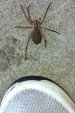
calling all spider experts
Wolf Spider...Yes Creepy...Yes Harmless...Yes Painful...YES. I had one of those suckers bite me a couple of years back cleaning out flower beds. About a month ago we had one of those on the step of our staircase (inside) and was completely shocked how big it was. I bent down to look at it...- rjpjr
- Post #15
- Forum: General Chit-Chat
-
-
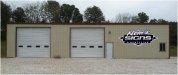
New sign for my shop...finally
maybe the logo needs some color to make it jump off of the building... maybe consider substituting the Klem's script since it is a little difficult to read... maybe a little bigger...- rjpjr
- Post #21
- Forum: Designs & Layouts
-

Pre School Design. Want some input.
I like the frogs :thumb: Perhaps the sky gradient should fade more sharply to help the Frogs JUMP out on the layout... :doh: Sorry... couldn't help it. :Big Laugh- rjpjr
- Post #11
- Forum: Designs & Layouts
-
-

New logo and truck layout
my thoughts about the logo... The tree is a little small and looks weak and crooked. I imagine a tree service would prefer portraying the impression of healthy and symmetrical.- rjpjr
- Post #10
- Forum: Logo Design
-

-
Critics welcome compliments enjoyed!
I thought this was an important question... Without knowing the above, I recommend bringing the ribbon elements together to work as one element.- rjpjr
- Post #20
- Forum: Designs & Layouts
-

Typeface ID please?
Anybody have any idea what the name of this typeface is? Thanks for any input.- rjpjr
- Thread
- Replies: 1
- Forum: Fonts and Typography
-

new customer logo
I would update the font as suggested. I would also consider rounding the corners to present a more natural/organic feel...more like bones and vertebrea. I would NOT offset the center row as presented in your second option as it looks like it needs an adjustment. :Big Laugh- rjpjr
- Post #20
- Forum: Logo Design
-

-

-

a different kind of font request...
Thanks for the suggestions... :signs101:- rjpjr
- Post #6
- Forum: Fonts and Typography
-
a different kind of font request...
Anybody recommend a font that has the same racey metallic feel of Serpentine without being Serpentine... A block font with pointy/sharp serifs? Thanks for any suggestions- rjpjr
- Thread
- Replies: 5
- Forum: Fonts and Typography
-

Font id?? Thanks in advance
Thank you guys for investing your time to help out. It is very much appreciated! I think I will work with Georgia and see if it will pass. Thanks Again. :signs101:- rjpjr
- Post #6
- Forum: Fonts and Typography
-
-

Type Face recognition
Thank you Fred... you're the best!!! :thankyou:- rjpjr
- Post #3
- Forum: Fonts and Typography
-
Type Face recognition
Can anybody name this type face?? Thanks in advance for your help!- rjpjr
- Thread
- Replies: 2
- Forum: Fonts and Typography
-

Damn flies!
:ROFLMAO: Exodus 8:21 If you do not let my people go, I will send swarms of flies on you and your officials, on your people and into your houses. The houses of the Egyptians will be full of flies; even the ground will be covered with them. Just Kidding... Sorry, I just couldn't resist...- rjpjr
- Post #14
- Forum: General Chit-Chat
-
Ideas for family reunion banner?
West Coast... Gang Warfare and also rappers!! :omg2: Kinda Harsh visually, but could be fun. Graffiti typefaces on Brick Wall texture background? Logo stenciled on the Bricks with paint runs?- rjpjr
- Post #9
- Forum: Designs & Layouts
-
pantone / cmyk bridge question
Seconded... from Color Bridge- rjpjr
- Post #6
- Forum: General Signmaking Topics