-
I want to thank all the members that have upgraded your accounts. I truly appreciate your support of the site monetarily. Supporting the site keeps this site up and running as a lot of work daily goes on behind the scenes. Click to Support Signs101 ...
You are using an out of date browser. It may not display this or other websites correctly.
You should upgrade or use an alternative browser.
You should upgrade or use an alternative browser.
Sign Layout...let me have it!
- Thread starter klemgraphics
- Start date


SignManiac
New Member
Too much negative space. Needs continuity.
klemgraphics
New Member


Jillbeans
New Member
It's still very disjointed.
Needs to be tightened up.
Everything is too close to the edges.
Stacy's arrow suggestion is what I always do myself.
But it is too big.
Love....Jill
Here's a quickie suggestion using one of John Deaton's Cridders.
I always think a sign should have a border, too.
Needs to be tightened up.
Everything is too close to the edges.
Stacy's arrow suggestion is what I always do myself.
But it is too big.
Love....Jill
Here's a quickie suggestion using one of John Deaton's Cridders.
I always think a sign should have a border, too.
Attachments

Last edited:
Marlene
New Member
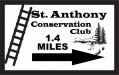
St Anthony and the Conservation Club would look better as all one font to make it all one name. with two different fonts, it just splits the message and makes it look disjointed. this looks like a sign to help people know how far they nned to go and which direction to turn rather than an ID sign so making the arrow and milage stand out more would rreally help those looking for this place. nothing bugs me more than having to wade thru a bunch of junk on a sign to firgure that info out. think of yard sale signs that have a huge "Yard Sale" and then in pen they make a tiny little arrow and write the address about .25" high, really a pain to deal with when they do that.
klemgraphics
New Member

SignManiac
New Member
You're just spinning your wheels because you don't have an understanding of basic design principles. You can change colors all day long and your layout will not improve. You really need to read Mike Stevens book for starters. Once you understand some of those principles, your designs will improve.
John Butto
New Member
likeshesaid
road signs
road signs
John Butto
New Member
Why do they need a sign, is not St Anthony the guy you pray to so you can find it.
Locals Find!
New Member
SignManiac
New Member

klemgraphics
New Member
All valid points, I will try to make some real changes later today, no time right now. Ordering that book today, any others recommended?
Oh and thanks for the quickie Jill If all else fails I will just hire you, but I really want to improve my skills if at all possible.
One question I do have though regarding the border, and please note I almost always include a border on signs, should you add a border when it is going to be fully framed in treated lumber? In this case sometimes I do and sometimes I don't, just wonder what others would do.
Oh and thanks for the quickie Jill
If all else fails I will just hire you, but I really want to improve my skills if at all possible.One question I do have though regarding the border, and please note I almost always include a border on signs, should you add a border when it is going to be fully framed in treated lumber? In this case sometimes I do and sometimes I don't, just wonder what others would do.
klemgraphics
New Member
:ROFLMAO: I'll give them this suggestion. Although I doubt that would help my bottom line much.Why do they need a sign, is not St Anthony the guy you pray to so you can find it.
Also thanks to everyone for the quick layouts, I definitely have a better idea what I should end up with.
Craig Sjoquist
New Member
Well I'm not going to comment about it.
But I will say ...READ ...Mike Stevens Mastering Layout & Dan Antonelli 2 books
After doing that you begin to understand what advertising should look like whether being a no parking or a anything else.
But I will say ...READ ...Mike Stevens Mastering Layout & Dan Antonelli 2 books
After doing that you begin to understand what advertising should look like whether being a no parking or a anything else.
John Butto
New Member
You don't need to buy any books, just check out all of SignManiac's work.
SignManiac
New Member
LOL John, thanks for the kudo's. My work is a result of reading those books and constantly observing other designers work and styles. It's an ongoing learning process and trust me, there are days I feel like I don't have a clue at all.
What I try to get across to those that are learning here is you're not just sticking letters down on a substrate. There is a lot more to it than that. It's no accident that some signs look better than others. Artistic ability comes in to play and helps some what, but that alone will not create good signs either.
I wish there was an easy button but there just isn't one.