-
I want to thank all the members that have upgraded your accounts. I truly appreciate your support of the site monetarily. Supporting the site keeps this site up and running as a lot of work daily goes on behind the scenes. Click to Support Signs101 ...
Search results
-
Best way to tackle this job?
Had to turn down the job. He previously had a guy who was supposed to apply graphics on the doors of the trucks... after removing the old lettering that was already on there. Wish I would have taken some pics, but let's just say...the guy used the wrong stuff. Those trucks need to head to a...- aandrews19
- Post #5
- Forum: Vehicle Graphics
-
-
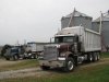
Best way to tackle this job?
I have a potential customer coming my way, thanks to a friend. I'm trying to better prepare myself for when I discuss the job with the customer. He is a grain farmer, looking to have graphics installed on his transport trucks/ trailers. Up until now, I have really only done smaller jobs...- aandrews19
- Thread
- Replies: 7
- Forum: Vehicle Graphics
-

Logo critique
What if it was just the heads, instead of the entire body. I think the actual dogs are actually taking away from the name, because they are the main focus. Try "three dogs" as the focus, with the dog heads over top, and "& kitty" below.- aandrews19
- Post #12
- Forum: Logo Design
-

-
Need a design
Looking for someone to pass a job onto, since I don't have the time right now. If you know someone to recommend please do. I know there are a few on here that are pretty good, just not sure which users though. Details... Stay Lean Vending - looking for a vending machine being squeezed by a...- aandrews19
- Thread
- Replies: 6
- Forum: Logo Design
-

Alley Kat - help needed
Sorry, haven't been on here in a week or so... THAT logo is their current logo which is what they are looking to change. They are planning on renovating (was originally slated for Nov/Dec), but have decided to sit tight until the holiday season passes. They'd be passing on too much money if...- aandrews19
- Post #28
- Forum: Logo Design
-

-
Nail Spa Sign
hm.. I do think it looks better with thicker letters.- aandrews19
- Post #17
- Forum: Designs & Layouts
-
Nail Spa Sign
Tried it with a black outline... Jill... I'm having trouble seeing what you are trying to point out in "Strasburg"... as far as letters U, R, and G... too close? too far?- aandrews19
- Post #13
- Forum: Designs & Layouts
-
Nail Spa Sign
If anyone has any suggestions as to where to go for an illuminated sign cabinet, please share. This is the first illuminated cabinet I'll be doing... and I could use any tips you guys have.- aandrews19
- Post #9
- Forum: Designs & Layouts
-
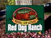
Painted Ranch Sign
Nice! I like that you can see some brush strokes in the dog's back... and I really like the look of the background behind the dog.- aandrews19
- Post #13
- Forum: Portfolio Board
-
-
Nail Spa Sign
Yeah, that was my first thought too. Was wondering if maybe I should change "Strasburg" and the phone number to black...??- aandrews19
- Post #3
- Forum: Designs & Layouts
-
Nail Spa Sign
How do you guys feel about this layout? Business is called "Strasburg Nail Spa", and they want their number on the sign. They want an illuminated sign cabinet (3' x 5') on the facade of the building. I kept it super simple, since there aren't too many elements to add.- aandrews19
- Thread
- Replies: 24
- Forum: Designs & Layouts
-

Chiroprator Sign Layout
I guess I should have mentioned that the sign is in a tough spot visibility-wise. The customer wants chiropractor to be as big as possible... And red... To catch a driver's eye. He is pretty much dead set on that.- aandrews19
- Post #9
- Forum: Designs & Layouts
-
-
Alley Kat - help needed
Forgot to update this. Still waiting on some kind of decisions as far as direction, but this is where it is at now. So, these are still very unfinishesed. I had origianally sent it in just black/white, but they wanted to see it with a few different colors just to get an idea.- aandrews19
- Post #21
- Forum: Logo Design
-
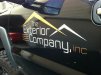
The Exterior Company
I designed the logo for this guy a few months ago, and I basically became a puppet. He is a nice guy, but when he has something in his head...that's it. He pays in full on time, and he keeps coming back to me for everything he needs, so I can't complain too much. Sometimes I guess you just have...- aandrews19
- Post #9
- Forum: Vehicle Graphics
-
The Exterior Company
Job I had on Monday. Nothing extraordinary. Pretty simple, but I like the way it turned out. Oracal 751 White Oracal 951M Red Gold- aandrews19
- Thread
- Replies: 8
- Forum: Vehicle Graphics
-

Hogs Hockey
Recently did a new identity design for a beer league hockey team (old washed up hockey players that never made it anywhere, so now they just get together drink beer and play hockey....but mostly drink beer). These jerseys are currently being crested. I don't do sublimation or embroidery, so I...- aandrews19
- Thread
- Replies: 2
- Forum: Logo Design