-
I want to thank all the members that have upgraded your accounts. I truly appreciate your support of the site monetarily. Supporting the site keeps this site up and running as a lot of work daily goes on behind the scenes. Click to Support Signs101 ...
You are using an out of date browser. It may not display this or other websites correctly.
You should upgrade or use an alternative browser.
You should upgrade or use an alternative browser.
Any thoughts on the design
- Thread starter Texas_Signmaker
- Start date

Texas_Signmaker
Very Active Signmaker
Yes I like that a lot. It's a more modern take.
thesignpost
New Member
Did your customer like it?
Did your customer approve the artwork?
Did the customer pay you in full?
Did you make the sign to the best of your ability and use quality craftsmanship?
The MOST important thing, Was your customer happy,would they use you again and possibly send you referrals in the future?
Then that's all that matters.....
Texas_Signmaker
Very Active Signmaker
Did your customer like it?
Did your customer approve the artwork?
Did the customer pay you in full?
Did you make the sign to the best of your ability and use quality craftsmanship?
The MOST important thing, Was your customer happy,would they use you again and possibly send you referrals in the future?
Then that's all that matters.....
Yes on all the above but that's not all that matters to me. I want to improve my design skills because that is the hardest thing to get down in my case. Dealing with customers, closeing delas, making my business profitable and pleasing customers are not a challenge for me, design is! Big difference in my sign and Johnny's or the other one!
Rick
Certified Enneadecagon Designer
Some really good ideas on layout of all that information. I can't add anymore to the ideas shown, but I've done hundreds of post and panel apartment signs, with the big apartment boom going on here, more and more want something more substantial... obviously this is overkill for a 36 unit apartment, but I thought it would be fun to show...
I will say, some information is not needed on there, like est. 2014, the full address and who manages it.
There should be constancy of the brand from the website to the sign.
I will say, some information is not needed on there, like est. 2014, the full address and who manages it.
There should be constancy of the brand from the website to the sign.
Attachments

Last edited:
Texas_Signmaker
Very Active Signmaker
And if it absolutely had to be flat....
this way you can screw it into the side of the panel and not the face....
Very modern and nice. Yea this customer wouldn't have gone with the monument but I like that last one with the posts. I really like modern design styles and wish more customers would too

Texas_Signmaker
Very Active Signmaker
Hey, those posts... you wouldn't make them out of wood and route the grooves would you? I've seen some square tube posts that were metal and had like hex screws without heads that held the sign face in the groove at the bottom. What do you use?And if it absolutely had to be flat....
this way you can screw it into the side of the panel and not the face....
Rick
Certified Enneadecagon Designer
Hey, those posts... you wouldn't make them out of wood and route the grooves would you? I've seen some square tube posts that were metal and had like hex screws without heads that held the sign face in the groove at the bottom. What do you use?
There are a few ways I could do it. I was thinking wood on this.
I avoid attachments on a sign face at all cost, if I had to have a face attachment, I would incorporate it into the design so it is deliberate...
Attachments

neato
New Member
Did your customer like it?
Did your customer approve the artwork?
Did the customer pay you in full?
Did you make the sign to the best of your ability and use quality craftsmanship?
The MOST important thing, Was your customer happy,would they use you again and possibly send you referrals in the future?
Then that's all that matters.....
I can't disagree more with this viewpoint. And I think this thinking is why our cities and towns are so littered with mediocre - bad signage. We are the professionals. The customer might have input that we have to take into account, but ultimately it's up to us to design a sign that that not only is effective, but also is pleasing to the eye, compliments the customers building and surroundings and contributes to our urban landscape. We owe it to our clients to do what texas_signmaker is doing, constantly seek to improve. Making money is important, but it shouldn't overshadow pride of craft.
neato
New Member
There are a few ways I could do it. I was thinking wood on this.
I avoid attachments on a sign face at all cost, if I had to have a face attachment, I would incorporate it into the design so it is deliberate...
I like this method! Thanks for sharing that tip. This is an area I would like to learn more about, fabrication and installation.
")
Texas_Signmaker
Very Active Signmaker
This is just as bad. Have to stop, get out of the car and walk up to the sign to read it. Fail.
The sign is at the entrance of a gate where it's a few feet away from the driver as they sit. Knowing the viewing distance and speed of the viewer is key. Now, I didn't mention that info here but one could assume that based on what I already designed. BUT, I agree and would use a non-serif font would easily clear that up. Not what I would consider a "Fail"
Can we retire the use of "Fail" already? That's been played out long ago.
Last edited:
Gino
Premium Subscriber
'Fail' cannot be used anymore ??
If the shoe fits..............................
This is basically a simple kinda routine sign. There are only so many things you can do with it. Putting up the original picture will merit some alterations, but designing a $4,500 sign is a little above and beyond the call of duty here. As mentioned by so many already, WE are the professionals in this equation and it is our job to educate the customer and let them make a decision based on good sound advice, not just do it to get paid, but that does and will enter into the decision. It is our duty to make sure they see how silly a sign looks with all of their mindless quirks or needs.
That original sign looked to be maybe $800 to $1,500 sign, installed, depending on local market and materials used. Nothing special about it. In the same token of giving the customer a proper product, we must know how to approach a sign and not reach for the stars or use up an entire year's budget on an entrance sign. We must know what values are needed for just about any sign that comes down the pike and point the customer in your professional wisdom in the right direction for the right budget.
Why not ??
This is basically a simple kinda routine sign. There are only so many things you can do with it. Putting up the original picture will merit some alterations, but designing a $4,500 sign is a little above and beyond the call of duty here. As mentioned by so many already, WE are the professionals in this equation and it is our job to educate the customer and let them make a decision based on good sound advice, not just do it to get paid, but that does and will enter into the decision. It is our duty to make sure they see how silly a sign looks with all of their mindless quirks or needs.
That original sign looked to be maybe $800 to $1,500 sign, installed, depending on local market and materials used. Nothing special about it. In the same token of giving the customer a proper product, we must know how to approach a sign and not reach for the stars or use up an entire year's budget on an entrance sign. We must know what values are needed for just about any sign that comes down the pike and point the customer in your professional wisdom in the right direction for the right budget.
Last edited:
Johnny Best
Active Member
I'm all for dropping the word "fail" unless it is accompanied by actual reasons and an explanation of why a layout fails.
Two words and a long standing graphic design concept I'd like to see less experienced signmakers learn about and apply more is "margin control".
Good graphic and sign design has to include a basic understanding and grasp of respecting the margins of the shape you are working within. This concept is glaringly clear in the better alternative designs that were offered here. Unless you are trying to create eye tension or a certain effect by running text off an edge, stretching text end to end and within close proximity to edges, inlines, borders, etc. a certain margin should be maintained in most text elements within a sign.
Try to think about a bullseye and how your eye is drawn to the center even though the actual bullseye occupies the smallest space.
Texas_Signmaker
Very Active Signmaker
This an improvement? Kind of not proud of the text in the yellow bar but my brain couldn't handle much more ATM

signbrad
New Member
Texas_Signmaker,
I believe this layout is a nice improvement over the original.
The word 'Oaks' nicely dominates. You have made it the "entry point" of the composition. This is what the viewer should see first. For viewers who are driving by, rather than walking or standing, it may be the only thing they see. So it is good that you have allowed nothing else to compete visually with this word.
This layout also shows greater respect for the importance of generous margins. The need for negative space in a layout, especially in the margins, is a principle that takes many of us years to realize. The tendency to fill up the available space with copy is an almost overwhelming temptation for new designers (and clients). Yet, even in the gold subpanel you have shown restraint. A newbie would have made the letters in this subpanel much larger.
.................
Here are a couple of tweaks for your last revision. They are not necessarily the right way nor the only way:
Do the squint test. When you squint, does the word "Oaks" seem a little low and to the left? If so, raise it a bit and bump it to the right till it seems visually centered in the black area when you view it while squinting.
Don't measure. Do this by eye and trust your eye. If the leaf gets closer to "Oaks" that may not be a problem. The leaf can be slightly downsized if it is a problem. (Also, should the leaf be an oak leaf? It looks like a maple. But then, I'm not a woodsman and it's a minor point).
Now, note the congestion in the lower right corner of the black area. It is caused by the words "at Cambridge." These words are very close to the border and close to the gold panel, effectively causing that corner to look filled. A flaw? Everywhere else the main copy has generous white space surrounding it—but not here. The solution? Well, if you've already raised "Oaks" a bit, there is room to raise "at Cambridge," too. And bump it to the left a little. Try to give it separation from both the border and from the subpanel. It could probably be downsized a little as well, enhancing the separation, if needed. I might even make "at Cambridge" bolder in an attempt to make it appear more closely related to the bold "Oaks." Does that make sense?
It's important that "The Oaks at Cambridge" appear as a unit, visually. The making of groupings—creating what some call copy blocks—is a practice I use frequently. Copy blocks surrounded by margins of white space go a long way to organize a composition, making it easier to scan and digest. This is especially true with heavy copy. When there is heavy copy, the secondary copy needs to downsized, firmly corralled.
Does it matter that some of the secondary copy becomes downsized to the point it is unreadable to passing traffic? No. Why not? Because heavy copy is not readable to passing traffic anyway.
The time spent glancing at a sign by traveling motorists is, in my opinion, about 1½ seconds per glance. In other words, this is the amount of time that a driver takes his or her eyes off the road to quickly scan a sign. A second glance, of course, may add that amount of time again. Still, what can you read in so small a space of time? One word, two words, three words? Certainly not a phone number and web address. And probably not a tagline or other secondary copy, either.
So, don't worry that relatively unimportant secondary copy needs to be "big and legible." Secondary copy should in no way compete with the dominant element(s). The dominant copy should clearly stand out and be scannable and digestible almost instantly.
For foot traffic, there is ample opportunity to stop and read all the copy, no matter if it's excessive. And, of course, for someone walking or standing in front of the sign, letter size is not really an issue. Consequently, do not be afraid to significantly downsize secondary copy. Even better, eliminate it.
I often draw a layout with all the copy asked for by the client, then I draw a second layout that has been edited, simplified. Often, a client, presented with both side by side, can see the visual improvement of the sign with less copy.
One of the primary goals of an initial consultation with a sign buyer should be to reduce the number of elements in the composition as much as possible. Of course, to a client, everything is important. But a sign that is bloated with verbiage, all of it vying for attention, is easy for a viewer to ignore. It simply becomes too much work to read. And, obviously, a sign that no one is inclined to read is almost the same as not having a sign. It is ineffective.
Back to the subject of grouping. The phone number and the address in the gold panel can be grouped together, too, so that they become more of a unit. Simply move them closer to each other, separating them with a bullet, perhaps. Then, center the entire unit left to right.
I would also move the word "The" farther away from the border. I actually like the original idea of executing it in script and allowing it to overlap "Oaks" slightly.
Elements that are close to each other are perceived as belonging together or being related. This is the design principle of proximity. Allowing elements to touch or overlap is the strongest form of proximity. When you overlap two elements, it helps make them look like they are a unit. This can be helpful if the two elements do not otherwise look like they belong together. For example, if they are not related by color or if they are composed of two totally different letter styles. Proximity keeps them visually grouped.
.................
There are, no doubt, dozens of ways this sign could be designed and be effective.
Phillip Newell's and Johnny Best's both look good. They just exhibit two different looks, personalities.
And though I speak of certain things as if they are concrete rules, they aren't so much rules as they are best practices and proven principles. The minute I say that something is a rule that can never be broken, someone breaks it and makes it work.
Few sign layouts are perfect, anyway. Maybe stop signs are perfect layouts. But occasionally someone still fails to stop.
Brad
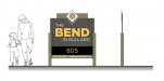
TheProDesigns
ProDesigns - Graphic Design Company
I already did this sign but I kind of use this as a rough template for the other properties. Any feedback on the layout? PS I'm aware the phone number was mis-aligned in this photo. I since corrected it, sometime my cutter will "Jump" like half an inch when cutting...real annoying.
