-
I want to thank all the members that have upgraded your accounts. I truly appreciate your support of the site monetarily. Supporting the site keeps this site up and running as a lot of work daily goes on behind the scenes. Click to Support Signs101 ...
You are using an out of date browser. It may not display this or other websites correctly.
You should upgrade or use an alternative browser.
You should upgrade or use an alternative browser.
Beer and Wine
- Thread starter Marco
- Start date
Graphic Destruction
New Member
I'd be more worried about who will be responsible for mounting those channels to the roof when it leaks, but that's just me.
nikdoobs
New Member
"I'm not particularly fond of the ampersand falling over"
+1
If it were me, i would straighten it and make it a little smaller.
"Also adjust your kerning on the tag line it all runs together"
+1
Might just be the typeface but the finial on your Cs look strange to me. It seems like there should be some kind of a serif and not just come to a sharp point.
A few small adjustments and I think it will look great.
+1
If it were me, i would straighten it and make it a little smaller.
"Also adjust your kerning on the tag line it all runs together"
+1
Might just be the typeface but the finial on your Cs look strange to me. It seems like there should be some kind of a serif and not just come to a sharp point.
A few small adjustments and I think it will look great.
Marco
New Member
vid
New Member
My first impression was "wow, that it's big." That's neither good nor bad, just an observation. Of course that brought me to Graphic Destruction's point, so I'm wondering about the structure to hold it on the roof. Aside from the engineering for snow and wind, I'm wondering about the aesthetics. Again, it's neither good nor bad, it's just an observation about potential clutter.
Since I just draw pictures, I'd be talking to the installer/engineer about the idea of having a full size raceway for the letters to see if that could be supported easier... and mostly because I like the look it adds to the building. Then too, I like reverse weeded stuff on logo boxes, so I'd do that for the CRAFT BEER AND.... portion.
As the others have pointed out, the ampersand is catching attention. Aside from it being rotated off baseline, it's size and color pull the eye to that at first glance --- I'd scale that down.
Attached is a sample of how I would initially approach it. I wouldn't use red in the design, but instead go with a brown as a secondary color. Using a softer color would help to differentiate this place from typical liquor store color schemes. (oh yeah, I just used a "placeholder" font in the layout because I didn't have the one you used)
That's my .o2
Attachments
Gino
Premium Subscriber
It looks like it's actually falling backwards. It becomes the focal point of your whole sign and it means absolutely nothing. Therefore, the average eye will look at something for a few seconds and all they'll remember is looking at that big red thing falling off the sign at the booze place. Is that what you want ?? Better yet, is that what is in your customer's best interests ??
Marco
New Member
Re:
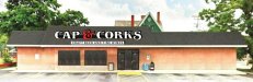
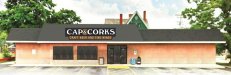
The owner was adviced that there may be some opposition to the above although there are larger signs (most are projecting type) at adjacent stores. This will be taken in stride, currently in design phase, there is a plan B which is placement of sign on the right side of building face just below the overhang, same location as old sign.Nice looking channel letters.Nice size and looks good on the building.
Is zoning going to allow a sign that big ?
Around here were usually only allowed 10% of the facade
Graphic Destruction
New Member
I would push for plan B. Our golden rule is mounting to a roof is always the last option (and we've even refused to do it in some cases) and CYA, because it will very likely leak and someone needs to pay for the repairs and damages.
ddubia
New Member
...the average eye will look at something for a few seconds and all they'll remember is looking at that big red thing falling off the sign at the booze place. Is that what you want ?? Better yet, is that what is in your customer's best interests ??
If they remember it's the booze place then it did it's job. :Big Laugh
Better than some TV commercials that I can tell you a detailed description of the ad but have no idea what product it was promoting.
Marco
New Member
Similar Signage
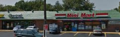
This is a similar case / perfect sample of this future project. There are many buildings in this area where we used the method as shown herein. An engineer's structural analysis is made prior to the permit process, during the design phase. Option B, will be to install the sign in place of the old sign; here (sample) it's where it says OHIO direction card.
This is a similar case / perfect sample of this future project. There are many buildings in this area where we used the method as shown herein. An engineer's structural analysis is made prior to the permit process, during the design phase. Option B, will be to install the sign in place of the old sign; here (sample) it's where it says OHIO direction card.
Attachments

Pixels Are Bad Mmmkay?
New Member
Completed work. Thank you guys here for assistance, special thanks to Vid.
Hey, hey, hey. Not too shabby.
