• I want to thank all the members that have upgraded your accounts. I truly appreciate your support of the site monetarily. Supporting the site keeps this site up and running as a lot of work daily goes on behind the scenes. Click to Support Signs101 ...

Best way to re-do this wrap

Stacey K

I like making signs
I did not do this wrap the first time, it was a shop that is now closed.

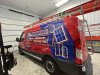
With that said, he would like to remove just the area with the wood grain and replace it with generic windows as they don't use Sierra Pacifica anymore. The van is white so the entire van is wrapped red with the graphics. I have the artwork here because he has all his artwork from the old shop that closed - yah!!! I'm thinking I should cut and remove the wood grain area and try to allow 1/8" overlap for the new wrap? He wanted me to go over the top of the vinyl however, the indents on the panel have bubbled (you should be able to see it). I guess I could trim the bottom edge?

Thoughts on how to do this? I don't want to say he wants it done cheap, because he's not a cheap guy, but he certainly does not want the entire wrap removed.

Thanks!

1704301970879.jpeg
 

JBurton

Signtologist
Honestly, you could cut and remove that wood grain and replace with cut/print graphics over the white, no real need to re-wrap that area unless he's got a concept to use for the background. I would not attempt to match the red, as even if you get something that looks good today, it'll likely fade at a different rate and look hodgepodge later on.
 
  • Agree
Reactions: 3 users

gnubler

Active Member
That needs some trimming around all the recessed areas! I just went through this with a Transit van when the customer requested I make cuts because on all their older vans the vinyl has lifted from the recesses.
 
  • Agree
Reactions: 1 user

Notarealsignguy

Arial - it's almost helvetica
I'd go over the woodgrain and knifeless tape where the black part of the logo and text overlaps. Give it an 1/8-1/4" extra
Leave the C in Pacific alone, nobody will notice the little black tail that is left.
 
  • Agree
Reactions: 3 users

Gino

Premium Subscriber
Any color scheme you & the customer come up with and add your stuff after removing the old vinyl. If you need to replace a letter or two, it would not be at all difficult.

altitude.jpg
 
  • Agree
Reactions: 2 users

gnubler

Active Member
Is this commonly done when wraps need to be "patched" or updated? I would think it would be very tricky to get the new vinyl lined up to the old, like around the black square of the logo and the number 6 and letter t. Cutting out the old vinyl would make me nervous too. I'd rather redo an entire panel from scratch, but I realize the red would probably never match. Good luck, Stacey!

And I'm liking Gino's design there...beveled Papyrus is one of my favorite looks!
 
  • Hilarious!
  • Agree
Reactions: 5 users

Notarealsignguy

Arial - it's almost helvetica
I wouldn't remove anything, just plop the new one right over the old. The things already a mess, you can't f it up.
 
  • Agree
Reactions: 6 users

Notarealsignguy

Arial - it's almost helvetica
Good eye, though I'd probably recommend trimming that radius out, it's going to tent up at some point anyway, or just pull everything to the right of the wood grain too.
Look at the entire thing, design, tenting, scratches and ask yourself if it really matters. These are those quick jobs for cheap people that you can actually make a few bucks on as long as you don't overthink it.
 
  • Agree
Reactions: 5 users

DL Signs

Never go against the family
I kinda had the same thought as Gino, use a blue like in their logo, then put some random windows on it like they want.... Then class it up a bit, **"Gino style" :cool:
**Artist will neither confirm nor deny that a touch of bourbon was a factor in this...
Personally I'd suggest doing the sides from the front door back. That red shouldn't be hard to match. Then they could have their logo straight, get rid of all the bubbling, the jagged outlines on some of the text, all the scratches, all gone, and you wouldn't have to do all that tedious time consuming trimming around everything to lay a patch.

play time.jpg
 
  • Hilarious!
  • Agree
  • I Appreciate You
Reactions: 5 users

Stacey K

I like making signs
Gino and DL - this is exactly what I was thinking.

This customer has about 15 vehicles and several trailers. He has an employee working on a job in another city so he's giving this van to him to use, otherwise it's been sitting at his shop for quite some time. So - not a lot of need to make it perfect.

I just picked this account up in Spring and did 3 other pick-ups with partial wraps. I cleaned up the design a bit but for the most part, I'm staying within the design parameters already set with the other 20 vehicles he has on the road.
 
  • Agree
Reactions: 1 user

Stacey K

I like making signs
I'd go over the woodgrain and knifeless tape where the black part of the logo and text overlaps. Give it an 1/8-1/4" extra
Leave the C in Pacific alone, nobody will notice the little black tail that is left.
I didn't notice the tail, good catch LOL
 

Gino

Premium Subscriber
Logo infringement, DL.

We're coming for you..................

logo police.jpg
 
  • Hilarious!
Reactions: 2 users

Stacey K

I like making signs
I just finished this van up. I'm almost embarrassed to admit that I simply removed Gino from DL's design and added some windows for a quick proof and the customer said - LOOKS GREAT! LMAO!

Here is one side. I went over the top and used some knifeless tape, which didn't work the best on some areas so I had to trim. I removed the tunnels and went over the top. This is one of those of jobs where the customer needs this van for a few months and then it's going to sit again.

Thanks everyone for your help!
 

Attachments

  • IMG_4111.jpeg
    IMG_4111.jpeg
    1.2 MB · Views: 236
  • Agree
  • First Place
Reactions: 8 users

gnubler

Active Member
Nice work! That looks way better than the original design. The dark blue works.
 
  • Agree
Reactions: 2 users

DL Signs

Never go against the family
I just finished this van up. I'm almost embarrassed to admit that I simply removed Gino from DL's design and added some windows for a quick proof and the customer said - LOOKS GREAT! LMAO!

Here is one side. I went over the top and used some knifeless tape, which didn't work the best on some areas so I had to trim. I removed the tunnels and went over the top. This is one of those of jobs where the customer needs this van for a few months and then it's going to sit again.

Thanks everyone for your help!
What? You didn't incorporate Gino's profile pic? Just shameful.... Looks great!!!
 
  • Agree
  • Hilarious!
Reactions: 1 users

Boudica

I'm here for Educational Purposes
Considering what you were working with - you did a fantastic job Stacey! IMHO. :rock-n-roll:
 
  • Agree
  • I Appreciate You
Reactions: 2 users
Top