-
I want to thank all the members that have upgraded your accounts. I truly appreciate your support of the site monetarily. Supporting the site keeps this site up and running as a lot of work daily goes on behind the scenes. Click to Support Signs101 ...
You are using an out of date browser. It may not display this or other websites correctly.
You should upgrade or use an alternative browser.
You should upgrade or use an alternative browser.
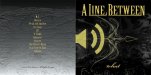
CD Cover
- Thread starter HaroldDesign
- Start date

EddieGallivant
New Member
Nice Cover
HaroldDesign
New Member
The music is rock (www.alinebetween.com)What kind of music?
What are you trying to say with it?
What does it mean?
The name itself is quite ambiguous.
I'm not looking for "meaning" in a CD cover. We're not looking to "express" ourselves in cover art. I want it to be interesting enough to look at, but not suggest anything that takes away from the name being ambiguous itself.
Just Another Sign Guy
New Member
my only suggestion would be to apply a filter or create an effect to 'tone' down the speaker symbol as it has no depth it just looks placed on top because it is.
HaroldDesign
New Member
Thank you for the comments! It's great getting suggestions on concepts, because there's no time wasted on things that should not be developed. Dan - I did just "put" it there. It needs help - I wasn't about to go further with that if the general opinion was that it's stupid to begin with. B Snyder - It does clash too much, but with Dan's suggestion I think it will work. The line under the letters aren't really that (it may appear that way on screen), but in print or better picture there is a logical pattern to what looks like a line running through the letters, not underneath. Hmmm... maybe I should ditch that part. Something to think about!
Rick
Certified Enneadecagon Designer
First Caleb, thank you for a well thought out response, and a lot of bands pretty much have that same idea about album cover design. Bands want to express themselves with music, just thinking with a designers hat on about how to put that across to the potential buyer. So I get what you are saying. But like most designed things, ambiguous is still saying something, and your CD also has to have shelf appeal. Obscure is difficult to pull off without some deeper concept driving it. How would it stack up against other similar bands? I listened to the 2 tunes you have.
Below is a scan of a book I usually recommend on communicating graphically certain ideas... this is what it says about obscure/ambiguous... I think it can be more interesting and more appealing. I think your band logo and the speaker icon fight each other because of the different graphic styles. I would to to come up with a concept then obscuring it graphically.
Below is a scan of a book I usually recommend on communicating graphically certain ideas... this is what it says about obscure/ambiguous... I think it can be more interesting and more appealing. I think your band logo and the speaker icon fight each other because of the different graphic styles. I would to to come up with a concept then obscuring it graphically.
Attachments

HaroldDesign
New Member
Thanks Rick! I think I could go for something that works into the design, but plays on a "hidden" quality. I like the example of a refection that is not the original image, too. That's great what it says about getting information about what people don't want (I use the all the time), just as I am never "offended" when someone points out a fault or negative opinion of my work, because it always still says something about what should or shouldn't be. Thanks!
HaroldDesign
New Member

Circleville Signs
New Member
First, congrats on getting the disc finished! I've been involved in the making of over 15 in my day, and the effort is usually worth it!
now, for the design. I REALLY do not like the speaker symbol. Why do you want it in there? Are you concerned that people won't know that your CD contains music? The rest of the design has a certain feel to it, and that speak icon just looks ridiculously out of place.
I think hat if you just lose that, you will have a fully rendered concept.
Gary
HaroldDesign
New Member
First, congrats on getting the disc finished! I've been involved in the making of over 15 in my day, and the effort is usually worth it!
now, for the design. I REALLY do not like the speaker symbol. Why do you want it in there? Are you concerned that people won't know that your CD contains music? The rest of the design has a certain feel to it, and that speak icon just looks ridiculously out of place.
I think hat if you just lose that, you will have a fully rendered concept.
Gary
Thanks Gary! The speaker thing is just something that "stuck" when I used it on a couple of show posters. For whatever reason people asked to keep those ones after shows, so I figured people like it. So far I thought it made for a nice clash between modern and ornate. ...Now I'm not so sure! I'll be taking a print proof to practice tonight (even though I still have to finish the inside art), and I'll make another one without the "icon". We've been using that speaker symbol for branding.
Circleville Signs
New Member
If the speaker symbol is something that you are branding with, then it needs to be included - but what about "remaking" it to flow more with the ornate piece flowing off to the right of it?
just dropping the texture over the top of it isn't making it blend at all...
Of course, my opinion and $.50 will get you a bad cup of coffee")
Gary
just dropping the texture over the top of it isn't making it blend at all...
Of course, my opinion and $.50 will get you a bad cup of coffee
Gary
HaroldDesign
New Member
I agree. Something about it. I looked at it again, and I think I'm going to use the speaker shape as a mask over an area of the background of the back cover so it's not so "look at me", and helps a sense of flow.If the speaker symbol is something that you are branding with, then it needs to be included - but what about "remaking" it to flow more with the ornate piece flowing off to the right of it?
just dropping the texture over the top of it isn't making it blend at all...
Of course, my opinion and $.50 will get you a bad cup of coffee
Gary

Circleville Signs
New Member
First, great use of that icon
I like the mask idea. I'd say, maybe set it at around a 30% opacity?
Gary
I like the mask idea. I'd say, maybe set it at around a 30% opacity?
Gary
HaroldDesign
New Member
Thanks again for the input! I don't want to get these things printed and then think, "this sort of sucks". I'll post an update of "final" cover and inside art some day soon. Any suggestions are greatly appreciated!

HaroldDesign
New Member
Circleville Signs
New Member
You didn't post anything!!!
Gary
Gary