SpiritMagnets
New Member
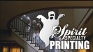
We just hired a graphic designer to redo our logo. This is the first design they submitted to us.
Our current logo was thrown together very quickly when we opened, and now that we've been around awhile, we'd like something more professional.
We market mainly to schools with booster clubs, etc...that's where "spirit" comes from.
We're bracing ourselves for impact...have at it......
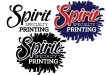
Our current logo was thrown together very quickly when we opened, and now that we've been around awhile, we'd like something more professional.
We market mainly to schools with booster clubs, etc...that's where "spirit" comes from.
We're bracing ourselves for impact...have at it......