• I want to thank all the members that have upgraded your accounts. I truly appreciate your support of the site monetarily. Supporting the site keeps this site up and running as a lot of work daily goes on behind the scenes. Click to Support Signs101 ...

Design input please

SebastienL

New Member
Hi everybody,


Havn't posted in a while, but I need help with a layout.

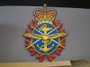
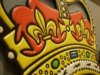
Here is the scenario: I'm designing this table top to commemorate the 100th anniversary of the Canadian Navy. Overall dimension is 42" in diameter. The final product will be CNC routed and printed similar to the attached pictures.

The two logos, the title "A Century of Support", the list of name of servicemen who paid to have this table fabricated and the text explaining the table must appear on the table. This is what I have troubles with. I really like the rope and maple leafs all around and I like the anchor in the middle. I'm just not sure what to do with the mandatory elements.

If anyone as any ideas, I'm listening...


Thanks,

Sebastien
 

Attachments

  • Table top design.jpg
    Table top design.jpg
    133.7 KB · Views: 74
  • PB060013.JPG
    PB060013.JPG
    154.6 KB · Views: 76
  • PB060014.JPG
    PB060014.JPG
    151.6 KB · Views: 84
  • PB060016.JPG
    PB060016.JPG
    158.8 KB · Views: 56

iSign

New Member
I'd love to help! My father was in the Canadian Royal Navy. It would be a special honor just to try to think of a single idea I can offer with any usefulness. I have to leave for a meeting, but I will check back..

first thoughts... thinner rope band, maybe slightly less of the leaves poking into the center.. both those changes could free up a little space... maybe the main copy could circle around the design, English arced over top half, French arced under bottom half... in fact if that lettering arrangement worked, maybe 2 thinner rope bands inside & outside of that ring of main copy, then leaves inside that.. then a smaller anchor & without the names being where they are now, the two logos could pull into that negative space on both sides of the anchor... and ..ummm... ok, that large ribbon scroll does look good... make it wider, position the two logos on the scroll, and typeset the names around it...

gotta go... I'll try some more ideas with your elements if you would consider emailing them to me:
signs@islandsign.com
 

SebastienL

New Member
Thanks iSign.

I have it as a CS5 file for now. If you tell me what version you have, it will be a pleasure to send it to you.

Definitively, the rope and leaves need to be thinner. I'm just not sure how to achieve that. Anyway, I'm not going to play with this today as it is total mayhem around here...
 

SignManiac

New Member
Are you open to a multimedia piece? Here's one I did using a variety of materials and methods.

The background panel is cut from .040 bronze aluminum. (or you could use something thicker if you like) The rope border was done on top of that in 23k gold leaf, hand spun and then I hand outlined the ropes in maroon 1-shot enamel.

The blue oval ring is 1/2" PVC with a beveled edge. Inside of that I designed and used a digital print.

I made the prismatic Letterville letters and put them on an 1/8" red outline that sat on top of an 1/8" blue border background.

The panel exchange ribbon is v-carved into a 1/4" PVC raised panel. There's a whole bunch of chit going on but it looks very dimensional.

I can visualize your piece done in a similar method?
 

Attachments

  • Letterville2.jpg
    Letterville2.jpg
    96.3 KB · Views: 61
  • Letterville3.jpg
    Letterville3.jpg
    78.6 KB · Views: 53

SebastienL

New Member
Nice work there, SignManiac. I did a few signs in the same style as yours, with cut letters mounted on stand-off, graphics cut to shape, etc. Never did any signs with gold leaf, though I'm dying to do one.

But the customer as already seen some of those military type badges I made, and thats what he wants. So I'll stick to that.

I'll post some pics when completed, probably early august...
 

iSign

New Member
Thanks iSign.

I have it as a CS5 file for now. If you tell me what version you have, it will be a pleasure to send it to you.

Definitively, the rope and leaves need to be thinner. I'm just not sure how to achieve that. Anyway, I'm not going to play with this today as it is total mayhem around here...

CS5 looking forward to trying to contribute an idea or two to see if it has any positive influence for you...
 

iSign

New Member
hey, can you check the address you sent to, I never got it.

OH.. I CAN'T BELIEVE I WROTE CS5... I MEANT CS4...

if you didn't already finish this project, I'd still be happy to see if I can make any useful suggestions. please send the file again, to signs@islandsign.com
thanks
 

SebastienL

New Member
Update...

Designed approved.

Here's a 3D render from Type 3. This is the most complexe 3D surface i've done so far. A good 8-10 hours from a flat vector file to get to this point. I just started it on the router; I figure at least 24 hours before it complete.

After that : Primer, print, cut outside diameter and lacquer...
 

Attachments

  • Render 3D.jpg
    Render 3D.jpg
    58.7 KB · Views: 74
  • Table top FINAL.jpg
    Table top FINAL.jpg
    128.2 KB · Views: 53
Top