• I want to thank all the members that have upgraded your accounts. I truly appreciate your support of the site monetarily. Supporting the site keeps this site up and running as a lot of work daily goes on behind the scenes. Click to Support Signs101 ...

Need Help Disclaimer for too much information / text?

TXFB.INS

New Member
does anyone have a DISCLAIMER that you use for layouts that are overloaded with text / information / wording?

I have verbally warned about not being able to read, especially since this is going on a roadway
looking for some verbiage that can be sent to a a final warning of what will happen once made and to cover myself if they "forget" the verbal warnings

They provided their FULL LIST of services, I have did the standard side-by-side as requested vs suggested proofing layout
They are still hard set with having ALL OF THE INFOTMATION on the sign


Suggested 96"w x 48"h
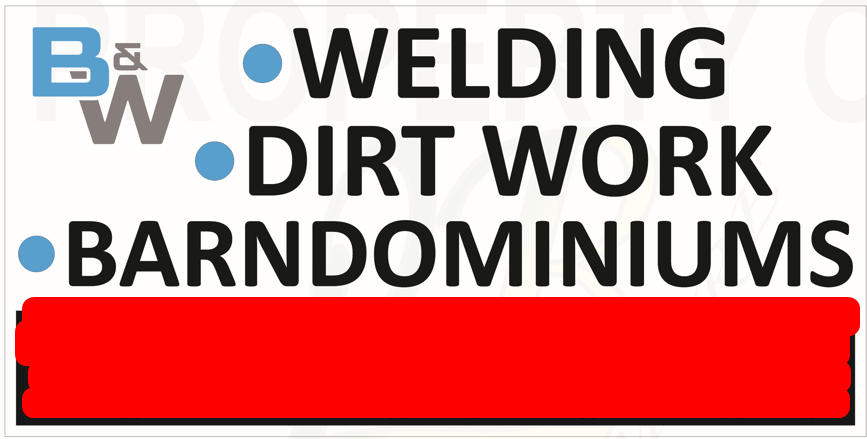
1670892572888.png


requested and what they want made 96"w x 48"h
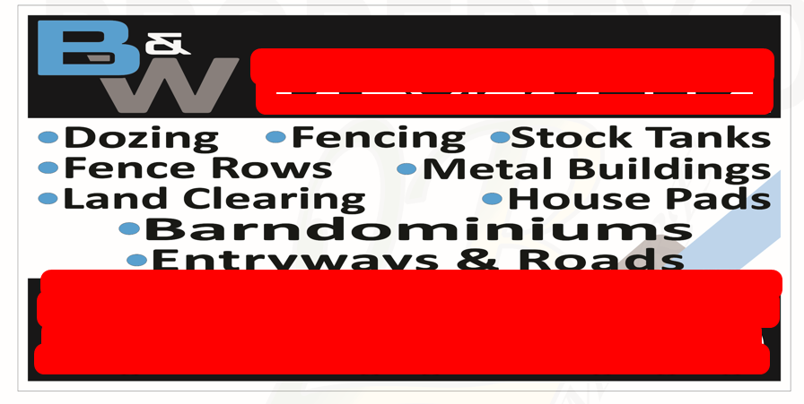
1670892584242.png
 
Last edited:

Boudica

Back to "educational purposes"
1. Use a more condensed font.
2. Space things properly - there should be an even amount of space around the bullet separators
3. Have the main service, what they do large, and make the other stuff a little smaller.
4. Try out a couple of columns, instead of listing items horizontally.
If you can do layout and design, you can include what they want, and still have it look nice.

I've been faced with similar challenges... It can be done
 
  • Agree
Reactions: bob

Texas_Signmaker

Very Active Signmaker
Why is their version so stretched? You can tastefully fit all their services on there and still make the sign look good. I don't like the version you suggested either.. the bullet points are too big and it looks odd having their logo just floating on the top left.
 

Pauly

Printrade.com.au
Do a better design
change the font
You can make that work very easily.

and dont forget.
The customer is always right. you give them what they want. if they want all those services, then that's what they want to promote


They still need to add their phone number, their mailing address with zip code and then website.

I agree with Gino. There's still a lot of space to take up.

Pretty sure they are there, just marked out in red.
 

Johnny Best

Active Member
Some customers like a lot of information on a layout. Figure out how to make it look nice, they are going to want changes so get ready for more frustrations and charge accordingly.
 

Billct2

Active Member
Great job Stacey, even "bad" signs can look decent.
But as far as a "written warning" that's what the signed proof is for.
I just had a job where they wanted a gray background with blue & orange lettering.
I showed a medium/light gray and they insisted on a dark gray. I said I was concerned about legibility but thats what they wanted.
I even gave color samples of the materials to show the actual contrast. That's what they wanted.
It had exactly the issue I was worried about, they love it, that's what they wanted
 

IndySignPro

New Member
We have debates like this all the time. Sometimes the issue is "The Customer is Always Right, even when they are wrong." If they want 9,000 items listed, then list the 9,000 things as nice as you can. If you hate the design when it is done, and they love it... then don't list it in your portfolio. If you won't deliver what your customer wants, then they will find someone else that will.
 

jochwat

Graphics Department
In situations like this we often include options in the proof, if time allows. Option A is what the customer wants. Option B (and/or C, D, E...) is our suggested layout. As the boss says, sometimes we need to save the customer from themselves. More often than not, they choose Option A from the proof, but I think that's due to the buyer just wanting it to look exactly like what THEIR boss is asking for. But when they choose our recommended suggestions, they are generally very thankful for the extra care given to their project.
 

Stacey K

I like making signs
If I have bad designs where "the customer is always right" I either don't post them or I post them during a time where I know nobody is on social media...like a Friday afternoon or Saturday morning. I use the best possible angle or a strange angle.

Sometimes I private message the bad ones to Boudica so she can get a good laugh for the day
 
Top