-
I want to thank all the members that have upgraded your accounts. I truly appreciate your support of the site monetarily. Supporting the site keeps this site up and running as a lot of work daily goes on behind the scenes. Click to Support Signs101 ...
You are using an out of date browser. It may not display this or other websites correctly.
You should upgrade or use an alternative browser.
You should upgrade or use an alternative browser.
feelings on this?
- Thread starter ucmj22
- Start date


ucmj22
New Member
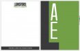
I don't like the arrows. It subliminally distracts you.
Dang, that was my subtle link to architecture and engineering, as in their technical drawings
ucmj22
New Member
I don't like mine either but it was fun to play with while I ate leftovers.
So I guess that means you dont like mine?
HulkSmash
New Member
So I guess that means you dont like mine?
actually yours is much better.
i dont mind it that much. nice job
tsgstl
New Member
I don't like the arrows and I don't like the color difference between the arrows and the lines. Or how the tip of the arrows are covered. Or how the dimension lines don't touch the actual thing it is measuring. But I like the general concept of the dimension lines, just making it work seems tough. IDK it's fun when you can play with something that isn't yours.
qmr55
New Member
IDK it's fun when you can play with something that isn't yours.
lol i had too...
but i like the original! good job man
ucmj22
New Member
Too round in my opinion. Especially when enlarged for the big green one.
Good point, I might make an alternate with a similar but sharper font for lunsford. Or... maybe I'll just sharpen up the corners on this font...
Rick
Certified Enneadecagon Designer
There is no reason to add some engineering reference when it says architecture and engineering... these logos are blah and it could be done better. I would do more research. You will be surprised (or maybe you won't) how bad a lot of architect/engineer logos are. Look at architects who have spent some time with their branding Gensler, HOK, NBBJ.... it's simple stuff, why? I don't think they want their business to be defined by their logo, they want something that is easily recognizable, and a mark for their marketing materials that does not clutter a layout.
jkdbjj
New Member
I think it is a great start. The L encapsulating the AE is an easily recognizable symbol/typography. I think it might need a new font maybe, but I like it.eh..?
As for the other stuff, I think it works just fine. The lines thicknesses are proper, the empty space seems reasonable.
The arrow, is neither here nor there for adding anything defining to your clients. Rule of thumb, if it is not needed, leave it out.
Thanks for sharing.
Rick
Certified Enneadecagon Designer
JTBoh
I sell signage and signage accessories.
not a big fan of the font, seems a little vertically stretched. Also, some of the lines and fonts are too heavy imo... might be good for a general builder, but an architect/engineer takes pride on using minimal materials to make a sturdy structure. Try to use that, and they might appreciate it more, especially if you explain it to them... i.e. "I know that you guys take pride on designing the strongest structure you can with the least materials - and I incorporated that into your logo design by doing _________"
ucmj22
New Member
well here is just a slight tweak, I havent had time to mess with it a bunch today. I just sharpened the angles on the font, and adjusted the positioning for the arrows. I'll probably let this guy know that I think his logo is terrible and we should change it before I work on it anymore