-
I want to thank all the members that have upgraded your accounts. I truly appreciate your support of the site monetarily. Supporting the site keeps this site up and running as a lot of work daily goes on behind the scenes. Click to Support Signs101 ...
You are using an out of date browser. It may not display this or other websites correctly.
You should upgrade or use an alternative browser.
You should upgrade or use an alternative browser.
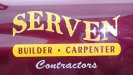
Font ID anybody?
- Thread starter Mason
- Start date
Shovelhead
New Member
The "spurs"....
were probably added to the font.
were probably added to the font.
Fred Weiss
Merchant Member
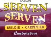
I agree that the spurs were added but I'm unable to take it beyond that due to the nature of the art eliminating the possibility of a automated comparison and the time constraints of visually comparing to thousands of serif fonts in my archives.
Of the major font families there is a passing resemblance to some of the Caslons but not enough to call it a match.
Of the major font families there is a passing resemblance to some of the Caslons but not enough to call it a match.
Shovelhead
New Member
Shovelhead
New Member
The serif on the "R" leg....
comes to a point on the pic.
comes to a point on the pic.
Gino
Premium Subscriber
It looks like one of the Century Schoolbook versions. Which one is hard to tell because of all the chopping and adding that has gone on with this one.
The diamonds are probably add-ons…. especially since they don’t keep a pattern going.
Based on the original layout and the other simplified usage of styles, layout and perception, it looks as if a novice just tried to make a fancier style out of a simple one. Rarely will you see diamonds going in two directions on the same letter, let alone on a ‘Thick’ and a ‘Thin’ stroke.