It looks like all the fonts they ranked are free/open source fonts.
I'm seeing a greater amount of customer provided art files set in Montserrat. It's a decent typeface; it even has a true small caps character set. The variable version of Montserrat was buggy at first, but seems to have been updated (now it works properly in CorelDRAW). I'd like Montserrat more if it had a variety of widths.
When I'm considering buy a new type package I'm more likely to buy if the font(s) have variable width axes along with variable weight.
I'll still use Gotham once in awhile, but I've really grown sick of it due to it being over-used in so many places. I dislike Arial and really hate seeing it when it is distorted. But when people stupidly squeeze and stretch Gotham out of its normal proportions it looks even worse. Gotham should not be distorted (especially when the type family has four native widths available).
My guesses:
1. Montserrat
2. Gotham
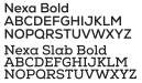
3. ? -Nexa is similar, but Nexa's "S" isn't right.
4. Akzidenz Grotesk
5. Neuzeit Grotesk
6. Avenir/Avenir Next
A really bad scenario is when a customer has a channel letter
sign made by another
sign company and needs broken letter faces replaced. The letters might look like they were set in Futura, but which type foundry version? None of the versions of Futura sold by Monotype, Linotype, Bitstream, Paratype, URW, Neufville Digital, TypeShop, etc are perfectly identical with each other. Set a string of text in any of those versions and then overlap them. None of them line up perfectly with the other. The same situation is true with Helvetica and its various "Helveti-clones" (like Swiss 721 BT or Nimbus Sans). I can spot the difference between the 1957 "plain" Helvetica, its 1983 "neue" cut and the more recent "now" version. It tougher to spot the difference between Helvetica Neue and Nimbus Sans.
And then there is the issue of people distorting the fonts out of their normal proportions. Variable Fonts add a new wrinkle to the mix. More and more, if we don't have the original art files we're going to have to make patterns from channel letter returns and craft the new channel letter faces from that.
 Right and I really hate