-
I want to thank all the members that have upgraded your accounts. I truly appreciate your support of the site monetarily. Supporting the site keeps this site up and running as a lot of work daily goes on behind the scenes. Click to Support Signs101 ...
You are using an out of date browser. It may not display this or other websites correctly.
You should upgrade or use an alternative browser.
You should upgrade or use an alternative browser.
Gorgeous lettering - is it a font?
- Thread starter Colin
- Start date


tulsagraphics
New Member
It looks like a font + glyphs + custom strokes. Font recognition tools might get close on some of the basic letters, but no font will give you all the elements for a complete design like that (at least not out of the box). Font recognition tools won't recognize glyphs either.
Chances are you'll just have to browse through dozens of font directories and find something that has a lot of nice glyph options (typically found in paid fonts). Then break out your digital tools to finish it out however you like (or have a designer do it for you).
Chances are you'll just have to browse through dozens of font directories and find something that has a lot of nice glyph options (typically found in paid fonts). Then break out your digital tools to finish it out however you like (or have a designer do it for you).
Patentagosse
New Member
Might be custom, might be one of the nice fonts I have bought from Letterheadfonts.com
Desire must be close... it offers some nice twists
Desire must be close... it offers some nice twists
Patentagosse
New Member

Ian Stewart-Koster
Older Greyer Brushie
That's Charles OdB's Desire. It was about $100 usd when i bought it a few years ago.
It's well worth supporting Charles & buying it- he's a great bloke!
It's well worth supporting Charles & buying it- he's a great bloke!
Colin
New Member
That's Charles OdB's Desire. It was about $100 usd when i bought it a few years ago.
It's well worth supporting Charles & buying it- he's a great bloke!
Erm, no, it's not DESIRE.
Ian Stewart-Koster
Older Greyer Brushie

Colin
New Member
Looks near-enough like a hand-modded adaptation of it. There are enough glyphs & alternates that you can chop, tweak, and weld as required.
I am not wanting or needing to re-create this sample, I was simply so awestruck by the beauty and quality of it, that I would want to buy the font if it is indeed a font.
bob
It's better to have two hands than one glove.
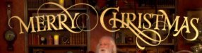
The 'Merry Christmas' in gold on the window is hand lettered by someone very good at it. There are three 'R's, each one ever so slightly different. The serifs on the 'H' and 'T' are irregular. That being as far as I looked, further inspection was not necessary.
Colin
New Member
The 'Merry Christmas' in gold on the window is hand lettered by someone very good at it. There are three 'R's, each one ever so slightly different. The serifs on the 'H' and 'T' are irregular. That being as far as I looked, further inspection was not necessary.
The thing is, this isn't gilding on glass, it's actually a screenshot from an xmas e-card someone sent to me. It was from the "American Greetings Corporation".
I just now sent them an email asking about it.
Given that Hallmark and other greeting card companies have historically had very talented & skilled hand-letterers, this too could be one of their creations. I'll let y'all know if I hear back from them.
Last edited:
Gino
Premium Subscriber
Talent and skilled hand letterers, yes, but I agree with bob, that was originally painted or even gilded on someone's window. No hand calligrapher is gonna do that kinda job. Just ain't in the stars. Some of hallmarks or whoever else's talented artists, more than likely..... copied that and made it their own. They probably even paid royalties to use it.
bob said:The 'Merry Christmas' in gold on the window is hand lettered by someone very good at it. There are three 'R's, each one ever so slightly different.
While it's likely in this case the lettering was created by hand, the fact a lettering sample has three different capital "R" glyphs with varying features doesn't automatically mean a font file wasn't used. The Desire Pro typeface was mentioned (available to sync via Adobe Fonts btw). Desire Pro has a whopping TWENTY different capital "R" glyphs. Some typefaces, such as Bookmania, are even more insane with the number of alternate glyphs offered.
Gino
Premium Subscriber
Correct. Whether this thing was originally pounced, traced or free hand, it still came from a base font. The handling of the swashes and flourishes is what makes it distinct. While a machine might've created the template, the hand-letterer takes poetic license and does his/her best to replicate exactly, but that will never happen. That's why when using speedball, it really will never get this exact.
bob
It's better to have two hands than one glove.
There are differences and then there are differences. The differences I noted were those that a hand lettered line would have, not due to multiple character versions. I took that into account when I was looking at this line.While it's likely in this case the lettering was created by hand, the fact a lettering sample has three different capital "R" glyphs with varying features doesn't automatically mean a font file wasn't used. The Desire Pro typeface was mentioned (available to sync via Adobe Fonts btw). Desire Pro has a whopping TWENTY different capital "R" glyphs. Some typefaces, such as Bookmania, are even more insane with the number of alternate glyphs offered.
Back when most all signs were hand lettered we seldom, if ever, worked from some particular type face or another. We sort of made it up as we went along. A journeyman sign writer had a few of each or scripts, romans, sans serifs, and black letters, etc. in his repertoire.
Gino
Premium Subscriber
HAhahahaaaa.......... Just dawned on me. This OP gives grief to someone for not keeping him informed and thanking him for a legit request. However, the OP puts up a fake request for no particular reason, other than to waste people's time and gives them all grief when trying to help him. Turns out, he was just holding back facts from the beginning and railroading those who tried to help. Guess he was just trying to pay people back. Then, he goes on to explain his vast knowledge on hallmark cards calligraphy. What a joke...
Boudica
I'm here for Educational Purposes
It does feel like a trick. Another thread started just so the op can feel superior to anyone who contributes.HAhahahaaaa.......... Just dawned on me. This OP gives grief to someone for not keeping him informed and thanking him for a legit request. However, the OP puts up a fake request for no particular reason, other than to waste people's time and gives them all grief when trying to help him. Turns out, he was just holding back facts from the beginning and railroading those who tried to help. Guess he was just trying to pay people back. Then, he goes on to explain his vast knowledge on hallmark cards calligraphy. What a joke...
Colin
New Member
I finally heard back from the card company, and they have informed me that it was hand-lettered by one of their artists. That’s too bad, as it would have been a nice font to have.
And to Gino’s last comment: I’m not sure what a “fake” font ID request is. It appears you’re infected with the boorish and bankrupt Trumpesque style of going on the attack and just making stuff up, but thanks once again for showing just how much of an unevolved, abrasive, obnoxious AH that you are. I know that you will find it impossible to resist, but please refrain from engaging in any of my posts. You are likely the most repulsive individuals I’ve ever come across.
And to Gino’s last comment: I’m not sure what a “fake” font ID request is. It appears you’re infected with the boorish and bankrupt Trumpesque style of going on the attack and just making stuff up, but thanks once again for showing just how much of an unevolved, abrasive, obnoxious AH that you are. I know that you will find it impossible to resist, but please refrain from engaging in any of my posts. You are likely the most repulsive individuals I’ve ever come across.
Gino
Premium Subscriber
Yo colin, acting dumb doesn't score ya any points..... anyway not in this village.If you knew anything about hand-painting, speedball or calligraphy, you'd know how that thing was created and that it wasn't drawn or made at a Christmas card size.
Your choice of adjectives are quite interesting, too....... but I think you left a few out. You need a newer thesaurus. You might try out writing cards for hallmark as you put words together just swimmingly.
The permission I need to enter into a thread is entirely up to me or the admins here, not you. You're a nothing to most here and probably always will be with the attitude you sport around.
As for the fake ID request, I guess you're just too dumb to comprehend just about anything, so you push it off as 'unneeded'. Sad little boy.
 Oh, and I don't have any infections, cause I drank the Trump kool-aide.
So, who's the lucky one here.... ?? Me or you since our paths have never crossed as you mistakenly said ??

Last edited: